• Last year the famous photographer Steve McCurry was caught having digitally manipulated a number of his photographs. He blamed his ‘team’ (Petapixel.com, May 6th, 2016). But what about his other family, his Magnum family?
• Only a few weeks ago, Peter Vik announced he was leaving Magnum Photos, because he refused to sign a new contract with an outside investment group. He left Magnum to protect his freedom, as a photographer (British Journal of Photography, June 15th, 2017).
These two news items may have nothing in common at first glance, but they may be symptomatic of trouble at Magnum Photos and perhaps a warning of things to come.
I have for many, many years been a strong supporter of the legacy that has led Magnum Photos to be a place for photographic independence, where photographers retain control of their photographs, sold for single use only to media far and wide.
When the founders of Magnum came up with the single use policy, it laid the foundation for the livelihoods of many of the best photographers of the past 70 years. The price for this success was of course a certain set of iron-fisted leaders that forced photography in a particular direction.
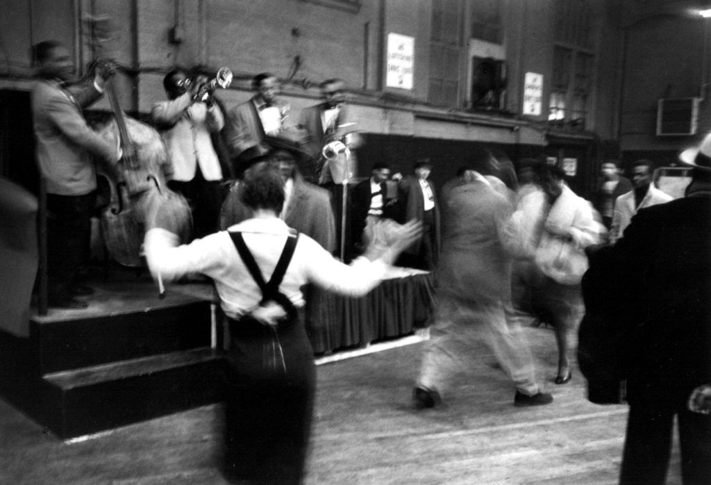
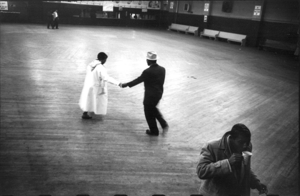
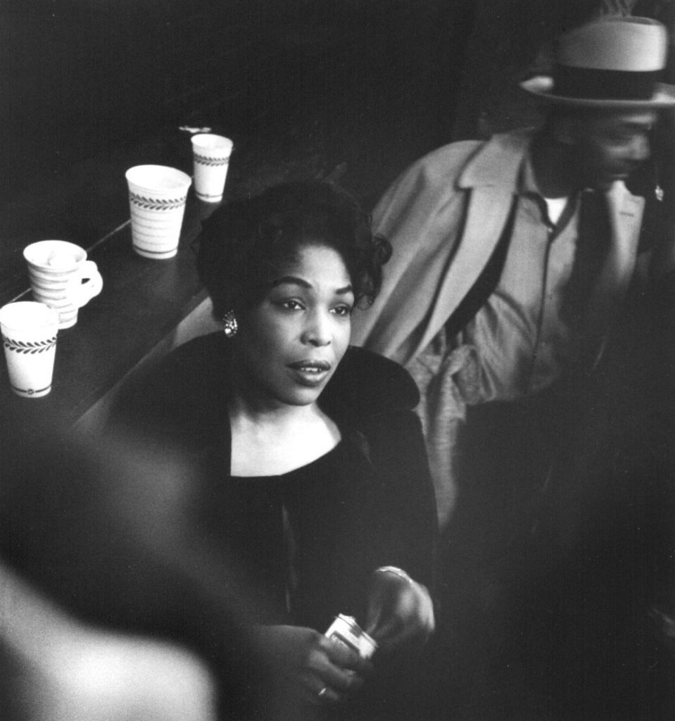
One of the early drivers was Henri Cartier Bresson (HCB). A fiercely independent photographer, who with a substantial family fortune behind him could afford to be selective in his assignments, and who as luck would have it with his first self-assigned project for Magnum Photos struck gold. HCB was in India to photograph Gandhi. As it happened, this was the day before Gandhi was murdered. HCB went on to cover the funeral leaving the world with some very iconic photographs that were sold to newspapers and magazines far and wide. In some ways, this single assignment cemented the name of Magnum Photos and made it what it has been for the past seven decades.
HCB was the backbone of Magnum Photos for many, many years. He worked hard at critiquing and schooling superb young photographers like Marc Riboud until he was satisfied that they had mastered the HCB esthetic. Shooting in his image, one might say. But strong personalities have their own challenges.
When Kryn Taconis an early Dutch member of Magnum came to Paris after having returned from Algeria, where he had been photographing on the side of independence (and therefore against the French, in the eyes of HCB), Magnum Photos on the specific orders of HCB refused to circulate his photographs through their usual channels, effectively muzzling Taconis. Taconis soon left the collective.
I met Kryn Taconis’ widow a few years ago, around 2002, I think. By then she was in her 90s. She showed me a photograph by HCB. A modest size print of Kashmir, from 1947. The inscribed photograph was HCB’s gesture of contrition for having effectively censored Kryn Taconis out of Magnum. He had come to visit, in person, admitting he was wrong to block Taconis’ work, by letting his own personal politics get in the way. He was a dollar short and a couple of decades late. Kryn Taconis had passed away in 1979.
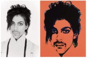
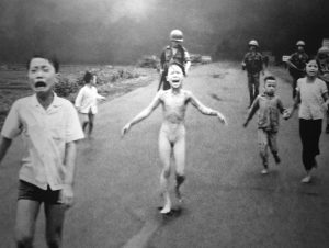
In modern times, when Steve McCurry was found to have manipulated his photographs to perfection, he blamed his ‘team’. McCurry made a lame argument that he was not shooting on assignment, and had not supervised sufficiently, etc. Had there been only one of these manipulated photographs, it might have been OK. Write it off to assistant enthusiasm, perhaps? But there are several internet-sleuths, who have uncovered further examples by simply comparing photographs by McCurry that are in circulation on the web. Does this taint all of McCurry’s work? You decide….

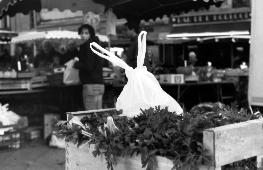
The final product

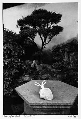
The original image
Reuters and AP and several other agencies, including National Geographic, all seem to endorse and enforce a code of conduct: Mr. Gerry Hershorn, who until 2014 was Photo Editor for Reuters, put it this way: “Well, there are … some very accepted practices. If you take a picture and somebody’s skin tone is purple by mistake, it’s very common for a photographer to bring the skin tone back to a proper skin tone color. A photographer is never allowed to change content. You can’t add information, you can’t take away things.”
Not long ago, AP severed all ties to Narciso Contreras. He had digitally removed another photographer’s camera from one of his photographs, taken in Syria. AP acted swiftly and scrubbed their website of all Contreras photographs. Santiago Lyon, VP and Director of Photography said in a statement: “AP’s reputation is paramount and we react decisively and vigorously when it is tarnished by actions in violation of our ethics code. Deliberately removing elements from our photographs is completely unacceptable.”
Don McCullin, one of the last greats of photojournalism – and not a member of Magnum – put it this way: “Digital manipulation of photographs is ‘hideous’ and has left photographers able to ‘lie’ to the public by doctoring images. Pictures have been ‘hijacked’ by digital, with old-fashioned skills of the dark room eclipsed by computer generated colour.”
When it comes to Steve McCurry, Magnum Photos has chosen to remain virtually silent.
It seems that when the big names in photography make mistakes, like HCB with his politics, or Steve McCurry with his digitally perfected colour photographs, there are different rules. HCB may be dead, but I do not think he would be happy about Magnum Photos taking on outside investors, and starting to lose control of the collective he founded. Likewise, had he been alive, I am pretty sure he would have asked Steve McCurry to leave Magnum Photos.
But, if Steve McCurry were asked to leave Magnum Photos, what would the new investors say? What would losing a revenue stream from work by what used to be one of the great photojournalists of his time? This may explain the silence from a usually outspoken Martin Parr, who just stepped down as President of Magnum.
For all its faults, Magnum Photos may be the last refuge for some of the best photographers in the world, who might otherwise have had to shoot weddings and corporate annual reports to survive. In a world where a cell phone video by an anonymous witness, has replaced professional photojournalism in most media outlets, it is tough to be a photojournalist.
I worry…. If books are anything to go by, Magnum Photos is doing everything it can to invent new revenue streams. There is a TV series in development, and I understand that there are discussions about how best to leverage the brand. With the new investors in place, who will be looking for a return on their investment, can coasters and coffee mugs be far behind? AND in refusing to tackle the McCurry issue, has Magnum opened the door to doubt about authenticity, and legitimacy of itself, and its collective of great photographers?
Harbel,
San Sebastian
See more on my website: harbel.com
Images are borrowed from the web and are attributed to Steve McCurry, and are for illustration purposes only, no rights owned or implied.


 Reflecting on a Small Chateau – Matheus Rose


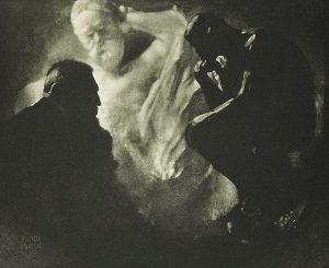 Edward J. Steichen – Rodin
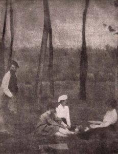 Gertrude Kaesebier – le dejeuner sur l’herbe?


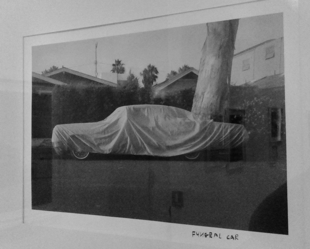
 The dreamer. By Harbel