One can reasonably argue that National Geographic Magazine is the most influential magazine focused on photography, since the untimely demise of Life Magazine. One can also argue that being the most influential comes with the most responsibility.
When the photo editor(s) at National Geographic select the one photograph per month from all the submissions to their ‘Your Shot’ community, they have awarded the photographer great honour and respect. I am sure it is an incredibly tough decision for the editors making the decision to publish one particular image over 1000s of others.
I sat on a couch in the lobby of a hotel this week, waiting for my room to be ready. I was leafing through the latest National Geographic Magazine. The May 2018 issue. Following stories about Picasso, birds flourishing following the catastrophic meteoric event that caused the extinction of the dinosaurs, and stunning underwater photographs of grouper and sharks, I came to the last photograph. The selection by the Photo Editors from the thousands that submit their work to the website organized by National Geographic under the banner Your Shot….

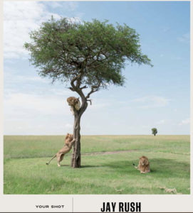
National Geograhic Magazine last page, May 2018
The photograph, which shows three male lions in and around a tree. One lion is in the tree sitting in what looks like a very uncomfortable position in a split of the trunk some 4 meters above the grass floor. A second lion is standing on its hind legs with its front legs gripping the trunk and the third lion is resting in a very regal position, suitable for the front staircase of any large bank, or around the base of Nelson’s Column in Trafalgar Square.
The composition is nice. There is great balance, a single tree on the right sits near the horizon line and breaks the horizontal line that separates the plain from the sky. Right at the golden section. A nicely composed photographs.
So, I think to myself, why doesn’t it look right? Why does it look like a painting and not a photograph? What is wrong with this picture?
The more I look, the more I am bothered by something not quite right. And then I get it. The lion on the left, on his hind legs and the lion lying majestically in the shadow of the tree have the exact same colour palate. The same tonal range. And why is this important? Well, the lion on the left is in the sunshine. The sun on his back. The lion on the right is in the shadow of the tree. Yet, the two lions are exactly the same colour. How can a lion in the sun be the same colour as one in the shade?
It can because it is not real. It is impossible. This then begs the question; is the perfectly placed tree in the background fake too? Is the grass really that green? Are the lions real? Is there a tree? Was any of it really there?
I don’t know Jay Rush. I don’t know anything about his work, but I do know that nature does not create the same amount of colour saturation in sun and shade and no camera that I have come across exists that can make it so. But computers, ah well, that is a whole other story. They can do anything.
If a tree falls in the forest, was it really there?
Harbel
PS: To the Photo Editors at National Geographic: Shame on you!

