In light of yesterday’s decision by the supreme court in favour of Lynn Goldsmith, I wonder if there is a special hot place in the underworld for those so-called artists, who will now face an onslaught of lawsuits.
Lawsuits, which until yesterday’s US Supreme Court ruling were an uphill battle with limited chance of success. Lawsuits that are now very winnable and should finally drive a stake through the heart of those that appropriate photographs to remake them, silkscreen them, or make other two dimensional copies.
In case you have been living under a rock, the ruling everyone had been waiting for fell yesterday in the case between the Andy Warhol Foundation and the photographer Lynn Goldsmith over the use of a Goldsmith photograph of the artist Prince (see my blog: Ending Appropriation of Photographs by So-Called Artists).
The US Supreme Court ruling was 7-2 in favour of Goldsmith, with Justice Sonia Sotomayor writing in the majority opinion: “Goldsmith’s original works, like those of other photographers, are entitled to copyright protection, even against famous artists…”
Where does this leave Richard Prince and so many others who have no original ideas and simply change the scale, or rephotograph other photographer’s work? Do they file for Chapter 11 protection as a business (assuming a lot of these photographers have protected themselves behind some corporate structure), or do they declare personal bankruptcy in order to avoid the courts, legal fees and the now almost inevitable damages to be paid.
Does Gagosian drop Richard Prince as an ‘artist’. Do other galleries do the same for those that for too long have lived off the work of others? Does this ruling make the art gallery complicit? Considering yesterday’s ruling, art galleries can surely no longer pretend that they didn’t know, when they decide to represent a particular copy-cat artist.
And perhaps more interesting, given that collectors are fickle beings; will the market now finally speak and make the work of copy-cats unacceptable, or better yet unsellable? Could it be that to hang Richard Prince’s cowboys, or an oversized Instagram image on your wall and talk about your art collector sophistication becomes so gauche that the monied collectors finally take their losses and turn their backs on appropriation and theft. Is it time to send the copy-works to auction – if the auction houses will touch them – and take the inevitable financial bath?
I look forward to a few years from now walking into a non-descript local museum and finding a poorly lit, somewhat hidden picture, with a small cardboard tag that reads: “Here hangs a work by so-and-so, who used to be a somebody, but now is a nobody. Felled by the courts and art collectors for being no more than a copy-cat”.
It is a great day for Lynn Goldsmith, Donald Graham, Eric McNatt, Norm Clasen, Jim Krantz, and so many others, who have had their work stolen and abused with neither credit, nor compensation given.
In a recent article in the NY Times, Julia Jacobs reports that the self-governed Association of Art Museum Directors voted 54% in favour of allowing the sale from their collections to pay for the preservation of other parts of their collection. The devil’s advocate might wonder whether this means that the Chief-Curator and the entire curatorial staff can get paid from the proceeds of selling off a few unpopular works of art? Is this the classic slippery slope?
I can appreciate that the COVID19 pandemic had a major impact on museums and galleries across the world. With attendance and ticket revenue at zero for a number of months, a great many public museums relied on governments to step up and cover the shortfall. Loans, grants and one-time funding were part of the short-term life-raft that many institutions needed to survive.
But this blog is not about the COVID19 pandemic, or museums struggling with attendance, but about whether the bond between the donor of work – often the artist – and the recipient of the donation – the museum – can be severed. Does a museum ever have the right to sell work that has been given, or acquired?
Is it a reasonable expectation that an artist who donates work to a museum can expect future generations to be able to view their work in perpetuity? While the museum may not be required to always have the work on display, is it a reasonable expectation that the work should at least be available from the stacks to be viewed by researchers, or other interested parties?
Many museum directors have voiced opinions about the new policy, but this is not a discussion for one museum, or the next, but rather whether it is a reasonable expectation on the part of the artist that forever actually means forever. That a gift is permanent and cannot be sold to either buy other work, pay salaries, or keep the lights on.
In a recent auction sale at Hindman in Chicago, the Houston Museum of Fine Arts sold a group of Eugène Atget Photographs. There was much celebration surrounding the successful sale. One might argue that in the photography realm, doubles of the same photograph exist and perhaps having the right to sell doubles would be acceptable, but where does this stop. The tip of the iceberg, perhaps?
I know several photographers who are working feverishly not to leave their heirs the challenge of finding a home for their work. They are attempting to settles their estate during their lifetime and being happy in the knowledge that a gift to a great museum is going to give them and their descendents eternal peace of mind. However, the new policy from the Association of Art Museum Directors and perhaps future decisions by this self-governed association, may well suggest that any gift or donation, or acquisition comes with an * giving consent to unilaterally sell it later.
Imagine if a photographer’s work falls out of fashion, and can be sold to the highest bidder because a Director, or Board of Directors, says it is appropriate to do so to pay for the salary of a new curator, or a new frame for a work by another artist. What is a reasonable expectation?
Can one museum be deserving of our confidence, while others are ‘maybes’, and yet others are outright ‘high-risk’. What is the Government’s role in preserving our past and not bowing to trends, pressure groups, or political correctness. It is one thing not to show particular work, but selling it, or worse, is that a decision for the here and now, or is that a decision that we should happily kick down the road for future generations? There are no backsies, once a sale has been made. There is no coming back from a decision that in the future could be deemed poor, or even terrible.
Is it morally acceptable for a future Board of Directors of a given museum to sell off work with a simple vote by a temporary majority?
I admit it. I am using Deana Lawson to prove a point. I am taking advantage of a well-known and highly respected photographer’s work to illustrate how the usually black-clad, face-less critics and gallery owners describe a photographer’s work. I aim to show how descriptions are nothing more than elaborate word-salad – a hopeless sequence of adjectives and expletives – assembled for the benefit of the writer, and seemingly meaningless to everyone else.
In the context of Deana Lawson, let me start by saying that I never stage photographs. I don’t ask people to stand or sit just so. I have only twice in my life asked a stranger whether I could take their photograph, and on both occasions I did not ask them to pose in a particular way, nor did I do anything but say ‘thank you’ after I made my photograph. As such, I really struggle with elaborate tableau photography with heavy direction and great control with nothing left to chance. By extension, I am not a great fan of Lawson’s work.
It is not that I cannot admire the skill of someone making such photographs, but I do find a more genuine approach by the photographer capturing a random moment in time through simple observation much more compelling.
Now, that I have revealed my bias, what I really want to write about is the way in which those that are in the business of displaying, criticizing, or selling art describe what is on display on the walls. This whole discussion started with a sentence I read in a newsletter announcing that the Gagosian Gallery is now representing Deana Lawson in New York, Europe and Asia.
I re-read the announcement twice and I still don’t understand what it means. Enter Mr. Google….. I did a search for Deana Lawson, I lifted the descriptive sentences found on the first couple of result-pages and dropped some of them in random order below, with the final entry being what started this whole process; the quote from the Gagosian Gallery press release.
In no particular order:
MoMA: “….saturated color continues to be a signature feature of Lawson’s practice, and in Roxie and Raquel the multiple yellows, whites, and blacks in the scene come together in a complex and compelling picture of family dynamics.”
Artsy.net: :Photographer Deana Lawson shoots intimate staged portraits that explore Blackness, legacy, and collective memory. Her pictures, which reflect both actual histories and contrived narratives, focus exclusively on Black subjects posed in richly detailed environments and interiors. “
Cat Lachowskyj for Lensculture.com: “These photographs contain multitudes — references to African diaspora, complex emotions, unspoken dreams, dignity, pride, love, visible scars, the trappings of household circumstance, the tenderness of generations.”
Wikipedia.org: “Deana Lawson is an American artist, educator, and photographer based in Brooklyn, New York. Her work is primarily concerned with intimacy, family, spirituality, sexuality, and Black aesthetics.”
Dodie Kazanjian for Vogue Magazine: “In her relatively brief career, Deana Lawson has become a Diogenes, a signifying truth-seeker of unviolated Black humanity and beauty.”
The Photographer’s Gallery: “Deana Lawson’s work explores how communities and individuals hold space within a shifting terrain of racial and ecological disorder.”
Gwendolyn DuBois Shaw: “Quoting Lawson: ‘Someone said that I’m ruthless when it comes to what I want. Maybe that’s part of it: I have an image in mind that I have to make. It burns so deeply that I have to make it, and I don’t care what people are going to think.’ Unfortunately, this kind of totalizing control isn’t good for anyone except Deana Lawson and the people who are making bank off it while blinding most of the art world to the consequences of this problematic artistic strategy.”
And finally, the Gagosian Gallery press release: “Lawson is renowned for images that explore how communities and individuals hold space within shifting terrains of social, capital, and ecological orders.”
I am finding the descriptions by the various institutions, websites, and critics really, really difficult to understand. I may not be a critic, and my command of the written language may be less evolved, but it is hard to imagine that the entries above are even about the photographs by a single artist!
I return to what I have said so many times in the past: Walk into a gallery, look at the photographs, make up your mind about what you are seeing, and only then read the labels, the gallery introduction, the catalogue, the critics. I know, this is not always possible if you are going specifically to enjoy something you have read about, or seen an announcement for, but try anyway, because we are so often pulled down rabbit holes that are not of our own making.
What we see and what we read in a photograph is deeply personal and has nothing to do with the intention of the maker, current trends, geo-politics, or anything else, or maybe it does for you. There should be no pre-judgement here. Simply enjoy the experience of seeing something and ‘reading it’ with your own lens and let others worry about where the work fits in the annals of art history, current culture, or artistic trends.
I guess the good news is that the Allen collection going up for sale at Christie’s this week contains seven photographs. Allen is by Christie’s hailed as a visionary collector, a self-made connoisseur, who took no advice from experts and collected with his heart, for himself, and on his own.
Yet, the only thing that made sense in all the hype I read, was that he was drawn to the pointillists and Jasper Johns because of their use of dots and letters and random words, which Allen could relate to from his time working with, and developing code. The rest feels a lot like one, or two of everything.
The stars are all here and of course, as a constellation, they are labeled by Christie’s as a visionary collection. It seems over a period of relatively few years, Allen was able to use his bottomless pot of gold to assemble a collection of art works, which as a whole has neither depth, nor much vision that I can tell, but which all share the same characteristic; the works are all ‘safe’. The artists are already in the cannon of art history. There are no flyers, no mistakes here.
Of course there is the possibility that Christie’s only picked the smooth, leaving the rough for the local North West auction house to sell. Yet, I wonder if this is the usual self-made person, turned insanely rich, turned art collector/patron, turned museum director darling, fundraising target…. One of those people who helps the art market, without really helping art.
Like the bored spouses of hedge fund managers with nothing to do, who are trying to make their own museum. This, in an effort to be taken seriously on the cocktail circuit and catch the eye of the museum director, in order to secure a seat on a coveted board of trustees. They collect to gain acceptance. They collect to be seen and to gain access. They bring nothing to the party, other than the frightening smell of eau des nouveaux riches.
I am of course being harsh, and probably overly critical, but doesn’t it always seem that museum directors spend their time collecting ‘patrons’ of the arts who 25 years ago wouldn’t have known a pie chart from a Damien Hirst spin painting? Patrons who with their money bought their way into a society, which is volatile and insecure, and entirely dependent on a bank balance at one particular moment in time, and of course a squeaky clean personal history with no suspect behaviour that has not been covered up properly. They carry the designer handbag, outrageously expensive fragrance, and single-use outfits worth as much as the annual culture budget of a mid-size town.
The problem is it doesn’t help. It is safe. It does not support the artists that need the help now, not when they are dead. The true visionary artists that are living in cold studios and who rarely benefit from their work until the obituary has been written.
Paul Allen – visionary – collecting visionary artists…. hardly. But let us for fun have a look at the seven photographs that made the cut and joined the Allen collection and are now on sale with all the hype that Christie’s can provide. The 7 are in order of catalogue appearance….. drum-roll please:
Edward Steichen: Flatiron 1904/5, acquired in 2001
Man Ray: Swedish Landscape 1925 (Rayograph), acquired 2000
Andreas Gursky: Bibliothek 1999/2014, acquired 2014
André Kertész: Cello Study 1926, acquired 2000
Irving Penn: 12 Hands of Miles Davis and His Trumpet, New York, July 1, 1986, year of acquisition not indicated
Paul Strand, Mullein Maine 1927, acquired 2002
Thomas Struth, Stellarator Wendelstein 7-X Detail, Max Planck IPP, Greifswald, Germany, 2009, acquired 2015
It seems to me that there is neither head, nor tail to these seven; not in process, subject matter, period… they have only one thing in common, they are safe names and they are expensive. They are, like the rest of the visionaire’s collection, safe work by safe artists. This just goes to show that with deep pockets comes…. no forget it. Nuf said.
“One of my pet peeves is how people now equate digital art with JPEGs and spinning little GIFs when it’s a medium that has a 60-year-long history that consists of everything from algorithmic drawings to internet art.” says Christiane Paul, the Whitney Museum’s digital art curator. (New York Times – Oct 31, 2022)
I take some pleasure – as an analogue photographer who does not use digital tools beyond scanning prints for my website – in seeing Christiane Paul’s comment above. After all, analogue photographers have for the past, I don’t know how long, been looking for respect as a branch on the Evolution of Art tree.
I think photography is now firmly established as its own limb on the Evolution of Art tree. This is now finally an undisputed fact. Some photographers have for a while now been encourage the digital side to find its own way. Those to whom the removal of content from the frame and the addition of enhancements, or even foreign objects, are the norm. Those to whom the photograph itself is merely an ingredient in a final work. Those are digital artists.
It seems that now the new NFT digital artists are snubbing the .JPGs that for so long have been the tool of choice for most digital artists. The format where the huge raw file post enhancement has come to rest. It is not without a certain mild satisfaction that I read that the NFT market has tanked and those that endure are finding their way to public institutions for rescue. There is no doubt that NFTs are here to stay, but there needs to be a distillation of quality, a new transparency, and a better understanding of what an NFT is and what it is intended to do.
Perhaps the NFT, when properly understood, can turn the digital photographer towards the new digital reality and lead the split in the photography branch on the Evolution of Art tree. One branch continues to show photography that is maybe 95% what the maker saw through the camera (I am not greedy, I can live with a bit of correction, but not addition, or removal of entire elements), and a second, new branch, which is digital art. It is the branch that holds works on paper that is based on minimal manipulation and is an honest, or near honest representation of what was in front of the photographer when the shutter was pressed. And a second branch which should remain on a screen in the digital world from whence it came.
While the NFT market may be down by 97% year-over-year in value and speculators and manipulators are feeling it in the pocketbook, it is a time for rebirth and sincerity and more than anything transparency. The NFT is here to stay. Nobody alive today can remember 1929, when stock tips from the person operating the elevator suggested it was time to get out of the market. In the NFT world, the market has spoken, people got out. It is time for recovery. Maybe this time a transparent and clear delineation might help with the split between photographic art and digital art.
The New York Times published a story recently about a painting by Marc Chagall on the verge of being destroyed, because a committee of experts in Paris declared it a fake. The story should be a warning to all art collectors.
The story begins with the purchase of a water colour painting by Marc Chagall at a Sotheby’s auction in 1994. A couple of years ago, the buyer decided – in consultation with Sotheby’s – it would be a good idea to sell it again, as the owner had moved to a smaller house and no longer had room to hang the painting.
In 2008, Sotheby’s valued the painting for insurance purposes at $100,000.
When the decision to sell was made, Sotheby’s insisted, as a pure formality, that the painting should be authenticated by the Comité Marc Chagall. The Comité is a Paris based organization that appears self-appointed by ‘experts’, who include in their number the granddaughter of the artist. The comité was founded in 1988, and takes responsibility for the authentication of work by Marc Chagall. It is unclear to me on who’s authority they operate.
Assured by Sotheby’s that it was only a formality, the seller sent the painting to Paris. Surprise, surprise, The Comté Marc Chagall declared the painting a fake. And worse, the report stated that the heirs were requesting the French judiciary seize the painting, and that it be destroyed.
In short: Sotheby’s lists and sells the painting as a genuine Chagall in 1994. Sotheby’s reaffirms the authenticity of the painting in 2008. It recommends that it be authenticated by the Comité Marc Chagall and is sent to France. The painting is deemed a fake and is to be destroyed.
A happy ending: Sotheby’s apologizes for its error, admits that it got it wrong, not once, but twice, and pays for the shipping to France and the inspection by the Comité Marc Chagall, as well as refunding the original purchase price. Case closed….. but, sadly no.
The real ending: Sotheby’s claims it is not their fault, somehow the listing in their catalogue is not really a validation, or certification of anything, it was a long time ago, and therefore they are not liable any more. In fact, they claim that liability for when they do get it wrong is only five years from the date of sale, which of course is written in tiny font worthy of any insurance policy in the terms of sale.
The loser: The lady, who Sotheby’s assured was taking little, or no risk sending the painting to Paris for authentication, is out of pocket for the purchase price, the shipping and authentication costs in Paris, and it seems will even lose the painting itself to fire, or shredding.
The Lesson: Be careful, and be aware of the risk of buying and selling at auction.
The commitment, and what it really means
Where did it all go wrong? Everything of course – absolutely everything – comes down to provenance; the well documented chain of ownership from artist to gallery to the present owner. For true authentication this chain must be unbreakable and rock solid.
In the Chagall case, the breakdown is in part because very often there is no chain of custody available at an auction house, often because the seller wishes to remain anonymous and provides no evidence, nor, it seems, does the auction house demand it. The buyer has to rely exclusively on Sotheby’s say so. Anonymous means the chain of custody – the provenance – is broken.
The message here is that you should always try to make sure that the chain of custody goes right back to the artist and is papered as such. Does the gallery where you bought the work represent the artist? Do it work with the artist? Has it provided you with written documentation to this effect? Is the description of what you have bought complete? Is there a date of creation, description, title, signature, condition report, a date of sale, a signature, etc.?
All this is only second best. Best of all is to get to know the artist a little bit and buy with their knowledge, either directly form the artist, or through a gallery that they recommend. The gallery may go under and no longer exist, but anything you have from the artist directly discussing the work or describing it is gold – pure gold – when it comes to provenance.
Lesson I: Buy directly from the artist, or at the direction of the artist in a gallery of the artist’s choosing whenever possible, and get as much background and description in writing as you can.
Lesson II: If the artist is no longer alive, then get the same information from the family of the artist, or the estate of the artist.
Lesson III: Ask a lot of questions. A gallery that has a reputation to keep will answer all of them to the best of its ability. Only buy when you feel good about it and, of course, with as much paperwork as you can get.
Lesson IV: Print your emails, keep records, because when it comes to re-selling, proof of authenticity – as best you can provide it – will very much influence the price you will get for your work of art.
Be smart about buying art, be aware of the risk of buying and selling at auction. Keep all your records in case you need them one day.
Harbel
(This blog may not be reproduced in full or in part without the permission of the author)
The Louisiana Museum, Denmark – March 24, 2022 to…. Forget it.
I managed to get to Louisiana, an art institution in Denmark, which has for many years been at the forefront of staging excellent exhibitions of mostly 20th century art. The museum has a strong enough collection to lend and borrow and thereby attract the best.
I admit my expectations were high. Diane Arbus was why I got into photography in the first place. The very unstable looking kid in Central Park holding a hand grenade was my trigger to change direction from Renaissance Art to Photography. Reading that the first ‘major’ exhibition of Arbus’ work in Scandinavia was only half an hour up the road from where I was staying, was an opportunity too good to miss.
This past Sunday, I made the short journey and couldn’t wait to see something about this great photographer that was new. Maybe even a few images I had not seen before. Maybe a visit with some of my favourite works. Alas, I was deeply disappointed.
The selection of work was limited – exclusively drawn from the Art Gallery of Ontario collection in Toronto – and the whole thing felt like a travelling road-show. It felt canned and hung because it was easy and fast. The AGO collection is far from exhaustive and has large gaps. The Louisiana Museum had many months to plan and prepare this show, given COVID and with our new knowledge of how to use tools like Zoom, or Teams, I see no reason why they did not take the opportunity and bring together something much more exciting.
My main challenge, was placing the works in chronological order, which doesn’t really work with the Untitleds, which form such a major part of her body of work. The subjects, which Arbus photographed in her many Untitled images, often have Down’s Syndrome, while others again are simply institutionalized ‘inmates’ with no voice of their own. These photographs are problematic in today’s context. Hanging them does not take into account critical issues around exploitation and the gaining of permission. Yes, the State may have allowed Arbus access, but that does not give her the right to shoot without permission, or does it?
Diane Arbus: Untitled (1)
One of the early labels attached to an image I do not recall, quotes Arbus saying something like, and I am paraphrasing: “….. my style of photography and a short lens demand that I ask my subjects permission before photographing them.” I do believe the Museum should have spoken to this when it comes to subjects that never had the choice, nor the voice. I presume by mixing in the Untitleds with the other works, the curator somehow thought he didn’t have to comment?
The labels accompanying each photograph start out being plentiful in content, but virtually become title, medium, date towards the time when Arbus’ style was more fully developed (larger square format prints). There is no mention of the famous set of images of which she sold only a single set to none other than Richard Avedon (unless I missed it), nor was it clear which grants she did, or didn’t get. There was a blown up low quality poster print of one of her applications glued to the wall – I think to the Guggenheim Foundation – which if successful should give hope to every aspiring photographer. It was rambling and poorly written, and certainly not terribly helpful for a jury to evaluate. The label did not say if she was successful in that particular instance.
Had the Louisiana curator and his team bothered to let it be known that this show was being assembled, there are experts abound who know Arbus and her work inside-out and backwards. Where for instance were the reference works? Where was Lisette Model’s Woman with a Veil, San Francisco, 1949, which so deeply inspired Arbus’ work. Where are the contemporaries. The Winogrands, etc. The Museum even had the recently published book from the seminal 1967 show in its bookshop, but it doesn’t show any examples. (New Documents – Arbus, Friedlander, Winogrand, MoMA 1967, curated by John Szarkowski).
Finally, Identical Twins hung on its own. A perpendicular short wall set up just for this image. Unfortunately, I am a little over this image. Over exposure perhaps, but it remains the cornerstone of any serious Arbus show, as it should. Identical Twins was – I think – printed by Arbus herself (I assume it was, as no Selkirk reference was given). It hung there in all its glory, but with a mat so tight to the image that you cannot see the border or framing at all. Anyone with any knowledge of Arbus and her work will know that she spent many, many darkroom hours working on how to use the edge of the negatives to create a frame around her work. The edge of the negative being part of how Arbus worked.
I have read many accounts of how Neil Selkirk – who printed for the the Arbus Estate under the direction of Arbus’ daughter – spent hours trying to copy the technique Arbus used to give the proper feel to each print. I do not understand why Identical Twins was framed the way it was. It makes no sense, as every other square format photograph in the larger size was hung in a frame with a mat that clearly showed the entire negative frame.
In the image below, which I grabbed off the internet, it is very clear what the border of an Arbus printed image of Identical Twins should look like.
Stephen A. Fran: Diane Arbus with her photograph Identical Twins, during a lecture at the Rhode Island School of Design in 1970.
The Danish population overall is not well educated in photography, the history of, or even the names of some of the key masters of the art. This is a great shame, given the role of photography in art today. You need only go look at the ‘photography’ section at the only important auction house in the country, Bruun-Rasmussen, to see that there is no market, nor it seems any interest in Denmark. Nobody is laying the foundation of knowledge, which is so disappointing. Louisiana’s has had a key role in bringing 20th century art to life and to the Danes. It had an opportunity with Diane Arbus to start doing so for photography, but chose instead to bring in a canned show with little or no context.
I looked into the curator, whom I understand is well respected. From my little and limited research online, he has the art history credentials, but with no, or very limited photography background. He is incidentally also the head of acquisitions at the Louisiana Museum, which again does not bode well for photography. Incidentally, I happen to know a couple of the photography curators that used to work at the Art Gallery of Ontario. They eat, breathe, sleep and dream of photographs. At Louisiana…. not so much.
The Diane Arbus show was such a wasted opportunity for the Louisiana Museum, and for their second act, well, the second act is just shameful. This summer, the Louisiana Museum will have a show of Richard Prince’s work. I wrote about this appropriating, unscrupulous, so-called ‘artist’ in a recent post. Needless to say, I will not be going.
Dropped and lost gloves as found – The Dirty Dozen
I blame Irving Penn. I saw his photographs of cigarette butts in a show in the 1990s. The stunning platinum/palladium prints, the tonal range, the softness and texture, yet sheer scale of these small found and collected cigarette butts blown up many, many times in size, left me with a new awareness and perception of what you can photograph and what works as both great subject matter and great art. In short Penn’s cigarette butts blew my mind.
While my reaction to the Penn photographs was one of awe, they were also liberating. Somehow they gave me permission to think about different things to photograph. In photographic terms, what Irving Penn did for me with his cigarette butts was make me consider new subjects and more importantly, they reminded me to look down, scanning the ground, as I have since spent countless hours doing, while walking the streets with my camera thinking in 24 x 36 mm virtual rectangles.
What I think about today, when I look at these same Penn’s photographs is how much of a lost opportunity the cigarette butts represent. I think the context of these butts would have been interesting. Where were they found? Was there a puddle, were there other objects nearby? Were there twigs, dirt, dried leaves? There is a context that is missing. I recognize that the perfectionist studio photographer does not venture into the natural world, but craves lights, tripods and so forth to be comfortable. In no way does this obsessive nature diminish the work, it just means that the story isn’t finished. The game is underway, but all is not revealed.
As a result of my obsession with these Penn photographs, I have been looking down a lot when I walk. Sometimes this has been very rewarding. In particular, I have found that ‘the lost glove’ has found a special place in my photographic vocabulary. For the past 15 years, I have been setting aside negs of lost gloves with the idea that maybe one day there would be enough good ones that I could do something with them.
I now have my dirty dozen, as I call them. Some are weathered, dirty and often wet, while some look like they were dropped only minutes ago. One is even covered in barnacles, spotted when I was walking along the beach after a storm. I have thought often of what Penn would do with these gloves, but then I decided they probably wouldn’t work for him, as what makes them good is the shape, the context, the environment, the setting in which they were found. None of my gloves have been moved, touched or enhanced by flash, lighting or other tools. Nor have the photographs been manipulated digitally. What you see is what I saw when I walked around with my head down and saw yet another single glove that had lost its owner and was now destined to end its life decaying or being scooped up by a road sweeper, or the flick of a broom.
Harbel: After the Thaw
Harbel – Lost Peace
Harbel – Black Wool
Harbel – Cross Walk
Harbel – Wool Mitten
Harbel – Folded Glove
Harbel – So Good Glove
Harbel – Barnacle Glove
Harbel – You Rock Child
Harbel – Lost with Razor Clams
Harbel – Lost with Puddle
Harlel – The Other Glove
There is a sadness that comes with every lost glove. To me it is the perfect metaphor for loneliness. Once there were two, now only one remains. In recent times, the lost glove is a harsh reminder of what so many people have gone through during the past many months of COVID isolation. It is the lost, the forgotten who suffer most.
This morning I read an interview with the very au-courant and hugely popular photographer Bastiaan Woudt by Marie Audier D’Alessandris, a gallery owner in New York (The Eye of Photography website January 25th, 2022). I read and re-read an answer to a question related to the colour Black several times:
The question: “… Black is a very recurring color in your work, in the sense of a very deep, very strong, very rich dark in your images, what is it in this color that you’re going after?
The answer, in part: “…. maybe it’s just part of the way that I process images and the way that I see, I really like to have a strong contrast in my images. But actually, it’s funny that you say that it’s like so black, because if you look in Photoshop it’s not totally black, it’s the same as the white parts in my images are never totally white…. these are all inspired of course by analog photography….”
At least Mr. Woudt is man enough to admit that it is all done in Photoshop. But, in a day and age where the Brazilian photographer Rafael Pavarotti is widely criticized for his ‘colour correction’ of 9 black models for British Vogue, where are we? Where should we stand on the use of digital manipulation. A lot of the criticism of the Vogue shoot was about the lack of differentiation/representation of actual skin-tone and the resulting sameness. I think we all agree that in reality everyone has a unique skin-tone, different one person to the next. It is not appropriate to offer a digitally manipulated sameness in the name of consistency of colour and presentation of clothes. When you view various photographs of the 9 Vogue models online, each one has their own skin-tone and each one looks entirely different, which is as it should be.
The question I have for Bastiaan Woudt – despite the fact that he shoots in digital and processes his work heavily in Photoshop – why are you choosing to present work where the skin-tones are so similar? There is a fake sameness one photograph to the next. Is it really possible to find models that are so alike, or is this more about sameness and presenting work that is so consistent to be unnatural and therefore in its imitation of living beings ends up being entirely about form and not at all about the model. Is it more about the clinical than the real? It is almost as though the model is an inconvenience.
It sadly feels like there is a certain Pantone number for near-black and another for near-white, and it is simply a matter of dropping in the digital file from the digital shoot and a second later extracting yet another like image, where composition – very good sometimes – is king and the sitter secondary, tertiary, or entirely irrelevant.
Skin-tones make photography interesting, it makes lighting – natural or cast by many lights – fun to play with and the results vary in intensity and strength, it is what makes capturing light so exciting. It is never the same twice. It seems this is missed entirely as the formula for Woudt-Photoshop-near-black and Woudt-Photoshop-near-white is generously applied. The result being a very predictable, repetitious and highly consistent seen-one-seen-them-all photograph. I look forward to seeing Mr. Woudt’s next body of work. With the compositional skills that Mr. Woudt clearly has, I am crossing my fingers and hoping for the best.
No……, we are not talking California, but the West Coast of Denmark!
Harbel – Low tide, Jutland, 2021
West Jutland is a 500 km stretch of windy, sandy coastline that is sparsely populated except for a few weeks in the summer, when the Germans roll up from the south and the Danes come from the east and go to their cottages hidden in the dunes.
Harbel – Hitler’s Atlantic Wall anno 2021
Protected by dikes a few small and medium size towns – including Ribe, Denmark’s first Capital – sit exposed to the elements with wind and rain best suited for boots and all-weather gear. Forget the umbrella, it won’t last 10 minutes.
Harbel – Tree at the Coast, Jutland, 2021
You could think of the coastline as one long beach with a few sandy islands off shore. The geographic contours remain flat and low. Most of the time you feel you can see forever.
The beaches are a paradise for wind- and kite-surfers, and naturally, the chief topic of conversation is the weather. The good news is that if you don’t like it, it can and will change momentarily.
Harbel – The Guardians at Viking Cemetery, 2021
Vikings came from this land and traces remain, as do the remains of Hitler’s unsuccessful Atlantic Wall. Mostly, it is ocean, sand, dunes, small houses and fishing boats, and for those few weeks in summer, there is no better place on earth. West Jutland – raw, wild and wonderful!
When the Marlboro Man met the hedge fund manager and his unscrupulous Art Advisor.
For a very long time, I have rejected the so-called ‘artists’ who appropriate and re-introduce someone else’s work as their own, which in turn, by way of the non-discerning eye of the opportunist art advisor, finds its way into the collection of a Wall Street hedge fund manager with more money to burn than a forest fire in Colorado. A collection where bigger is better and expensive is an attribute.
For the past 30-odd years I have followed the ups and downs of the judicial system, which has interpreted a single word: ‘transformative’ in any number of ways with wins and losses awarded to one side, or the other. More often than not, the victims have been photographers with great talent, but not so deep pockets.
There may finally be a glimmer of hope on the horizon. 2021 may well turn out to be a key year in the fight to take photography back from the copycats:
In August 2021, the photographer Lynn Goldsmith – probably best known for her portraits of musicians – was successful at the New York Second Circuit Federal Appeals Court, in her appropriation case against the Andy Warhol Foundation. The ruling overturned a lower court decision and states that Andy Warhol’s silkscreen of Goldsmith’s 1981 portrait of Prince was an appropriation and was not sufficiently transformative.
Goldsmith, Lynn – The Artist Prince 1981 | Warhol, Andy – Prince
In December 2021, the New York art gallery Metro Pictures closed it’s doors for the final time. The gallery was opened in 1980 by Janelle Reiring, an assistant to Leo Castelli, and a partner. Metro Pictures legitimized appropriation, mostly at the expense of photographers, who did not have a chance to benefit from the collectors who made Metro Pictures a huge success. Not to suggest that the closing of a single gallery in any way changes what has been happening, but perhaps in a small way there is justice for the photographers who for years have tried to fight against overwhelming odds for their rights and their photographs.
Appropriation in the modern context probably originated with the ready-mades that the Dadaists exhibited. A urinal, a metronome, an iron. In the 1960s, things get a little fuzzy when Andy Warhol made Brillo Boxes and placed them in a gallery. More fuzzy yet, when Marilyn Monroe’s studio portrait was turned into the now famous silk screen series, along side Liz Taylor, Mao, Elvis Presley…..
I don’t know if it hinders or helps, but I think of ‘transformational’ as something more than taking a two dimensional image and changing it to another two dimensional image, where you can still recognize the original image. I don’t care if you go from colour to black and white, or the other way around; add paint; frame it, or unframe it; enlarge it, or shrink it; digitize it; re-photograph it…. If a photographer who in most cases has a difficult enough time making ends meet cannot count on society to protect her or his work, where exactly are we?
On March 1st, 2018, Richard Prince tweeted, attaching a photo of one of his Instagram appropriations: “Last night at LACMA. Artists don’t sue other artists. They get together, have a cup of coffee, argue, kick the can, hash it out, talk about Barnett Newman, and how aesthetics for an artist is like ornithology is for a bird.” Maybe, just maybe, 2022 is the year where the appropriated laugh last.
In his commentary on the work of 100 photographers called “Looking at Photography” Professor Stephen Frailey writes of Richard Prince: “Richard Prince’s work as a component of the hollowing of cultural authority is particularly perverse and savvy; the transaction from yard sale into the ranks of high culture, with the resounding approval of the financial market place.”
I guess the market speaks and the lemmings follow. Be that as it may, but answer me this: Where does Norm Clasen go to get his just rewards.
After a hiatus in 2020, Paris Photo 2021 was back this November. While I should have written about the event sooner, it is perhaps good that I have had time to digest and think about things before writing.
I was able to secure a hotel quite close to the new temporary venue at the south end of the Champ de Mars, where every morning and afternoon I was greeted by an uninterrupted view of the Eiffel Tower before entering and after leaving the exhibition. This alone made it Paris Photo.
Atwood, Jane Evelyn – Blind Twins – St Mande school – 1980
I was astounded by the ease with which traffic moved in and out of the venue. The checking of COVID passes and the checking of tickets and badges was smooth and at least as good as it has ever been at Grand Palais. Full marks there!
Once inside, the venue looked and felt very permanent. There was nothing temporary, or cheap about the construction, or materials used to form the exhibition hall. It was laid out as a giant letter T. At the top, where one enters, there were rows of booths across, separated by main aisles. Down the center column of the T there were first a few more gallery booths, and then the various ‘special’ sections and finally the books and a small stage area at the back. The book section I found was well done. I did not go to the show during any of the book signings, which may have created some serious bottle necks, but when I was there, the opening afternoon and evening and during the mornings later in the week, it was great.
I had an opportunity to revisit some classic images at the galleries. There was a prominently centered print of one of my all time favourite works by Chris Killip (Killip sadly passed away in October 2020), among several of his well known works from the North of England in the mid-1970s. Of course there were superb works by several of the usual suspects: Penn, Avedon, Newton, etc., etc., but equally there was new work, and a few new discoveries for me, which is always wonderful.
Killip, Chris – Youth on a Wall, Jarrow, Tyneside 1976
However, I did want to point out one booth in particular (You know who you are….); It was an exhibition of work by a single photographer (I understand this is one of the things that you get bonus points for when applying to participate in Paris Photo. Why? I don’t know….). I bring up this particular booth as it showed a mix of modern Estate Prints that looked to me to be printed on 30cm x 40cm paper and hung along side vintage prints some of which were the same size, some smaller. The frames and frame sizes were almost identical throughout. The exterior walls of the booth were predominantly hung with the Estate Prints. I seem to recall, priced around EUR 2000.
I avoid Estate Prints like the plague. They have no secondary market value to speak of, and I think they misguide the new and young collectors, who are dropping good money on something without any real chance of ever recovering even a fraction of their investment. Estate Prints, particularly those that are not limited in terms of numbers are downright scary. They can of course be nice decorative pieces, but so can posters.
In the case of the booth that I am speaking about at Paris Photo, I found deception in the air. I think anyone who is new to collecting photography would be tempted by a price-point in the EUR2000s, for a photograph that they might well remember having seen in a book, or magazine. Of course, the very tempting price point compared to other photographs that were hanging in the main aisles would perhaps have led more than one novice to make a catastrophic mistake. I don’t think the majority of casual visitors to Paris Photo would know the right questions to ask.
Of course, there are exceptions to my Estate Print rule, such as the work of Diane Arbus, or that of Luigi Ghirri. The latter because the colours in his vintage work have shifted so badly that they look worse than my 1975 family album in most cases! In the case of Diane Arbus, the fact that she barely printed any of her work in her lifetime so sadly interrupted, and the fact that her daughter took charge with a master printer has over time proven to be a reasonable way of sharing Diane Arbus’ incredible images.
Perhaps an argument could be made for entry level collectors to have access to work by great photographers, but when you can go into the auction and secondary market and purchase work for under EUR 2000 that is vintage, or at least signed by the photographer in her or his lifetime, it is wholly inappropriate that someone should pick up a modern Estate Print with no real value at an event like Paris Photo.
When you attend an event like Paris Photo, the premier photography event of the year, there is no room for this kind of deception and the booth should not have been allowed to show the Estate Prints in the way they were shown. It made me, as a collector and a photographer want to go wash my hands, if not have a shower.
I don’t think I saw a single Chinese gallery represented, which I found interesting, but of course given quarantine rules in China and Hong Kong, I completely understand that you cannot attend a show and then go home to endless weeks of quarantine. Not good for business.
There were likewise several North American galleries that were not in attendance. This I think was in part due to travel advisories (for instance in Canada) and perhaps common sense on the part of others not willing to take the risk of booking flights, hotels, and crate transport at great cost with the risk of having the whole thing cancelled. As a result, there were several new galleries that were more ‘local’, some European, several Parisian, and these did their best to fit in and bring interesting work.
Wood, Tom: Bus Odyssey 1986
Overall, it was great to see old friends and new galleries alike and it was in some ways like stepping back to a time when there were no worries and we could enjoy photography for photography’s sake.
I look forward to next year and again seeing new, old and exciting work.
On a final note; I would suggest to the organizers that they find a supplier of modular partitions for 2022. I walked by the event hall on Sunday night with my dog. Tear down was underway, and there was way too much used drywall, and other single use materials that went straight into dumpsters and no doubt from there to landfill. In today’s day and age, that is just not good enough.
After a long absence from my blog and from travel, I am extremely pleased to have been able to once again take in an exhibition. I don’t know if the Martin Parr show at the Villa Medici was intended to be a show for COVID-times, or if it is merely a happy coincidence, however, the exhibition is a photography show in the open air. I have rarely experienced these other than on the fence that runs along Les Jardins du Luxembourg in Paris, which is OK, but a rather terrible setting, and the odd temporary things you meet on the road that are neither curated, nor usually very interesting.
The Parr show on the contrary is well thought out and placed in a corner of the Villa Medici gardens, high above the rooftops of Rome. Using various formats from maybe 1.5 m tall by 4 m wide, to smaller 30 cm by 40 cm, a couple even smaller, and finally a few lawn loungers with Parr images printed on the seating fabric. The show offers various views of Parr’s work in an unusual setting.
Harbel: Martin Parr – Villa Medici, Rome 2021
This section of the Villa Medici gardens are laid out with a grid gravel path and tall hedges that make up large rectangular spaces of grass with a few architectural fragments, the occasional sculpture, but still quite formal. You walk the path, get to an opening and step in. There are ‘6 rooms’ in the show, closed off with fences and images on two ends. The show takes up only a portion of the whole garden, and the balance is blocked off for those that pay for another ticket to tour the gardens. Not cool, but at COVID times, I guess any museum is excused for gouging a little. It has been a heavy drought in the money department for most all of them, the private ones in particular.
Unfortunately for me, I guess I have seen too many Parr shows in the past few years and found that most of the images in this show are retreads of greatest hits. The scale of the images do nothing for quality, and the fact that they are set the way they are, exposed to the elements, it is perhaps understandable that it is more about the image than the quality of printing. As prolific as Parr is, there is a certain disappointment – at least on my part – when you see the same lady on the beach with her eye protection, and the man with the hat not quite covering the bald spot. But, I must say, I was happy just to be there and see photography once again.
Harbel: Martin Parr at the Villa Medici, Rome, 2021
Was it great? No. Was it worth seeing? Yes. Would I pay for it if I knew what I was going to get? Probably. I was just happy to be among photographs again.
One of the advantages of being locked up due to the COVID pandemic, has been the time to read and look at the excellent prints that I have in my boxes by some of the great photographers, whom I admire. It also gave me time to go through thousands and thousands of my own negatives to see if there are any worthy of platinum/palladium printing.
My friend Gerry Pisarzowski in Toronto, Canada, is a world-class platinum/palladium printer and I have long wanted to make a few. Gerry shares my world-view on what constitutes a great print, and he is a master at making them.
After much time spent looking at small rectangles through a loop and at my silver prints, I picked 20 negatives and made the decision to have them printed in platinum/palladium. There is a magic to platinum/palladium prints that is hard to describe, so this is probably not the greatest forum to try to present what should really be seen and touched, yet, it is worth trying.
Harbel: Yorkshire 2017
The classic platinum/palladium print has a beautiful flat surface, the paper is mat and often has a little texture, like water-colour paper for instance. A print usually bears the very dark brown, or pure black strokes made with the brush when the platinum/palladium coating was applied, before being exposed to the light source. As such, platinum/palladium prints have the white of the paper, the black of the brush stroke frame, and finally the image itself. Some people mask the brush strokes either with a mat when framing, or by using a frame when applying the coating. Personally, I love the effect of the hand painted frame around the photograph, and I think it a great shame to hide it.
Much has been said about the platinum/palladium print as the king, or indeed the queen of photographs. I know this in part technical, as the process makes an incredibly stable and safe photograph, however, I think it is also because of the rarity of the platinum photograph. It is not a cheap process. The materials are expensive, and prints tend to be small, because it is a contact process, meaning that the negative is the same size as the final print. Given that small prints don’t seem to be in vogue at this time, where often prints seem to be judged by their square footage, as opposed to their quality, platinum prints are unique and special. Very special.
In a time when bigger is better, the luxury of being able to hold in your hands a small print made with care, using deep knowledge of the process and a bit of black magic is not only wonderful, but so different than what you would expect from a digital, or silver gelatin photograph.
I can warmly recommend that if you can find a great platinum/palladium printer, it is worth the effort and cost to make a few and experience what your photographs can also look like when presented on fine papers using noble metals. You could start by visiting my friend Gerry Pisarzowski’s website for more details of the process and perhaps you too can enjoy holding in your hands a magic platinum/palladium photograph. (http://geraldpisarzowski.ca/)
Since I was a very young boy, I have been travelling to major sightseeing destinations around the world, mostly in Europe, but also in North America and Asia. Instead of making my own photographs, I bought postcards, because I knew that those that make postcards wait for the perfect weather, the perfect clouds, the perfect light and the perfect scene that represents the city, palace, church or temple. Usually these postcards are in colour. They are a standard size, and either in a vertical or horizontal format.
Postcards rarely show any people. I guess, people tend to place the photograph in time, and place due to the clothing that people wear, the haircut, or the handbag. This would impact the longevity of the card and reduce sales! Photographers also avoid cars for the same reason, as a particular model will tell the person looking at the photograph when the photograph would have been taken. As such, most photographs have no people in them, no cars and try to be as timeless as possible. In short, you sell more postcards if the image is perfect and there are no references to time. These photographic postcards survive year after year on custom metal stands that are rolled out every morning, and returned inside every night. But are they not dead?
I have always looked at these photographs as impossible. How do you get the light to be perfect, the clouds just so, with no people around and no indication of the year, month or day the photograph was taken? Of course this has gotten easier with time, as software now can remove undesired elements, but when I was a kid, I am sure the photographers waited for months for just the right circumstances.
Harbel: Piazza Navona
To me, these photographs are interesting, but not real… or at least they seem impossible. I have over the years been fortunate to spend extended periods of time in several major cities and have wondered what might be possible. I still stand confused and in disbelief. If the clouds are right, the angle of the sun is not. If the angle of the sun and the clouds are right, then an irritating delivery van is parked in the wrong place, or a flock of tourists wonder across my frame. A poster advocates for a political candidate, or a poster for a movie. All are time stamps that just don’t seem to be there in the perfect postcards in front of the tobacco shop.
Harbel: The Papal Apartments
So, what can I do to take iconic images and rethink them? I thought that perhaps by going to black and white I could maybe do something. But that has been done before we had colour postcards, more than 120 years ago. But then it came to me that I could create movement around these well-known places by using a simple instrument. A bird or two to suggests that there is life in these places, that they are not dead, even though they may be devoid of people. Is this a new way of seeing? Surely not, but it is my way of rethinking the standard postcard, and I have been doing it for years. The confluence of good light, an iconic setting and a bird, or two does not happen often, but sometimes, you can get lucky…..
15 years ago, I bought my first photograph by Chris Killip. The photograph represents a time in history, where a committed, but impressionable 30 year-old Killip witnessed the bottom of an economic cycle in Northern England, when industrial manufacturing was dying, and poverty and despair were the order of the day.
Killip, Chris – Youth on Wall, Jarrow, Tyneside, 1976
I relate to the photograph in my own personal way, as I am pretty sure that the young man in the photograph is more or less my age. It is difficult to say exactly, as Killip has not said anything about his subject, other than naming the photograph: Youth on Wall, Jarrow, Tyneside, 1976. In 1976, I was 15 years old, much the same, I think as the young man in this photograph. My father always said that I should always remember that we do not pick where we are born. The Youth on the Wall grew up at a time when things were tough, factories shutting, unions being busted, and the industrial heartland of the United Kingdom gutted.
The young man is wearing a warn jacket – half a suit, I think, that has seen much better days – with pockets appear to have held clenched fists for a very long time, and perhaps a rolled up tweed cap. We can see a couple of stripes at the bottom of a sweater, which to me looks like part of a former school uniform. We cannot see what he wears under the sweater, but I would guess a not-so-white undershirt. His trousers are black and suggest that they have been worn a lot. Long wool socks connect the trousers that look shorter than they probably should have been at the time, with the massive worn boots, that seem impossibly big, or at least several sizes larger than what this otherwise gaunt young man should need. But what really grabs me, aside from the great photographic composition, are the clenched fists pressed against the young man’s forehead, and the lines emanating from his closed eyes, and across his forehead below the very short hair, no doubt cut quickly with a machine. It is as though the youth wants to will himself to disappear. To vanish from the trials and tribulations that form his seemingly endless reality.
The composition of the photograph reminds me of Ruth Bernhard’s nudes in boxes. It is as though the young man is making himself as small as possible to fit in a tiny space identical to the photographer’s frame. His clothes remind me of the grafters that would show up every day looking for backbreaking work in the docks of Liverpool, or Belfast. Men hoping to be picked by the crew bosses for a day’s work loading, or unloading ships by hand. Colin Jones’ work comes to mind. I can imagine that the youth has a rolled up cap in his pocket and could easily fit in among the thousands of day-labourers hoping to stave off the greedy landlord for another day and buy the basics for a simple meal for himself and his family. Of course, Killip’s youth is much too thin and weak to ever get called upon by the crew bosses.
Chris Killip passed away on Tuesday. He was 74. He is best known for his work in North England in the mid-1970s. He created a body of work that was collected in one of the most important photography books of the period: In Flagrante. Killip lived among his subjects, shared their loss and their despair and understood the context of his photographs – if not yet the importance – such that he was able to vanish into the background and show the raw reality of what was happening at a time in history that was cruel, hard, and for many an endless fight to simply survive.
I look at this photograph every day when I walk into my living room. It reminds me that I should take nothing for granted and should be happy to be alive, healthy and eager to take on the day.
Chris Killip (1946 – 2020) Rest in Peace, and thank you for the daily reminder.
Harbel
Note: First published on The Eye of Photography: https://loeildelaphotographie.com/en/in-memoriam-chris-killip-1946-2020-by-soren-harbel-dv/
A 1648 engraving found at the Museum of Medicine in Madrid shows the ‘Plague Doctor’ in full costume. The costume design is credited to the French Royal Physician, Charles de Lorme in the early part of the 17th century. The protective costume was designed to keep the doctor safe, while treating patients who suffered from the Plague. It was also known as the Black Death. The plague was wide spread in densely populated cities across Europe in the middle ages, resulting in millions of deaths.
Harbel – The Mask
The key feature of this protective outfit is the characteristic mask with the large beak shaped nose. The beak was filled with various aromatic and medicinal herbs to protect the airwaves of the wearer from infection. The Plague Doctor wore full PPE, in those days made of impregnated leather boots, gloves and a cloak, as well as a hat and is often seen with a short stick that he would use during his examination of the patient.
Stephan Gladieu – The Plague Doctor in his mask
The photograph above is a modern take on the Plague Doctor traversing Paris at a time of high stress during the 2020 COVID19 pandemic. The photograph is by Stephan Gladieu, a great French photographer, perhaps best known for his colour portrait work.
The profile is unmistakable. The warning very real!
The sight of the Plague Doctor silhouette walking the empty streets to the home of a poor suffering citizen, or to the hospital to treat patients suffering from the bubonic plague, would be incredibly alarming. Very scary. I cannot help but think that this is perhaps a great message even today.
Be careful and stay safe, AND wear your mask whenever you are around other people. It is the right thing to do. The safe thing to do. It is the least you can do to protect and respect those around you.
The lab where I buy my Ilford FP4 film is in Valencia, Spain. Their service is excellent and I am happy to give them a shout out: Carmencita Film Lab is great. They ship quickly and always have stock on hand. I have not tried any of their other services, but if they are anything like their film service, I am sure they are great!
The reason I decided to write this blog entry is the tag line on Carmencita’s website, which I have used for the title here: Because Life is not made of 1s and 0s. I am starting to see a renaissance in the use of film. People stop me and ask about my camera. In the line-up at airport security – as it used to be – there was always curiosity around my old beaten up Leica, but the frequency is definitely up.
I take this as a signal that the concept of the limitation to just 36 frames, the wabi-sabi of having to wait to see your imperfect negative and print, along with the idea that digital manipulation is not a requirement, is back in vogue.
After all, digital manipulation has nothing to do with the concept of capturing light and shadow, which is the foundation of black and white photography, it is about fixing it later. Photography should be about you and your pursuit of excellence in the moment, much like drawing a circle freehand, over and over again, knowing you will never do so perfectly, but you still keep trying!
To many, I will always be a dinosaur. A slowly evolving photographer, who has spent countless hours trying to get the camera to help me capture my particular split second view of the world around me. I frame, I shoot, and I hope that I get what I conceived in my mind’s eye. Sometimes it works, more often it doesn’t. I like the idea of chance… of serendipity.
Harbel: Broken Umbrella
So, for those that are interested in analogue and those that see film as the new frontier: Welcome! For those that are still shooting film and love it: Keep doing your thing!
If we are lucky, the analogue ripple may one day turn into a proper wave – if not a tsunami – and we may actually trigger the rebirth of interesting printing papers on par with what existed in the first half of the 20th century.
I came across a photograph by the Italian Master Photographer Nino Migliori. Like most other photographers, I have known Migliori only for a single image. In fact, I will admit that I knew the photograph, but not the maker for many years. I am of course thinking of his spectacular Il Tuffatore (The Diver) from 1951, which I always think of in the company of Kertesz’s Underwater Swimmer from 1917. Both of which have achieved almost iconic status.
Migilior, Nino – The Diver 1951
“The Diver” – shown above – is the result of a great eye, a great composition and a little good fortune, given the speed of film in 1951. But, to my happy surprise, I ran into an auction catalogue, where I saw another Migliori image, which I had not seen before, and which I find wonderful.
Born in 1926, Migliori is closing in on his first century. He has worked in what I would describe as an independent and slightly irreverent manner his whole life. His work reflects a great love of his native Italy, while at the same time making images that are not necessarily geographically specific, but rather show the genius of a great observer. I have previously quoted Eduoard Boubat, who noted that the difference between a great photographer and everyone else, is that “the wandering photographer sees the same show that everyone else sees. He however stops to watch it.”
When you stand in the window and look at the rain come down and your daily walk with your camera is messed up, because of bad light and rain, it takes a certain genius to see this photograph develop in front of you. Add to that the great fortune that someone down there didn’t get the memo about the exclusive use of black umbrellas….. The photography gods were clearly on the side of Nino Migliori.
Migliori, Nino – The Albino 1956
The photograph plays with scale. It takes a while to figure out what you are looking at, and to me at least, it has an almost botanical feel. A close-up photograph of a pillow of perfectly formed dark flowers with a single bloom that is without pigment? Or, with a smile on my face, I thought it could be the pope amongst his flock, but of course on closer inspection, the tightness of the crowd and their umbrellas throw you back to a time when people carried black umbrellas, wore hats, and suits and actually went to the office. Now people sit at home thinking of a time when crowded streets and subway platforms were the norm, hoping one day to return.
It is time to look at more work by Migliori. I look forward to it!
I recently purchased a photograph by a young Greek photographer. I really enjoyed the feel of the image and the mystery that he has achieved with what could either be simple analogue tools, or some heavy computer intervention. I prefer to think it is the first! Of course.
I did what I always do, ignoring the context entirely. The photograph was in a selection by the photographer that showed up this morning in one of my photography newsletters. I figure that given all the shows and exhibitions around the world that are suffering either from COVID-closure, or a very restricted audiences, that we owe it to the photography community to buy a piece here and there to keep everyone committed to their art in bread and water, if not steak and Chateau Lafite.
I may have made the purchase as a reaction to the news that for the first time in 20 years, I will not be attending Paris Photo, which was cancelled yesterday. The Paris Photo organizers hung on much longer than they should. My gallery friends said months ago that they would not take booths this year… that 50% of sales go to the United States, and given what is going on in the US, it would be unlikely that many, or any Americans would attend, or even be allowed to attend, etc. Long story short; Paris Photo finally bowed to the increasing number of COVID cases in France and elsewhere, as well the recently imposed restrictions on the size of crowds.
Feeling my growing depression over not going Paris Photo, I was so pleased to see something I liked in one of my newsletters and jumped on the chance to acquire a super photograph.
But, I digress… the reason for today’s blog entry is for me to perhaps suggest that there is great danger in the written word. Personally, I don’t like artist’s statements, nor do I like curator’s commentary most of the time. I like to let a photograph speak to me on it’s own terms and having that impression help form my interpretation of what is happening in the image, and my response to it.
The danger to me comes when the artist sets out on some kind of verbose rampage and completely messes with my feeling, or interpretation of a work. There is a degree of risk here. Because, if I see it, love it and want it, but then read that my reaction to the image is completely off side, relative to what the photographer says she, or he intended, one of two things happen: Worst case; I turn around, shake my head and walk away, or best case; I buy it anyway and spend the rest of my life trying to dispel from my mind the statement made by the artist.
Karabelas, Nasos – Woman #101
The image here I love. Beautifully executed, the image allows my imagination to go wonder, while the other half of my brain goes on to an internal dialogue about the technical aspects of the execution – utterly hoping that it is not all about software.
Here is a portion of the artist’s statement:
“….. Each photo is an entity, which includes a certain mental condition. So, we are dealing with a variety of emotional loads within a world that is equally ambiguous with ours. The forms obtain a dreamlike dimension. Sometimes you can not easily understand their contours. Τhe exploration of the forms inside the photographs gives us the opportunity to discover the various aspects of our psychosynthesis.”
In this particular case, I went ahead and purchased the photograph, because I really think it is a great photograph, but it was close. I almost walked away.
The lesson here is to not overthink the work, or at least let it speak for itself, because paraphrasing one of my favorite Japanese photographers: If I could write, I would not be a photographer.
– It is sinking in…. even among non-photographers!
Early this morning, I was walking through the Milano Centrale railway station. For the most part you could fire a cannon in the place and hit nothing. For an average Wednesday, it was a little sad. No, very sad. COVID19 is still very much in play here in Italy and people are playing it safe. Doing what they now call ‘smartwork’ which is the new term for working from home.
I passed a bookshop that was open early, maybe dreaming of selling a newspaper or two, and much to my surprise it finally happened…… The photography monographs were mixed in with the painting and sculpture monographs. First, I was irritated, because seriously, who wants to go through reams of books to find the photographers. But then, it dawned on me. This is probably the first time I have encountered an art section, and not an art section, a photography section and an architecture section. I realized that this might just be the wave of the future – finally – where books on Rembrandt sit next to books on Marc Riboud. Martine Franck next to Helen Frankenthaler. You get the idea.
Mario De Biasi – Milano Centrale 1950s
It is perhaps appropriate that I discovered this in Milan and not some other city, because this month kicks off the 15th Milan Photo Festival, which runs from the 7th of September to the 15th of November. Milan has always had a great crop of artists, chief among them Gianni Berengo Gardin – my personal hero – who turns 90 this year! Galleries work hard, alongside auction houses to educate and bring great exhibitions to the citizens of Milan and those that come to visit from elsewhere.
The photograph above is one from my collection, a small vintage print from a platform at Milano Centrale in the 1950s. More people then, than now, but nice to see that Campari was still a great drink then, as it is today! Mario De Biasi was a great photographer, not well known outside Italy, but worth a look!
I have been wondering…. If software keeps improving, and the young does and bucks of the photography world all shoot digital, what happens when the ideas run out for extra-large, fully saturated colour photographs…. When perfect focus from front to back is no longer enough.
Woudt, Bastiaan -Disk 2020
I am sorry to say that perhaps I have my answer in the work of a young photographer from Belgium. His work imitates classic fashion photographs from a golden age. Something a great photographer might have done in the 1960s. Sam Haskins perhaps, or David Bailey…..? Grainy fashion photographs that look very casual, but are actually the culmination of years of practice and skill in the studio and in the darkroom. You can see these images in your mind’s eye.
Haskins, Sam – From Cowboy Kate
What I find so troubling is that rather than honouring the skill and expertise in lighting and darkroom work of the Masters and putting in the work, the young photographer does what seems all too common, he takes an average photograph using his digital camera and goes in and fixes it on his computer. He does what only a contemporary photographer shooting in digital might do, he disrespects those that paved the way and made his life possible by taking a digital photograph and fixing it to look like something from an age when true Masters of the medium showed off their skills in the studio, behind the camera, and in the darkroom.
Bailey, David – For British Vogue
In a recent quote the photographer said:
“I shoot digital but the inspiration of analogue photography is very important and I think I have found a perfect way of having all the advantages of shooting digital but with the complete aesthetics of the analogue photo.”
Woudt, Bastiaan -Halo 2019
I wonder if it is just being lazy, or simply a sign of the times. A young-ish photographer – born in 1987 – would rather work on a computer using a digital file than setting up the studio and lighting properly and having acquired the skills to execute the perfect shot using the materials that define the medium. For extra measure, he adds in the grain at the end to resemble a classic analogue photograph and ‘Bob’s your uncle’, as they say.
Bassman, Lillian – Barbara Mullen Blowing Kiss
Instant gratification seems to be the new normal. How quickly can I see the image. How quickly can I upload the file and get behind the screen to do my thing, before posting it on Instagram. Coco Chanel said the highest form of flattery is imitation……but to make a dress and copy a silhouette still takes skill. On an average computer you can do most things and I don’t find that particularly flattering. In fact, one might wonder; was there a studio, a model and a hat, or is the whole thing just a jumble of ones and zeros.
A perspective on a Christopher Williams palm tree.
I attended an auction this past week. Sadly not in person. I enjoyed the familiar, and not so familiar images passing my screen, the sound of the gavel and the recognition that life still goes on, despite everyone being in their respective homes and having to share online. Yes, the atmosphere is not quite the same, but the excitement of the duel between the last two bidders standing and the teasing and cajoling by the auctioneer to squeeze every last penny from them is still real and exciting.
I was curious about a lot, shown below, by Christopher Williams. I will be the first to admit that I did not know the photographer, nor have I paid any attention to his work on past occasions, where I might have come across him at an auction or in some other context. But, I am drawn to this image, not because it is particularly good, nor because it is particularly well composed, but because it was estimated to sell for between US$15,000 and US$25,000. Pardon me? I took photographs like this when I got my first camera and went on holiday. This is a photograph from the beach, with a couple of little swimmer’s heads and a big palm tree shot in Veradero, Cuba. I seem to recall that Veradero is one of the main charter destinations in Cuba and as such, no doubt, this photograph has been done over, and over again using everything from colour film to digital photographs using traditional cameras and today probably an iPhone. This is not a great photograph! This is a postcard…… What gives?
Williams, Christopher – Punta Hicacos Varadero, Cuba. Chromogenic print
I started to dig a little more, looked up Christopher Williams and started to understand that this wasn’t actually about the photograph at all, but rather a work by a contemporary artist who, as a student of John Baldessari, works in entire installations, using references, which require a lot of work by the viewer and is highly experiential. I found a reference in The Guardian newspaper archives, which described an installation at one of the leading galleries in London, the Whitechapel Gallery. The reviewer happened to be my favorite Sean O’Hagen, whom I have written about before. The knowledge he brings to this show, along with what he learned from the accompanying catalogue creates a deep experience for those that attend the show and embrace the homework required to fully immerse in the exhibition and the message from Mr. Williams.
So, why am I writing about this? Well, at the same auction Graziela Iturbide’s ‘Lady of the Iguanas’, perhaps her most famous photograph, sold for $ 5,000, including the buyer’s premium. You could also have bought Eve Arnold’s fabulous image, incidentally also from Cuba, known as ‘Bar Girl, Havana’ for $4,250. Or, you could have bought Robert Frank’s ‘Chicago Convention’ for the same price realized for the Williams palm tree. As a collector, but also as a photographer, there is absolutely no contest in my mind. A postcard versus key works by key photographers in the Pantheon of 20th Century photography.
I do not profess to know a lot about the photography resale market, but it is a reality that unfortunately, people buy names. Some buy photographs, but many buy names. This may well be the case here. Williams’ work has been taken out of an original context – an installation – where I am sure it made sense given surrounding images, colours of paint on the walls, the height at which the photograph was hung, the frame it was in, etc. I question whether a conceptual artist thinks this isolated palm tree photograph is an appropriate representation of their work?
I understand that prints of concepts and installations by Christo and Jean-Claude were sold to raise money to make the temporary installations happen. I completely understand that an Artist has to eat and make money. But what does a photograph mean that was once part of an installation, which on it’s own has no independent reference, or context? What is it worth? And how should we view it? And who should buy it?
Sean O’Hagen describes Christopher Williams’ installation in the following way: “…. to fully appreciate the layers of meaning and allusion at play here, one must be au fait with the postmodern art theory from which they emerge.” And later concludes: “How much pleasure you take…. may depend on how much prior knowledge of his work – and of art theory and of conceptual strategies in general – you bring to it.” While, I often struggle with photographs, where I have to do a lot of homework before viewing them, this is of course taking things to a level well beyond most audiences, including me.
When I enter a photography gallery, or museum exhibition, I skip the catalogue, any text on the wall usually located at the entrance, and go straight to the images. I don’t even read the captions. I want the photograph to speak to me. I want to enjoy the quality of the photograph, the paper it is printed on, and the feeling it gives me when referenced to the sensibilities and knowledge that I have accumulated over the years as a photographer and collector. Only after will I sometimes – not always – look at what the curator intended and why the show is hung the way it is. But, that’s just me.
I will conclude by saying that a colour photograph, a little larger than a piece of photocopy paper, 10 3/8 by 13 1/2 inches to be exact, printed in an edition of 10, showing a well lit palm tree on a beach, on a sunny day at a tourist hotspot that looks identical to a postcard that I might pick up at the tourist shop in the all-inclusive hotel that I would probably be staying in, makes no sense to me. I simply don’t get it. Outside a conceptual installation, how can I possibly look at this photograph and coolly drop $10,000?
Martin Parr made a book called Boring Postcards, which was exactly that; reprinted boring postcards. Need I say more?
I remember sitting in my basement with Paul Hoeffler, not with jazz in the background, but the annoying sound of my scanner, as we were working our way through stacks of photographs of Billie Holiday. Bowmore 12 was the poison of choice. The stories flowed, as did the single malt. We were scanning images of Billie Holiday for the now legendary Burns series Jazz.
Hoeffler, Paul – Billie Holiday
We scanned many photographs of the legendary singer, but what I find most interesting in hindsight was maybe the contact sheets. I have reproduced 1 below. The sheet was not the greatest, in terms of quality, but you have to admire the degree of access. Don’t forget, this is while Billie Holiday is on stage, singing. She is a Superstar, with a capital ‘S’ in Jazz terms, yet she is no more than a couple of feet in front of Paul’s lens, maybe less. I might even forgive her for forgetting a line, when you have a camera in your face like that! You can read Paul’s recollection here:
“ ‘Lady Day’ as she was known, died the summer
of 1959. She was in a NYC hospital –
arrested for drug possession – two detectives stationed at the door. Billie Holiday was 44 years old. She has been described as a ‘simple woman
with a gift’.
These photographs were taken
during her week-long engagement at the Ridge Crest Inn, Rochester, New
York. I was in Rochester studying at
R.I.T., and covering the music and musicians.
These images represent a fraction of those taken; the contact sheets show
a radiant Billie, then the next frame displays a troubled and confused singer
having forgotten the words.
Twice, or three times, I drove Billie, her husband and Alice Vrbsky back to their hotel. Alice was Billie’s close friend, seen here putting on her coat and wearing glasses. Alice tried to keep Billie in a responsible state. Peppi, Billies little white dog, was always along. Peppi was the substitute for the child she never had.
Hoeffler, Paul – Billie Holiday and Peppi
What I saw was a very troubled woman, angry at social injustices, burdened by alcohol and drugs, and not able to steer clear of the bad actors – the men, the lovers.
Billie Holiday had a strong presence. She was vulgar, basic, with a natural ability to make music, which touched many, many people. It still continues to reach out today.”
I don’t think anyone, other than maybe Paul himself has seen the contact sheet below. I scanned it for him, as we were working our way through the stack of prints that would be scanned and forwarded to Ken Burns. I have been hesitating to show it, but I think it is a reminder of what Paul always talked about; the good old days before the goons, or should I say security guards, the publicists, the official photographers, and the hoards of long lens paparazzi.
Hoeffler, Paul – Billie Holiday Contact Sheet
And finally, below, something that Paul did, but was much less known for. A colour image from the same set. Yes, he could do that too.
One of the reasons I got into photography, both as a shooter and as a collector was Peter Beard’s connection to Karen Blixen, or as she is known in large parts of the world, Isak Dinesen, her nom de plume. Karen Blixen was still alive when I was young, she died in 1985. By 1991 her home, north of Copenhagen, had been made into a museum. I was on vacation in Denmark and went there soon after it opened. There were a couple of references to Peter Beard at the museum and I started looking into the connection. I was interested in photography and had read Out of Africa as a young man. The combination was irresistible.
As often happens to me, I went from one fascination to another. Blixen led me to Beard, which in turn led me to read and collect first books and then through a stroke of pure serendipity a few prints by the great photographer. I will not bore you with a biography of Beard, there are lots of obituaries around these days, and no doubt there will be lots of features in magazines and future retrospectives to come at museums and galleries around the world. But, suffice it to say that he was so enamoured with Blixen that he made his way to Africa by way of Denmark, eventually using some of his vast inheritance to acquire land next to the property, where Blixen so desperately had tried to grow coffee. He named it Hog Ranch.
In Kenya, it seems, Beard found his proper identity. He photographed, lived an explorer’s life, shooting mostly with a camera, as opposed to a gun, and capturing wildlife and the people that co-exist with them. He famously worked on a book, which he in 1965 presented to the White House as his last call for the protection of wildlife in Africa. Particularly East Africa. Beard seems to have been on a mission, I suspect one that he only realized was there once he got to Kenya in pursuit of the exotic and dream like qualities he had read about and had seen pictures of. With a healthy trust fund in his back, he could afford to live a lifestyle that most can only dream about. Though coming from near NY royalty, he seems to have been more comfortable living in a tent and walking around in a worn pair of shorts with a camera around his neck in the hills above Nairobi.
An explorer by nature, I think, he probably thought of himself as being born too late. Longing for a time when the Empire was in full bloom and Kenya an outpost of the British-ness. He probably identified with Finch-Hatton and all the other characters that would work their way through the hills from trophy to trophy, once in a while coming back to Nairobi to drink at the club and share war stories of what they had felled with a single bullet, and what got away.
Beard’s work is interesting
in that he really has only one body of work that anyone takes seriously, that
being made prior to the publishing of the 1965 book. There were the odd commercial projects to
follow, but he kept going back to what he was known for. Reworking and rethinking and retouching and
adding to the East Africa animal photographs that we have all come to love and
appreciate.
Beard, Peter – I Will Write when I Can – A
A family member told me that there were two major tragedies in Peter Beard’s photographic life. The first when his house in Manouk burned down with a lot of his prints and negs lost forever. This is well publicised. The second episode is not so well known…. Beard had been married to Cheryl Tiegs for a while and had apparently been given many, many warnings, but Peter was hard to tame and got home at dawn one day to find a smouldering pile of negatives on the front lawn.
Beard, Peter – I Will Write when I Can – B
One theory for why Peter Beard took to making his colourful collages and adding to the beautiful photographs that he had made in the early 1960s was that he needed to camouflage the fact that his photographs were copy prints from old photographs, because the negatives no longer existed. You can as a purist of course lament this, but you have to give credit to the creative and often beautiful way in which Peter Beard decorated his images. Using found objects, cut-outs from magazines, Polaroids, blood, sometimes from the butcher and sometimes his own, hand prints, foot prints, and so forth. He would draw little figures of animals and men, colourful images drawn from a creative mind that had been making collages and had kept diaries with cut-outs from an early age.
Beard, Peter – I Will Write when I Can – C
I only met Peter Beard once. In Toronto. He was there for an opening of a gallery show and had been given free reign on the normally white walls. I was the last visitor through the door the day after the opening and he happened to still be there. I said ‘hi’ and asked if he would sign a book for me. Peter was as usual in bare feet and covered in indigo ink. His feet were somewhere between black and blue. The black from walking around barefoot, the blue from ink. He decorated surfaces normally white with prints of feet and hands and little scribbles. Funny figures that reminded me of a children’s drawings. Colourful and cartoon like. He not only signed a book for me, he decorated the first couple of pages with hand prints, a drawing of an alligator, a speech bubble by the fetus of the elephant that he had photographed that was on the title page. A personalized greeting to a guy he had no idea who was, whom he took the time to create a little work of art for. He was kind, friendly and very comfortable in his own skin. Notoriety and fame did not seem to change him. He was focused on you, and while he had done his little show countless times over the days and weeks of exhibitions he had had in various places, he took the time to make the experience personal for me. I will never forget that.
Beard, Peter – I Will Write when I Can – D
Some time in the early 90s,
I bought an 11×14 print of ‘I will write when I can’ Lake Rudolf 1965. It is the classic Beard photograph that we
have all seen of him lying in the mouth of a huge crocodile writing in his
diary, looking all serious. There is a
hand drawn ink line – indigo of course – drawn to the open area below the
crocodile, where he wrote the title, signed it and dated it. It has been among my most treasured
photographs for a very long time. I have
shown 4 versions of this image in this entry, to give you an idea of the
versatility and creativity of Peter Beard.
Peter was 82, when a couple
of weeks ago he walked away from his home in Long Island. He was found 16 days later a mile away in a
forested area. Those that knew him had
been speculating and hoping – despite the odds – that he had gone on one last
expedition. And maybe he did. Rest in Peace, Peter Beard. King of the
Jungle.
I borrowed this title from William Blake. What does a photograph say about the photographer. When a photographer makes a photograph, does he reveal a little of him, or herself? Many photographers have chimed in on this topic over the years. Here are a couple that made me think:
“Without the camera you see the world one way, with it, you see the world another way. Through the lens you are composing, even dreaming, with that reality, as if through the camera you are synthesizing who you are” – Graziale Iturbide
Or:
“Great photography involves two main distortions: Visual simplification and the seizing of the instant in time. It’s this mixture of reality and unreality and the power and truth of the artist’s statement, that makes it possible for photography to be an art” – Roger Mayne
Whatever your preference, in some ways, we are talking about the holy grail
of photography. The so-called personal
style. The ability to make a photograph
that is recognized immediately as being by you.
I once read that Frank Horvat, who is now in his 90s was accused of not
having a ‘personal style’ and therefore was difficult to discern and identify
as a master of the medium. I would argue
that Horvat has periods of personal style, which are fairly easily
identifiable, but that the length of his career, going into seven decades now,
has allowed him to move here and there on the style spectrum, sometimes making
it hard to identify his work.
I think deep down, most photographers would judge their life’s work as complete, if they could walk up to a relative newcomer in the photography world and that person were able to say that a particular photograph is by them.
Particular photographers have particular ways of composing their images, some have particular times of day that they work, usually early morning or just before sunset. Some go after a particular subject matter time and time again. Some print in a particular way. Some overexpose, some underexpose. I remember reading that Bernard Plossu said he only wants greys in his photographs. I am quite sure Ray Metzker would argue against that, were he still alive. Metzker favours a lot of intense and deep blacks. So many ways of seeing, so many photographers. Such a broad and varied range of possibilities.
Photographers strive. Few succeed. With great passion comes hope of maybe a little of the photographer’s personality seeping into every image and someone out there being able to discern your work from that of all others. We live in hope. At least some do. Others are quite happy being forever anonymous and will argue that it is a mistake to do anything but document in a democratic coat of pure, neutral observation. Ah, if only…..
I once toured the ‘S’-class Mercedes manufacturing line, where hundreds of highly paid auto-workers hand-build the top-of-the-line Mercedes cars. There is a certain respect owed to those people that build and assemble with their hands. The aura in the great hall was palpable and the pride was everywhere. I crossed the road and went to the ‘C’-class Mercedes plant, which is virtually 100% automatic and has robots swinging large and small pieces back and forth across space and time, before a car emerges at the far end of the line.
In discussing the two plants, which could not possibly have been any more different, the member of the design team that was walking me around said that actually, the ‘C’-class is a much more accurate and precisely assembled car, and if it wasn’t for the customers who insisted on having a hand-built car and were willing to pay for it, rightfully the ‘S’-class Mercedes should be built by a similar line to that of the ‘C’-class. Clearly, there is value in a little inaccuracy, knowing that it was made by a human, and not a machine.
The Japanese have a lovely term called wabi-sabi. Wabi-sabi has many definitions. To me, it means that there is perfection in imperfection. That a small error, or imperfection in say a drinking vessel, a flower arrangement, or even a new building, is what adds the human touch. The little something that is a signature of human quest.
Harbel: The Sicilian – (I only saw the mask once I got in the darkroom)
Analog photography is much the same. There is film, a camera, developing,
printing, a final print, and at each step, there is a little bit of the
photographer. A little bit of
wabi-sabi. Bruce Weber talks of clients
being impatient and wanting to see a photograph, even before it is taken. How digital has created the need for urgency,
immediacy, perfection, and if not, the ability to make perfection.
“A lot of people have gotten so used to this digital age. They all expect to see the picture before it is taken. Or they want to change the picture. I like it when pictures aren’t so perfect.” – Bruce Weber on Shooting with Film
I read recently about the thousands of individual micro-lenses
that combine to create the perfect depth of field in a digital camera. The perfect sharpness from the front of the
image, all the way to the back. This is
like the new hyper clear and sharp televisions that give me a headache. Life is not like that.
When we look at our surroundings, our eyes focus on something. We focus on something close up and everything else around that object falls slightly out of focus. If we look at a wider area in the distance, things that are near us drop a little out of focus. To some degree, analog photography mimics this. As photographers, when we focus a camera on a particular area in front of us, we are making a decision. We are choosing to focus on something, and not something else. Or we may elect to throw it wide open and get as much of the scene in front of the lens into view, but that usually comes at a price, which drops whatever is immediately in front of us out of focus. Of course, modern technology can mimic these types of decisions. A digital camera can be set to take photographs like an analog camera. But, most photographers who shoot using digital don’t bother. They deal with that on the computer later, using Photoshop, or whatever software platform they choose.
The joy to me of analog is that you see the image in
your mind’s eye. You set your variables,
select what goes where in the frame and focus on whatever draws your attention,
or not, depending on what you are trying to achieve. You press the shutter and you wait.
First there is the joy of seeing the negative and
placing it on the light table, getting out the glass and having a look at what
you have managed to capture. Then there
is the print itself, when you place the negative in the enlarger and make the
first test print. Perhaps a small 8×10
or 5×7 print. And only after you have
studied and played with the process for a while do you end up with the final
print. Doubtless, there are
imperfections. Things you could have
done better. Perhaps a bit of shadow
where you had not seen it, when composing the image. Perhaps the horizon line is not entirely
level. Perhaps there are a couple of
people in the distance that you had not noticed, because you were so focused on
getting a particular subject just right.
To me, this is the fun of photography.
The serendipity that sometimes works in your favour, sometimes not. This is analog photography. Photography as it should be.
I have the luxury of making the same photograph five
times; I compose it in my minds
eye; I make the photograph; I see the negative; I see the test print; I make the final print. And no matter what, there is always something
that you wish you could have done perhaps a little differently. This is wabi-sabi. The small imperfections that make us human.
It has been a little over two years since I wrote about
Monsieur Plossu and his photographs. I
was fortunate to purchase three of his photographs a few months ago. I immediately had them framed and hung them
in my livingroom. I sort of forgot about
them, in the way that you can do when something fits and becomes part of your
environment. Your atmosphere.
When I was in Paris last, I saw a book. Plossu
Paris(Textes d’Isabelle Huppert et Brigitte Ollier Éditions Marval, 448
pages, 29,90€). In French
only, unfortunately, but photographs speak.
And in this case, loudly. I
particularly noticed the book, because the front cover was one of the images
that I bought last year. And this
combined with a quote by Plossu that I made a note of, compelled me think about
his images in a different way.
Plossu, Bernard – Paris
I have always thought of Plossu as a ‘from the hip’ sort of
photographer. Someone who is not too
uptight about horizon lines being level, perfect focus and so forth. A little accidental almost. But then I read this, and it made me think:
“less good photos of
Frank bring more poetry than perfect pictures by Henri Cartier-Bresson.”
–
Bernard Plossu
You have to think about
this a little bit. On the face of it,
coming from a fellow photographer, this is almost heresy. But does he have a point? When composition is perfect, lighting
perfect, triangles perfect, framing perfect, what else is there? You look at the image in admiration, but the
story is complete and there it is. Well,
I think this is where Plossu has a point.
If you look at Robert Frank’s work, there is a play, or whimsy about it
that is perhaps poetic. If you believe
the stories, his seminal book “The Americans” contained not his best
photographs from his 10000 mile journey across North America, but those that he
felt worked. Which means that like
Plossu – in perhaps not quite as exteme a way, but still – Frank has a few that
are slightly out of focus, perhaps not the greatest composition, or should I
say not conforming to the accepted rules of the game. There is the odd one that is askew. But Frank’s work has poetry. I think that is what made “The Americans”
such a hit, both with photographers, and-non photographers alike.
Poetry to me is a
language onto itself. As much said, as
left unsaid. A collection of words carefully
selected to communicate something, which is usually an emotion or feeling,
often atmospheric. But importantly, the
carefully selected words and what you make of them is founded in the economy of
the words. The few that say the
most.
In so many ways, a well
executed photograph does the same thing.
I think often about discussions I have had with other photographers as
to whether photographs that you make should have a title, or description.
The argument for no
title: I don’t want to push what I saw onto the viewer. Just because I see something, doesn’t mean
that everyone else sees the same thing, and indeed a title will perhaps rob the
viewer of the opportunity to make their own story, seeing something entirely
different.
The argument for
title: I have an intent with my
photographs and they form part of a narrative, or say something specific that I
want to convey. A title helps set the
stage, location, time, date, etc.
Either is of course fine,
though I must say I fall in the first category.
In a photograph what you exclude is often equally, or more important than what is in the frame. Take my second Plossu. To some it may simply be a few deck chairs in a rainstorm, or wet fog. To someone else it could be a poem about the joy of being alone, at last, maybe on a ship, away from everyone. A place to dream. To me ironically, it is about a smell. The smell of being on the water when it is misty and damp, but with hope, as there is enough sun to form quite strong shadows of the chairs on the deck. I can smell the salt water, the seaweed and the mist that only happens on the ocean. I love this photograph for the permission it gives me to dream and make up my own story.
Plossu, Bernard – Deck Chairs on the QEII
Now, the question of
course…. Does it matter that Plossu titled it:
Deck Chairs on the QEII? Well,
not for me, because it affirms what I was already thinking, so no harm, no
foul. But, to someone else, I don’t
know.
The cover shot of the book Plossu Paris is to me one of Plossu’s greatest photographs. It is too simple. Too easy. Yet, he did it, and it has a quality that I think is both exceptional and bold. The photograph is exposed in such a way that the tablecloth is all you see. The furniture all but disappears. The press-folds in the heavy white linen form gentle shadows. It is the consummate black and white photograph. But, not pretentious. Not in your face. It doesn’t show off. It is gentle, elegant and egalitarian. A café? A fancy restaurant? At home? It doesn’t matter. It could be everywhere and anywhere. But it is so beautifully elegant. It is delicious! And it let’s you make your own story. Poetic.
I remember sitting in Paul’s livingroom, or should I say office. Paul Hoeffler was a great photographer, who lived in a large, old Victorian house in Toronto. It was the biggest room in the house. Filled to the gills with files, photographs, reels of taped music… Jazz playing in the background. Softly. We were going through some boxes together and Paul was telling me stories. I liked to sit and listen, as he would hand me a print to look at. I would take in the circumstances that he was describing, while holding the resulting photograph. It added an extra layer to the conversation. Paul was a great storyteller. One story in particular, which he never actually dictated to me, so I will have to paraphrase, was about his photograph of Lee Morgan.
Paul described Lee Morgan as one of the very best trumpet
players he had ever heard. A promising
and rising star on the Jazz scene. I am
not a musician, so it is hard for me to recount all the superlatives and
capabilities as a musician that Paul described, but suffice it to say that he
was if not the second coming, at least destined for the stars.
Paul explained that he had been photographing a performance in 1958 of Lee Morgan playing in Rochester with Art Blakey. He had met him the year before in Newport. Paul took a great number of very good photographs of him that night. But the one that struck me, was an unusual photograph for Paul. Taken outside the venue, it is Lee Morgan after the concert. More portrait like, but also very atmospheric. He is holding his horn, as if about to play. His carrying case on the ground. Clearly Paul must have asked him to pull his trumpet out for the photograph. He never did quite explain how that came about. But, here is Lee Morgan in his overcoat, horn near his lips, fingers ready to go, his case on the ground in front of him, a little to his right. He is standing on what looks like wet pavement, with a scattering of leaves around his feet. But, what you immediately notice is the beaten up sign attached to the telephone pole. It reads: No Outlet. The photograph is from 1958.
This photograph Paul saw as a spooky premonition of what was
to come in 1972. He often singled out this
photograph when I was around and shook his head. Somehow feeling connected to a story that he
was not a witness to, nor had any part in, but which he somehow felt.
Paul Hoeffler, – Lee Morgan No Outlet
For those that don’t know, Lee Morgan got introduced to heroin by Art Blakey, during a time when he played with Art Blakey and his Messengers. The down spiral was hard and the heroin quickly took over. He met Helen Moore, who ran a kind of after hours gathering place for jazz musicians, doubling as a soup kitchen for down and out jazz musicians in NY. The story goes that she took pity on Morgan, got his horn back from the pawn shop, and helped him back from the edge.
They remained a couple for 5 years. Never got married. But might as well have been. Morgan came back with a vengeance and unfortunately, so did the bad behaviour; the booze and the womanizing, which Helen took badly, as the story goes.
Moore went to one of Lee’s concerts, at the same time as another woman that Morgan was seeing on the side, at the time. The two women got into a fight during intermission. Helen reportedly went home and picked up a gun and in a fit of anger shot Morgan in the chest during the second set. She was heard screaming: “Baby, what have I done!” as she ran towards the stage.
The joint was appropriately called: Slugs.
Lee Morgan was 33.
No Outlet.
Harbel
Note: I have previously written a blog entry about the great Jazz Photographer Paul Hoeffler. This is my second short entry about Paul.
I have spent a lot of time recently looking at Japanese photography from the 1960s through the early 1980s. There is a great depth of material. Photographers that are outstanding and so very different from what we are used to seeing in Europe and North America.
I am sure that we can come up with many reasons for
this. The end of WWII. The horror of Hiroshima and Nagasaki. The devastation of a nation. The loss of a generation. Famine and malnutrition. Layer upon layer of pain and suffering. But the crop of photographers that are now
dying out, who were born during or shortly after the war, are sadly not well
known outside of Japan. They did
incredible work.
Often heavy and moody. Often a little, or even very sad. Contemplative. More often than not printed with heavy blacks. There is a feeling. An atmosphere that makes me pay attention. Often saying ‘Japanese’ well before I look at the label. It is hard to explain. But, very real. It is as though the Japanese idea of perfection is there, in terms of skill. Like a great sushi chef, who spends 10 years making the rice before being let near the fish, or a knife. Photographers in Japan of the postwar generation are like that to me. Skilled beyond most anyone, but being Japanese they perfect their skills and then they let a little wabi-sabi in. A little natural error. Beauty in imperfection. This is done with the harder blacks in the printing, the crop, or simply shooting from the hip without even looking, and saving it in the darkroom, as in the case of Moriyama.
I was recently able to view a show by Shin Yanagisawa. Now in his 80s. He frequented a particular train station in
Japan with obsessive regularity and produced a body of work. A wonderful book. And to my good fortune, a small show of
vintage prints in a small gallery in Paris.
In the print here, which I admire greatly, he has achieved a feel, a
mood and a story to be told by anyone who has ever seen anyone off at a station
or airport. Only 18 x 24 cm in size, the
black is deep as the darkest night, and the woman… well, what can I say. This is a photograph that is universal, yet,
so very Japanese.
Shin Yanagisawa – Untitled
In 2001, Shin Yanagisawa said: “…… I have always believed
that photographs express something that cannot be captured in words. If I were able to express myself in words, I
would stop working as a photographer.”
The lady on the train needs no title, no story. This may be the highest form of poetry.
One can only stand back and admire Shelby Lee Adams and his commitment to a full and honest presentation of the people of Eastern Kentucky’s Appalachian Mountains. For nearly 40 years, he has been doing this with a large format 4”x5” camera, a heavy tripod and repeated visits that have made his sitters close friends, who look forward to his visits, and the photographs that he brings, as a gesture of thank you for letting him make their photographs.
I think of Shelby Lee Adams as a contextual portraitist. A photographer who includes enough circumstance and environmental content to not only portray the image of the person, but who also includes references to where the sitter comes from and what they are about. I could perhaps refer to this as the antithesis of the Irving Penn Worlds in a Small Room photographs. Where Penn photographed in his mobile studio against a neutral background, Adams works hard to include the references around the sitter to help the viewer better understand the subject of his photographs.
Shelby Lee Adams: Brothers Praying
I understand that Adams walked and drove with his uncle, a retired physician, who after a year of retirement in Florida came back to Kentucky and in a WWII Willy’s Jeep did many years of house calls in the foothills of the Appalachian Mountains in Eastern Kentucky. Often riding with his uncle, Adams earned the trust of the many families he met, and one could say, earned the right to return with his heavy and cumbersome tripod and lights.
The photographs that Mr. Adams makes are of course anchored in a long tradition of great photographers. The list is long and you can no doubt come up with everyone from Disfarmer, to Evans, Dorothea Lange and so forth, but when you take the time to study Adams’ work, you realize that he is different. The Farm Security Administration set out to document migration and the lot of those that suffered during The Dust Bowl of the 1930s and started the slow move West. The mostly anonymous people in the FSA archive, who may from time to time be identified with a short description following a quick exchange with the photographer, before they moved on to the next shot, remain largely unknown. FSA photographs are documents, or proof of a certain suffering. Adams’ work is different.
Adams’ sitters have a glow in their eyes, an affection that comes across only when the sitter is a close friend, beyond just being a subject. Adams has spent many, many hours with the families, has shared meals, drunk good home made sour mash and enjoyed the company of these largely forgotten people that somehow the American Dream left at the doorstep. Proud, free and honest, often grounded in a strong Christian faith, the people of Shelby Lee Adams’ photographs come to life in a way that can only happen when you can feel an intimacy between the person with the button and the person in front of the lens. Adams says: “I can’t emphasize enough how vital a non-judgmental eye and sincere recognition is…. Kindness and empathy contribute on this journey. “
Shelby Lee Adams: Mary, 1989
Shelby Lee Adams of course is also a master printer. His work comes across in beautifully toned prints on paper that is the best available. I am sure, he would have dreamed of having some of the papers that were available 50, or more years ago. There is a classic elegance to the work that would have been perfect on a warm 1930s paper. However, we live in the 21st century and we work with what is available and Mr. Adams does a wonderful job presenting his subjects in a manner that can only be described as timeless, reverential, but honest and true to the circumstances under which the people live in the Hollers of Eastern Kentucky.
When still available, Shelby Lee Adams worked with a Polaroid back for his 4”x5” camera and used to give the Polaroid to the subject of his photograph, before organizing himself for the actual exposure. Taking home the film and developing and printing the images in his studio at the very north tip of the Appalachian Mountains, Shelby Lee Adams returns a couple of times a year to visit and share the resulting images with his friends, who greet him with a smile and a hug.
You can feel Shelby Lee Adams’ photographs. This is rare and wonderful and justifies my nomination for the title the Most Important Living Photographer in America.
Robert and Fred died within a day of one another. Both hugely significant in their own right, and while one will always overshadow the other, it would be a great shame for one to be lost and not given the proper attention that he deserves…..
On Tuesday the September 10th, it happened. What everyone had been expecting and nobody wanted. Robert Frank, perhaps the most important photographer of the 20th century passed. I have a great passion for the type of photographs that Robert Frank made. Frank’s timing was not always perfect, his focus sometimes a little off, even his lighting was sometimes a little too hard, or too soft, but he captured images that forever changed photography and gave him almost mythical status. Among those of us who like to think we make photographs in a certain tradition that for all intents and purposes link directly back to him, he is a god.
Robert Frank had an uncanny ability to see things that captured the essence of our existence. I doesn’t matter if you look at his later work, which was more cerebral, or if you look at his break-through portfolio ‘The Americans’, it was always about capturing an honest, unembellished truth. The essence of an American town, a rodeo, a road leading to eternity, or a tuba. His images were not all individually outstanding, though many were, but they have an honesty and a virtual time-stamp that bring out the best in time, place and circumstance.
Robert Frank was Swiss, he
captured America with an open mind and an open heart, as only one from ‘away’
can, which leads me to the second thing that happened that week……
The day before, on the 9th of September, in Vancouver, a city known in photography circles mostly for contemporary work – some in large light boxes – the passing of Fred Herzog went largely unnoticed, except by those who either knew him, or admired his visionary approach to colour photography.
Vancouver in the 1950s was a backwater, a pacific port with lots of warehouses, ships coming and going and a departure point for those engaged in the mining- and logging industries. Not particularly refined, nor particularly pretty. With a setting between ocean and mountains it had a great canvas. But as only we humans can, it was a lot of front row industry, a busy, dirty and noisy port, lots of really bad neon, bars, wooden houses that looked ever so temporary, surrounding a couple of monumental stone buildings, that would eventually come to anchor what most will now agree is a world city.
Transience was the nature of the old wood houses that were usually no more than a couple of stories high, set in a tight geographical setting that over time would require much densification and endless high-rises. As such, much of what was around in the 1950s and 1960s has been erased. Virtually no evidence of the frontier town by the water remains. Thank goodness for Fred! At a time when colour film was slow as frozen molasses, and people still moved as quickly as they do today, Fred captured Vancouver in a way that is both local and global. He found qualities in simple new cars in an alley, a sea of neon lights, the interior of a barbershop, a window at the hardware store, and in people who look like they are from everywhere.
For most people these scenes are difficult to place geographically, other than it being somewhere in North America, but that is what makes them great. Herzog doesn’t dwell on the incredibly beautiful Vancouver setting with mountains, sea and sky, but on the urban. Often the slightly gritty urban. His head-on elegant use of colour and composition with people peppered in for good measure, always in just the right number and somehow perfectly placed, gives rise to his great eye and masterly skill, using tools that today seem almost impossible to handle well.
The Equinox Gallery in
Vancouver still has a great selection of Fred Herzog’s work. It is still attainable and exquisitely
printed from the original Kodachrome slides that in miraculous fashion have
survived less than optimal circumstances.
Fred’s work found its way to
Paris Photo a few years ago, the annual mecca for those, like myself who are
consumed by great photography. A bold
show of only Fred’s work took up an entire, large booth at the seminal event of
the year. It was a popular stop for
collectors, who found something new, exciting and rooted in photographic
excellence.
Fred worked for the University of British Columbia for almost as long as I have been alive. He started the year I was born. He photographed in the name of science and in his spare time out of personal obsession the city he came to love from a very early age. Anecdotally, he came to Vancouver based on a single photograph in a geography textbook at school back in Germany, where he was born, during a time of great upheaval.
Fred came to Canada in 1952. He leaves a legacy, having captured a vanished time, but while geographically specific and significant, also of great universal appeal.
Ulrich Fred Herzog was born in Stuttgart, Germany, September 21st, 1930 and passed away in Vancouver on September 9th, 2019. He was 88.
Both Herzog and Frank were not from where their most famous work is made. Is this significant? Does the outsider see differently…? Save that for another day.
You travel the world, and while it is different everywhere
you go, certain things seem to remain the same.
Take for instance the presence of certain birds. It seems that wherever you go there are
pigeons, crows, seagulls – at least where there is water nearby – and of-course
the humble house sparrow.
In photography, there are a number of people that have focused on birds, as do I when I see the opportunity. At the moment there seems to be a bit of a wave happening. For instance, there is a French publisher, that has gone to a number of well-, or lesser known photographers and asked them to put together a book of photographs with birds.
The books are small collections of maybe up to 50 photographs, put together and sequenced by the photographer. Different photographers feature birds, others simply have birds as an accessory. All are photographs, where birds take on great importance, either by design, or accidentally, adding a certain instantaneous urgency to the photograph.
The sudden flight of a bird, or something as transient as a
bird temporarily sitting on a branch, or on the head of a statue, or flying
through the air just so, might make the difference between something wonderful,
or something very ordinary.
Cases in point are two photographs, which I judge to be the best of their kind. The first by Pentti Sammallathi, is a purely serendipitous composition, which in a photographer that does great work, time after time after time, is perhaps not a coincidence, but rather extremely observant. Or perhaps just plain lucky.
A tree devoid of leaves and looking like either the dead of winter, or death itself, comes back to life for an instant, when the plumage of leaves may be seen for no more than a fraction of a second, created by a passing flock of birds. The scale of each leaf, or in this case each bird, relative to the tree, lets the viewer contemplate for a brief second the splendor of a tree fully in its glory, at a time when in fact, it is either dead, or dormant. It is perhaps a metaphor for life itself.
Sammallathi, Pentti – Delhi
The second, and equally as incredible photograph, is a much, much darker master-piece by Masahisa Fukase. A Japanese photographer, I will confess that I did not know well, until I saw a show of his in Amsterdam. He had a strange, photography obsessed life, where at the height of his career, where so many wonderful things could have happened, he fell down the stairs and spent the last 20 plus years of his life in a coma, on life-support, never regaining consciousness. The photograph may or may not say something about a photographic career, or it may say everything. Fukase worked on a project in the unforgiving winter of the north of Japan, where he made photographs, which resulted in a book that has achieved cult status, and fortunately was recently re-issued, called Raven.
Fukase, Masahisa – Ravens
This particular photograph is of a tree, where a large number of crows, or ravens have taken shelter for the night. The scene is dark, yet because the photographer used a flash to make the photograph, the eyes of the birds reflect the light and this is captured on the film, as white dots. It is as though the birds are all watching the photographer. There is something incredibly ominous about this photograph. Something very Hitchcock. I am usually not a great fan of flash photography, and never use one myself, but in this case, it works. The result is both scary and magnificent, all at the same time. The Murder of Crows, or the Conspiracy of Ravens.
Birds animate a photograph in ways very little else
does. Maybe that is why many
photographers like them in their photographs.
A simple fly-by can change the mundane to the inspired.
I have in the past lamented the gallery that forces a photographer, or any artist for that matter, to work in a particular way. In addition to often resulting in series of photographs in a certain quantity, I also mean that the gallery has a certain lay-out, a certain amount of wall space and will organize its exhibitions based on the limitations dictated by said space. The walls are the walls and an accommodation must be made to bring the art to the space, as opposed to the space to the art.
And here we have the crux of the matter: A gallery has an artist in its stable with a
contract. Perhaps even an exclusive
contract. It befalls the artist to work
with the gallery to get an exhibition of their work. If the average gallery has between 6 and 10
shows per year, and a stable of maybe 20, or 30 artists, it does not take a
world class mathematician to figure out that on average you wait 3 years to
have a solo show. This assuming of
course that the gallery does not play favorites. Given this state of affairs, it is no wonder
that the artists might be forgiven for trying to get their work to fit the gallery
space.
Further, it stands to reason that the gallerist fancies him-, or herself a connoisseur and has great sway when it comes to the work of the artists in the stable. After all, they picked the artists and brought the artist a certain standing by having gallery representation in the first place. Of course, I am generalizing a little, but for most artists, this is their reality.
Given that the gallerist will decide what work is shown in their gallery, the work will be influenced by the gallery space. I have heard several examples of where an artist presents new work to the gallerist, only to be told that the work is not suitable for the gallery, or will not sell. Short of breaking their contract and walking away, with whatever consequences this may entail, the artist is basically destined to conform to the wishes of their gallery.
Galleries seem to have had artists over a barrel for the
longest time. Sometimes this
relationship can be a fruitful partnership that encourages an artist to do great
work, but sometimes it is the shackles that stifle creativity and evolution of
artistic expression. After all, it
mostly comes down to simply economics.
Supply and demand. If there is
supply and no way to create demand (as in no gallery representation), the
supply is no longer relevant, however great it may be. Case in point: Dora Maar, once the muse of Pablo Picasso, and
currently showing at the Centre Pompidou in Paris, was a great artist. Picasso blackballed her work by threatening
all the galleries in Paris with his wrath should they dare to show or sell her
work after their tumultuous break-up.
Great supply. No demand.
Let me give you an example from a very well known gallery in Italy, which has in its stable one of the greatest living photographers. Out of respect for both, I will not name names. The photographer one day came to the gallery with a whole box of 30 cm x 40 cm prints that he had just finished making in his darkroom. Each photograph was wonderfully printed. The tonal range perfect. The photographs were timeless. And they will never leave the box. Why? Well, the subject matter is drawn from a number of old and perhaps forgotten cemeteries, where tilted and fallen stones, exquisite sculpture and the undeniable fate that awaits us all is shown, as only a great photographer can present it.
The fact that these photographs will never hang on the gallery wall, or be shown beyond the confines of a single box in a sea of boxes, is a reflection of the gallery having decided that this work is unsellable and under no circumstances can it be shown or hung in frames along the walls of the gallery. Of course, the gallery may be entirely right. Not a single sale could happen, were the gallery to hang a show of dead people and their memorials. But, is the decision not to show the artist’s cemetery work the gallerist’s to make?
In a world where the gallery reigns supreme, there is obviously only one answer to this question. But with public spaces abound, is it the only answer? Sadly, here too, the gallerists hold most of the cards. Art is hung in public buildings, museums, and the like, but most often with a gallery deciding what should, or should not hang. In a word, the gallery is the filter. I can understand this, as it is easier for a public service, utility or institution to go to a gallery with multiple artists and simple say that we want a show each month and can you do that for us. Easier because there will be a variety of artists represented by the gallery and instead of having multiple artists to coordinate, there is a single point of contact. Working with artists who might have different ideas, different frames, different demands, or even a different esthetic may proved challenging. Working with a gallery is above all else simple.
I write this entry as a response to what I read in the most recent issue of Monocle. A gallery in Milan run by Massimo de Carlo – the article calls him ‘Milan’s most prominent gallerist’ – has moved to a new location. A villa, constructed in 1936.
Massimo de Carlo Gallery – Milan
The article goes on to say that: ‘The space is embellished with a rainbow of mixed marble and ornate wall decorations’. De Carlo is quoted as saying: “Artists don’t want cold industrial spaces and cement floors anymore”, he continues “The future of art is in locations with personality and history that can stimulate the artists.”
Massimo de Carlo Gallery – Milan
And there you have it.
The space for the artist to show his or her work is no longer merely a
blank canvas to serve as a neutral background for their work. No, now the artist has to accommodate the quirks
of a 1936 villa, designed and decorated for the use of a family, not as a
gallery. Built at a time, when the
Fascists ruled Italy. Now, the artist
is expected, as per de Carlo, to be inspired by the space and produce art
accordingly. This sounds a little
totalitarian, does it not?
In a rather flattering introduction to the new show at FOAM in Amsterdam, Alex Prager is described as being rooted in: “……. the photographic tradition of William Eggleston, Diane Arbus and Cindy Sherman, each of whom mastered the art of freezing the indeterminable everyday moment.” I am sure being in the company of those that most photography enthusiasts, and novices, recognize for their brilliance, will make lots of people flock to FOAM, Amsterdam.
Eggleston is one of the early proponents of colour photography. Arbus observed people, mostly on society’s margins, and Sherman is famous for her Untitled Film Stills. All three are gods on the Mount Olympus of Photography, yet, each is known for a very different contribution to photography. I am not sure that you can find any overlap between the three, nor even with the best intentions any reasonable link to Alex Prager.
I might buy the argument that there is a bit of common ground between Sherman and Prager, but even there, I have trouble seeing the relevance. In Sherman’s break through work Untitled Film Stills, she uses herself as a model to make photographs that could double for those we would have seen in the front lobby of any movie theater through the 1980s. The genius of Sherman’s work is in the story she is not quite telling in a single black and white photograph. Sherman says nothing. There is no title. She lets the viewer develop a story in their mind’s eye. Different hair and make-up, different looks, different distances, different settings evoke different film genres. There isn’t a Museum today that would not fall over itself to have a few Sherman Untitled Movie Stills in their collection. The photographs are beautifully staged and executed in the standard 8” x 10” format that you would see at the movie theater.
William Eggleston made photographs that, one might say, broke the colour barrier in photography. Serious photographers before Eggleston were black and white photographers. Sure, others contemporaries shot in colour, but their success did not happen till much later when they were ‘discovered’. Think Saul Leiter and Fred Herzog. Eggleston uses saturated colour. His compositions, which are often deceptively simple and sometimes by appearance, almost random. Eggleston’s photographs are shot analog and printed with the best available materials, as dye transfer prints.
Diane Arbus, is the photographer with whom I have the most difficulty finding any common ground with Prager. Arbus usually shot square format, full frame photographs of consenting people on the margins of society. Portraits, one might argue. She showed those that were outsiders and often disadvantaged. Always photographing in black and white, Arbus is best known for her posthumous 16” x 20” photographs, printed by Neil Selkirk.
Now, let us have a look at Prager. She comes up with good stories, or suggestions of stories for her pictures, which are often helped along by a title (unlike Cindy Sherman, who did not title her film stills, just giving them numbers). Prager then uses advanced computer graphics, takes a sometimes large number of digital photographic files and blends them to create the setting and background she is looking for. She prints them in large sizes, in hyper-saturated colour. One might say, that Parger is more like Jeff Wall than Sherman, Eggleston or Arbus, but maybe less cerebral?
Prager, Alex – Susie and Friends – The Big Valley 2008
So my message to the person writing the infomercial copy for the Alex Prager show: Colour by Eggleston. Film still by Sherman? What by Arbus? I get that you need to get people through the door. I understand that: ‘Come and see Alex Prager’s oversize, saturated colour digital prints, made using advanced software skills, blending multiple digital files, made to resemble could-be-real-life situations…..’, might not sell, as many tickets.
Let us call a spade a spade, and let us not invoke those
that were trailblazers, to boost sales. This
is not fair to Alex Prager, and certainly not fair to Eggleston, Arbus and
Sherman.
“…the world you live in is colour: you must re-invent it in order to show, as the colour becomes the very subject of photography, it is not a mere recording…” – Franco Fontana
The work of one of my favorite colour photographers is on display in Modena. After almost 60 years of work, Franco Fontana is given no less than two exhibitions across three venues. I saw a retrospective of a reasonable size, maybe 100 photographs in Venice a few years ago. But the Modena exhibitions are supposed to be the main event. I hope to go there in the coming weeks.
At 86 years of age, Fontana keeps working, the quality and the eye remaining intensely strong. In a recent interview by Paola Sammartano, Fontana talks about his work. I found it enlightening. As you can see from the quote above, making colour photographs is challenging, as what we all live and see is in colour – well most of us anyway – and in order for this not to be just another postcard, enter the magician’s eye for composition.
Fontana, Franco – Havana 2017
Fontana explains that what the colour photographer has to do, is turn the colour of the everyday into the subject itself. To a photographer – me – who tries hard to see the world in black and white and shades of grey, this is profound. Fontana does not look for a particular composition of everyday life, as I do, he looks to take colour and turn the colour that he sees into the subject of the photograph, not actually setting out to record the object or scene that is in front of him. Fontana has a different way of seeing.
I first knew Fontana from books. He has done a lot of books. Still does. A few years ago, I bought a Polaroid by him, which I proudly framed. And more recently, I added a second photograph. It is one of Fontana’s most famous photographs taken in the south of Italy. The rolling landscape and the single tree are brought together by clear lines of precise colour coming from each field. Note that there is no horizon and aside from the tree, which could be large or small, there is no indication of scale. It is a wonderful colour composition. It works. Much better in colour, than it would have in black and white. This is a photograph of colour, not a tree, nor a landscape. This is pure Fontana.
Fontana, Franco – Basilicata 1978
Fontana says that: “….what you see is colourful and has to be reinvented [by the photographer] because the colour itself must turn an object into a subject. If it remains merely an object, then I think the film, and not the photographer, is managing the colour.”
To me this explains
why in his most successful photographs, Fontana is not making colour saturated,
beautiful postcards, but is using the colour that he sees to create
compositions that are about colour itself.
Colour separate from what is actually before him when he takes the
photograph.
I think many would
probably suggest that Fontana’s most successful photographs have an abstract
quality to them, showing fields of colour that together with other fields of
colour create a splendid composition.
Fontana is asking the viewer to think about colour for its own
sake. Some will seek to find, and in
most cases can make out the original object of the photograph. There is nothing wrong with wanting to
understand the origin of genius. It is
to better understand what it was that Fontana saw, and reinvented, so well.
Among today’s hyperactive selfie-nation there are surely phone owners who can make Fontana photographs, either by chance, or by computer. But, I admire that Fontana with film, camera, lens and available light, repeatedly can produce profound statements of colour that are not only recognizable and in his signature style, but also represent the finest in colour photography.
The curator of one of the two shows in Modena, the one not curated by Fontana himself says that: “His bold geometric compositions are characterized by shimmering colours, level perspectives and a geometric-formalist and minimal language”, going on to say that: “The way Fontana shoots, dematerializes the objects photographed, which loose three-dimensionality and realism to become part of an abstract drawing.”
I like what Fontana
himself says a lot better, but then, he is only the photographer.
Harbel
Note: See the exhibitions at the three venues in
Modena through August 25th at:
Palazzo Santa
Margherita, Sala Grande, Corso Canalgrande 103
Palazzina dei
Giardini, Corso Cavour 2
MATA – Ex
Manifattura Tabacchi, via della Manifattura dei Tabacchi 83
I read this morning that a body of work by Annie Leibovitz is being presented at Art Basel as a 200 cm x 100 cm composite of her Driving series from the 1970s and early 80s. While this on its own is not great shakes, it goes to the continuing issue of bigger is better. Instead of 63 images in a book, these have been assembled in a digital grid – 9 across and 7 down – unlike the original images, which were of course analog. So, how do we read this. Is it a means to an end, as in achieving a huge price point, for a work by Annie Leibovitz? I don’t get it.
Leibovitz’s gallery, Hauser and Wirth – a Gagosian Gallery in training – when announcing their exclusive representation of the photographer, said among other things: “…through a poetic body of far-reaching work Leibovitz has become an avatar of the changing cultural role of photography as an artistic medium”. I don’t even know what that means…..
Hauser and Wirth is a global super gallery that represents few photographers, a lot of conceptual artists, and I guess, now Annie Leibovitz.
I have a lot of time for Leibovitz’s work in her days at Rolling Stone Magazine, but sadly, I think she lost it a bit over time going to large crews, huge production and lighting get-ups and sadly more and more digital manipulation. The final straw for me was when I read that she shot Queen Elizabeth II for an official portrait and then decided it was better if she moved her outside, expect she only did that on the computer, so we have a photograph taken inside Buckingham Palace with perfect, controlled lighting and a completely fabricated background. Maybe she was thinking of Renaissance portraits that often had highly imaginative landscapes in the background, like the Mona Lisa?
Leibovitz, Annie – Queen Elizabeth II
All this to say that I am a great admirer of Leibovitz’s handheld, spontaneous and opportunistic photographs of artists and people driving cars, but she seems to have lost the plot and is now represented by a gallery that is playing with the price point of her work to create a new and different Annie Leibovitz, no longer a photographer, but some kind of conceptual artist.
Incidentally, Hauser and Wirth also represent August Sander, about whom they say “Sander is now viewed as a forefather of conceptual art…..” Serieux? The same August Sander that the gallery quotes on its homepage, just a few lines above, saying: “I hate nothing more than sugary photographs with tricks, poses and effects. So allow me to be honest and tell the truth about our age and its people”. I guess you will say anything to get your artists to fit within certain gallery parameters.
One has to wonder about the big global galleries (read super expensive) that are said to manage the careers of their stable of artists, and, I am told, unceremoniously dump them, if they cannot reach a particular price point within a certain period of time. These galleries usually will show a variety of artists; great masters of modern painting and sculpture, contemporary artists and the occasional photographer. They will include the photographer, because the gallery’s clientele is the super wealthy that will pay top dollar for art recommended by these galleries, and at the moment, photography is cool.
But how do you solve the price point? Bigger is better, seems to be the answer. Gursky’s huge digitally manipulated plexiglass mounted images, or Jeff Wall’s equally huge digital tableau prints and light boxes, help justify the price. Now, you can add Leibovitz’s 9 x 7 grid of drivers in cars.
One has to wonder, if clients are actually buying art, or are buying a gallery provenance. Do they say: ‘I bought this at Hauser and Wirth’, or ‘I bought a photograph by Annie Leibovitz’. A guess? …….Anyone?
Annie, the Avatar, as defined by Webster: “An electronic image that represents and may be manipulated by a computer user”. Appropriate? I am sorry Ms. Leibovitz has chosen this path. Her work deserves better.
I recently wrote about plagiarism. About the need to pay tribute. About paying homage to those that inspire us.
I know when you see a lot of photographs, you are likely to
borrow, or at least recall certain composition elements, or particular subject
matter. This is as old as time. Romans copied Greek statues, and basically,
it has not changed much since.
Picasso is said to have stolen liberally from his peers and
borrowed even more from those he called his friends. Books have been written about his rivalry
with Henri Matisse, and when you see a Juan Gris cubist painting and one nearby
by Picasso, you would be fully in your right to think one is the other, and the
other the one.
In photography plagiarism has been discussed widely, and this blog is not so much about that, as it is about how we pay tribute, and are inspired by great photographers.
I had a chance to walk a Marc Riboud retrospective, maybe 10
years ago. Marc Riboud was a
Cartier-Bresson protégée, who broke free from the Master and Magnum, the agency
that he founded, to follow his own path.
Riboud spent a lot of time in China around the time of the Cultural
Revolution and is responsible for some of the most iconic photographs of China
at the time.
Riboud, Marc: Le Petit Lapin – Shanghai 2002
One of the most unassuming, but genius photographs that he took was indeed in China. It is titled: Le Petit Lapin – Shanghai 2002 (The Little Rabbit). As you can see above, it shows a simple white plastic bag, with its handles knotted. With a little imagination, it is a small rabbit sitting on a table in a Chinese classic garden.
When I left the show, aside from his most famous
photographs, such as the Painter on the Eiffel Tower, or Washington DC 1967,
the photograph that stayed with me to this day was the simple plastic bag.
For years after, I kept seeing tied white plastic bags, and I kept thinking that I too could take a photograph that would perhaps be my version of the white rabbit. I have been at this for years. Then one day, I was in Aix-en-Provence, and saw what I think is a fair homage to the master. I don’t place objects, nor do I move things to create composition, I merely observe, focus and press the shutter. Did I get a monkey off my back. Not really. I still see knotted white plastic bags as rabbits.
Harbel: The White Rabbit – Homage to Marc Riboud
So, for what it is worth. Here is my homage to the great Master, Marc Riboud, who will be an inspiration for the rest of my photographing years.
Mr. Riboud, you may have passed, but your legacy lives on.
I have for the
past few hours looked for a contact email address for the La maison Européenne de la
Photographie in Paris. I have given
up. I was in your museum this past
Friday and I walked the Coco Capitán show.
Might be a little early for a young photographer to have her first
museum show, but I am sure she is very grateful. There are some original ideas, particularly
in the texts, however, I lost interest when I saw the this:
Coco Capitán: Funeral Car
Please forgive my horrible photograph, it is
obviously from my phone and in trying to eliminate glare and reflections, it is
taken from the side, as you can see.
What troubles me is that you, Mr. Simon Baker, the recently appointed Director of MEP by way of the Tate would choose, or allow the photograph to hang with no credit to Robert Frank, one of the greatest living photographers. Not any reference that I could see.
For the readers here, I have found a reasonable
representation of Robert Frank’s image online, which I have pasted here. Mr. Baker, I am sure you need no introduction
to this image.
Robert Frank: Covered Car, Long Beach 1956
I have over the years
enjoyed the shows/exhibitions at MEP.
And while some is not to my taste, other work has been exceptional, and
that is what a good museum should do.
Inform, challenge and enlighten.
However, it saddens me that in a time of easy plagiarism checks, with software solutions abound, you would let Coco Capitán’s ‘Funeral Car’ hang on your walls. I find this extremely troubling. There is no credit given to Robert Frank, as there should have been at an absolute minimum. For a person of your pedigree, there is no excuse.
The notion that art may be ‘repurposed’ is often used as an excuse, however, the way in which a similar size black and white photograph with an identical composition, even tonal range is presented crosses the line. Diptych or not, the framing lets the photograph stand alone. This is plagiarism, pure and simple.
While I may find the work of Cortis and Sonderegger fun, as they recreate iconic photographs in their Swiss studio, at least they show enough of their handy-work to make sure there is no way a viewer would see an image as the original work. Further, in their descriptions, they give full credit and actually explain the context of the original work.
Other photographers will copy the style, or content of a photograph, however, I would like to think that they do so while honouring the original photographer by way of declaring their photograph an homage.
As for Coco Capitán, there are no redeeming factors that I can see. Sure, she might not have known, she may not have studied the history of the medium, but for you, the Director of the Museum, there is no excuse. You failed to do the right thing.
Paul Hoeffler was my friend.
We spent many a night discussing great Jazz musicians and his
photographs over bottles of single malt whisky.
Always Jazz music playing in the background, softly, as often Claire,
his wife, would be giving piano lessons in the next room. Paul is virtually unknown outside a small
circle of committed admirers, yet, he deserves so much more…..
I think back on the man that didn’t take the obvious
photograph, but was more in tune than any other musician photographer, that I can
think of. Paul knew music. He knew Jazz.
His office and studio took up the
entire living room in his traditional red brick house in Toronto’s Roncesvalles
area. And unlike any other photographer
that I have visited, Paul’s place was equally full of records, discs, reel
tapes and recordings of every kind, and the boxes, and boxes of photographs and
negatives that made you careful where you sat and vigilant about where you put
down your whisky glass.
But first things first. I was introduced by my bank manager, who thought I knew something about marketing and perhaps could help one of his customers figure out what to do with a room full of prints and negatives. We met and I would say that had Paul been a sailor, I would have called him salty. He was in his early 60s when we met. Paul was born in 1937. And he was surrounded by a very large amount of stuff, which I think only he knew his way around. When we met, he had had a long career in places like Rochester, NY; New York City; Providence, RI, before moving to Toronto and settling down for keeps. I got the impression that he was sad at the state of the art of photography, in the sense that he felt that he no longer could get the access he needed to make the photographs that mattered. Too many managers, handlers, agents, security guards, fences and locked doors. He would often say things like: “those times are gone”, or “it is not like that anymore”. A little bitter perhaps. I don’t know, but a master of the highest order.
Paul studied photography at RIT, the famous Rochester Institute of Technology. Names like Minor White and passers by like Ansel Adams were the cast of characters that gave courses and instructed the young Hoeffler. RIT is of course located in the legendary city that spawned Kodak, and therefore seemed like a logical place to study photography. He started to shoot at virtually the same time as Tri-X film became the film of choice for consistent black and white photographs. As a young student one of his first assignments was a Jazz concert. And as they say, the rest is history.
Paul knew the music, almost as well as those playing it and
he therefore knew where to be and where to focus during a performance. I was fortunate to work endless nights with
Paul on a catalogue for an exhibition. A
humble 24 page booklet, yet, I heard and re-heard stories that eventually got
transcribed by me and became part of the catalogue.
I don’t think anyone will be able to find a copy of the
catalogue today, so I will take the liberty of recounting a couple of the
stories. Ones that have stuck with
me.
Let me start with the 1955 meeting with Louis Armstrong. During a break in the concert at Rochester, Paul Hoeffler went back-stage and went into the dressing-room where Armstrong was holding court. I will leave the words to Paul, as I recorded them:
“Armstrong was there with a lot of fans and admirers. People would come up and say: ‘Louis, I am a little short, can you help out?’ He had his big roll of bills, and he would peel off a $5, a $10 or a $20. The place cleared out a bit and I was shooting some pictures. He had a bandanna around his head and he looked at me and said ’Oh, you might want to have a picture like this.’ He put his horn up to his lips and posed for me for several pictures. I had enough sense to shoot a few frames and stop and say: ‘Thank you, very much.’ I added; ‘Incidentally, in the movie last year, you played a tune called Otchi-Tchor-Ni-Ya. Would there be any chance of you doing that in the second half?’ Trummy Young the trombonist, was with him and Louis nudged to him and said: ‘Remember the movie we made about the white trombone player, Miller?’ Trummy smiled. ‘Remember the tune we played, Otchi-Tchor-Ni-Ya? Our friend here would like to hear that in the second half. Think we can do it?’ Trummy nodded. I thanked him very much and went out. For the second half of the program, I went into the pit right in font of the stage. The band came out. Armstrong played a tune and then spotted me. He nudged Trummy, looked at me and announced to the audience: ‘Last year we made a film about Glen Miller. And in that we played a tune called Otchi-Tchor-Ni-Ya. We have a special friend here tonight, who made a request to hear that tune, and right now we would like to play that and dedicate it to our friend.’ I was 17. I was floating.”
Paul was full of stories like this. He would tell me he was on stage with Erskine Hawkins and his band taking pictures, under the watchful eye of Julian Dash, the tenor sax player, who had suggested he stay close. He was the only white boy in the entire roller skating rink, and following a disgruntled girlfriend shooting a couple of rounds, apparently upset that her boyfriend had taken another girl to the dance, Paul understood and stayed close. Nobody was hurt. I don’t know if this explains how Paul had access, but he took photographs from under keyboards, behind drums…. That night, Paul shot the audience from the stage and produced what he often referred to as his Dream Dancing photographs. A little fuzzy, very moody, they show outlines of bodies moving around the dance floor. You can almost hear the music.
Paul Hoeffler: Dream Dancing
Finally, the one shot that I think says it all about how Paul worked. He was at a show with Count Basie and his Orchestra. He was, as usual in prime position, but he didn’t do the obvious, he photographed the wives and girlfriends waiting in the wings. Desperate for the show to end and their lives to begin again. It is a photograph with so much atmosphere and so much feeling, and at the same time an eye for what it was like being on the road, night after night putting on a great show.
Paul Hoeffler: Wives and Girlfriends
I am often reminded of how Herman Leonard, or William
Claxton photographed Jazz, and while Paul was in contact with many other jazz photographers,
he was in my mind better. Unlike
Leonard, who seems to desperately cling to a steady supply of cigarette smoke emanating
from conveniently placed ashtrays, Paul didn’t need these tricks to make magic. He felt photographs.
I will probably write a couple more entries about Paul and his photographs. He passed away from cancer some years ago. Never a dull moment around Paul. He was full of stories, full of life and had a deep, very deep knowledge of the music and the musicians that he photographed. Paul Hoeffler, the Greatest Of All Time. I miss him.
In a recent article, Agnes Sire, the Director of the Fondation Henri Cartier-Bresson discussed the legendary photographer – by most collectors and enthusiasts of photography simply referred to as HCB – setting out to explain some of the magic that has surrounded the photographer for more than three quarters of a century. Here is my contribution:
In
HCB’s seminal book, in English called “The Decisive Moment” and in French
“Images à la Sauvette” (1952), HCB assembled a selection of his photographs of
various subjects, in a novel style that was made possible by a small, nimble
hand-held camera, in the hands of a master, who had a great eye and a classical
background in composition. The book has
come to be, perhaps, the most important book ever published in the field of
photography.
The
HCB paradox, in my mind is one of reconciling the idea behind the two titles of
his book. In English TheDecisive
Moment, in French translated into English Images on the Run. Arguably HCB did both, he found the exact
moment to take a photograph. He did so with great composition and great command
of light and shadow. However, the concept
of the decisive moment is based on perfect composition and perfect content, but
to make a photograph at the decisive moment, you have to wait for the decisive
moment. You have to be patient. You compose your image in the view-finder,
you set the graphic elements and ensure that the light and shadow elements will
work in the final black and white print, and then you wait. You wait for the right element to enter the
photograph, usually this is people, a dog, a car or another moving object and
you press the shutter when the moving element is in the perfect position in the
composition you have prepared for it.
This is the Decisive Moment.
Henri Cartier-Bresson – Hyères
A
good example is the bicycle rider in the 1932 image from Hyères in the south of
France. The graphic elements of the
staircase, the position of the photographer above the subject, and the stairs, walls
and building all round, create the perfect setting. The perfect light and shadow elements form the
perfect frame for the lone bicycle rider that comes along the cobble stones on
the road below.
Images
on the Run, on the other hand, suggests that you lift the camera, compose the
image on the fly and capture the moving elements perfectly within the field of
the viewfinder. All in a fraction of a
second. This requires not only
incredible luck and intuition when it comes to the compositional, or graphic
elements, but also the moving elements have to be just perfect. While I would argue that this happens, it
does not happen often, and certainly not every time.
Henri Cartier-Bresson – Behind the Gare Saint Lazarre
A
prime example of this would be HCB’s Behind the Gare Saint Lazarre, which
captures the jumping figure and his reflection in the standing, perfectly still
water, with a poster in the background of a circus artist in a strikingly
similar position as the jumper in the foreground. There would have been only a second or two to
anticipate this shot and certainly no time to prepare. Lucky?
Perhaps, but it still takes a great eye to make this come together.
The
contradiction in these two photographs is that in the first, the one from Hyères,
it is 99% sure that the composition was created, and the shutter pushed down only
when the bicycle appeared below.
Arguably, HCB might have seen a bicycle come across the field, followed
by him setting up the shot and waiting for the next bicycle, however, unlike
the Saint Lazarre image, where HCB could see in advance that the figure was
going to come across the boards and would perhaps jump, giving him time to
raise the camera and press the shutter at the perfect moment, the shot with the
bicycle could not be anticipated, as the bicycle would have come from behind the building to
the right at some speed, and there simply would not have been time to even raise
the camera.
This
interpretation of the two book titles, perhaps illustrated with the two
examples above, creates part of the mystique around HCB. He nursed this mystique. It is said that he buried a small box of
negatives – individual negatives cut from whole rolls – in his garden before the
outbreak of World War II. The mystique
is augmented, as some of these negatives are among his most celebrated. They date from the 1920s and 30s and are in
many cases iconic. However, in saving
individual negatives only, as opposed to entire rolls of film, you cannot see,
if he took 30 photographs to get the one with the bicycle…. Perhaps there was one
with a pedestrian, one with a pram, one with a car, and so forth, and he
selected the one with the bicycle. There
is no way of knowing how the decisive moment was achieved. How many shots it took before the bicycle came along. It is more than likely that there would have
been several photographs from the same spot before the bicycle came along. We will never know, and I am convinced that
HCB liked it that way. The box of
individual negatives contributed greatly to the legend that he became and
cemented in his followers his incredible ability to compose every frame perfectly
every time. We will never know how many
photographs of the same scene would have appeared over and over again with
variations in the key moving elements, until the right one came along and the
decisive moment occurred.
Why
is this important you ask? Well, I think
the majority of HCB’s iconic images are actually very carefully composed frames
with moving elements captured just at the right time. As opposed to simply lifting the camera at
the right second and by magic shooting at the same time as designing the
composition within the frame, as would be the case with the ‘photographer on
the run’.
This
is by no means a scientific analysis of the master’s work, nor is it a critique
of the man’s incredible skill and his wonderful photographs, it is my interpretation
of how he nursed his own legend and at the same time suggested that
compositional, framing elements were everything, but that the fraction of a
second when the decisive moment happened was also everything and somehow the
compositional elements came together with the moving elements in a decisive
moment, in a spontaneous, not pre-planned fashion. This is pure fabrication. Perfect composition, lighting and the moving
elements do not just come together in the 1/125th of a second that
one might shoot in today, or the 1/50th of a second that HCB would
have shot at in the middle of the last century.
Yes, it can happen. Yes,
experience will help with the composition elements. But it is not something that happens over and
over again and just for HCB.
I
am not suggesting that HCB’s photographs are not mind-blowing and that the
sheer volume of his incredible photographs are not awe-inspiring for any
photographer, what I am saying is that a great number of his photographs are
carefully composed in advance and taken once the moving, critical element
entered the frame in exactly the right position and the shutter was
pushed. Of course, lots of HCB’s
photographs are absolutely taken on the run, but often the compositional
elements are not quite as strong, and the action, or the moving elements, as I
call them, tend to be a little more centered in the frame, as would be natural,
if you see something happening, you raise and point your camera, and press the
shutter, all in a matter of a split second.
In conclusion: HCB did both the well-composed decisive moment photographs and the images on the run photographs. So, perhaps it is appropriate that his collection of photographs published to such great effect in 1952, in a somewhat convoluted manner had both titles. The result is a collection of both carefully composed images, where behind the scenes, an entire roll might have been committed to get just the right moving element, and images that were a result of a split second decision to shoot, where a roll might actually contain 36 completely different photographs.
HCB
was superb at supporting his own legend, and had a reputation for harshly
critiquing mentees who broke his rules for strict composition and perfect
timing for the moving elements. He was a
great photographer, but the legend that all his photographs were split-second
decisions, where he just happened to be exactly in the right place, in the
exact right position, in the 1/50th of a second where the whole
thing came together in his view-finder just so, is entirely the stuff of legend
and a carefully nurtured legend at that, which HCB seems to have enjoyed
thoroughly. His writings, his
quotations, his legendary privacy, hatred of having his picture taken, all have
fed the reputation and formed the iconic legacy that he enjoyed during his
lifetime, and beyond.
One
of his more famous quotes reads:
“For me the camera is a sketch book, an instrument of intuition and spontaneity, the master of the instant which, in visual terms, questions and decides simultaneously. In order to ‘give a meaning’ to the world, one has to feel oneself involved in what one frames through the viewfinder. This attitude requires concentration, a discipline of mind, sensitivity, and a sense of geometry – it is by great economy of means that one arrives at simplicity of expression”.
This is the stuff of legend, and for the average photographer the kind of stuff that makes the knees knock and the hands tremble. And while it can certainly happen, it is the exception rather than the rule, because as a rule with HCB, composition came first, and more often than not, the moving elements were the result of patience and multiple efforts before achieving the final result. The quote is revisionist, and designed to further fuel the legend.
It doesn’t diminish the value or the
incredible number of magnificent photographs that the master produced during
his long career, but it does make him human.
At least a little more human than the legend might otherwise suggest.
For a long time I have been subscribing
to Alex Novac’s newsletter. Alex sells
photographs and is a well-respected expert, particularly in the area of 19th
century images. He also takes it upon
himself to provide updates to his subscribers on a variety of current events,
and I paid particular attention to his summary of discussions with exhibitors
at Paris Photo, which I attend each November and have for years.
This year, he interviewed and quoted a
number of exhibitors who overall were very happy with the exhibition and
enjoyed the incredible attendance and the many sales, as well as seeing what
their colleagues are up to. Paris Photo
remains the key event in the calendar of anyone collecting photographs,
wherever they might be from in the world.
In 2018, one of the booths at Paris Photo was Peter Fetterman, one of the Grand Masters of the medium from his gallery in California. Peter Fetterman’s booth at Paris Photo was a wonderful display of what the French call ‘Humaniste’ photography, what I often translate to ‘The Human Condition’. I quote, as follows from Alex’s newsletter:
With regards to the photography market
generally, Fetterman commented, “If it’s great material and it touches
people, then the market is strong. I think people are more sensitive now and
can tell when an image has been created for a market rather than as a personal
statement. All these photographers in my booth, back in the day they never sold
anything. They did it, because they had to do it. Emotionally they had to
express themselves through their photography. But a lot of the work created
today is big prints about nothing, in an edition of three, and that’s supposed
to make it important? It’s manufactured, and I think people are catching on to
that. It’s a lot of hype. I think the real artists will always be successful,
and the here-today, gone tomorrow won’t. It’s Darwin basically, survival of the
fittest and the most talented. And I think market corrections are good.”
I have for many years been wondering how some of the modern photographs that we see commanding huge prices can possibly be set along side some of the masters of the medium. More about that another day, and hats off to Peter Fetterman. I share his views.
A most famous, smelly leather jacket recently sold for $147000. A remarkable amount of money for a remarkable garment. Levi Strauss & Co. made the jacket. They called it the Cossack. Originally sold in 1931, Levi Strauss & Co. bought the jacket back in 2016. Why you ask?
Albert Einstein purchased the leather Cossack jacket – a brown leather model with a small collar and a simple row of buttons. No embellishments. A simple, straight up and down leather jacket that would look modern today, as it would on someone like Steve McQueen or James Dean in the 1950s and 1960s. Timeless.
Ms. Lotte Jacobi had photographed Einstein in 1928 in Germany and returned to photograph him at Priceton in 1938. At Princeton, she asked Prof. Einstein to invite Leopold Infeld to join him in his office, so that she could photograph Einstein while in a conversation with the colleague. The resulting photographs show a relaxed Einstein wearing his now famous leather jacket with his signature hairdo. The photograph may well be the most famous image of the Scientist and Nobel Laureate, perhaps competing with the Arthur Sasse 1951 photograph of him sticking out his tongue at the photographer.
Lotte Jacobi: Einstein at Princeton
Einstein bought the jacket around the time when he was in the process of
becoming a US citizen, and continued to wear it for many years. He wore it frequently. There are several photographs showing him
wearing it, including an iconic April 4, 1938 cover of TIME magazine, a colour
illustration based on the Lotte Jacobi photographs from the session at
Princeton University.
Time Magazine Cover April 4, 1938
As a collector of photography, I often wonder what makes an icon, and what
best illustrates an icon. Is it a photograph
of Marilyn Monroe’s skirt over the subway grate by Bruno Bernard, is it the
Dennis Stock photograph of James Dean walking in the rain with a cigarette in
his mouth near Times Square? What photograph has that something that makes the
subject an icon, or indeed makes the photograph iconic? What makes it cool, and
why do these photographs continue to capture the imagination? I don’t know, but Einstein in his leather
jacket is the best, it is simply the definition of looking cool.
Einstein started work at Princeton University in 1933. He applied for US citizenship in 1936 and
became a citizen in 1940. A colleague at
Princeton, Leopold Infeld wrote about the jacket in his autobiography: “One of my colleagues at Princeton asked me,
‘If Einstein dislikes his fame and would like to increase his privacy, why does
he … wear his hair long, a funny leather jacket, no socks, no suspenders, no
ties?’ The answer is simple… One leather jacket solves the coat problems for
many years.” Thomas Venning, who works
at Christie’s added that the jacket was “an incredibly worn, rather pungent
leather jacket.” And added, “Einstein was an incessant pipe smoker and,
astonishingly, 60 years after his death, his jacket still smells of smoke.”
Levi Strauss & Co. will add the jacket to its archive, said Tracey Panek, the company’s historian.
Karl Lagerfeld, the ‘Kaiser’, fancied himself a photographer. I watched a documentary about his work some years ago and basically, a small army of assistants set up the shot and Karl stepped in, in his black driving gloves, high collar, skinny black tie, sunglasses and white ponytail and pressed the shutter. Did he have the vision? Probably. Did he do the work? Not really.
I am not sure I consider this the work of a true photographer, but I do have respect for Mr. Lagerfeld’s creative skills in many areas. The man had a great eye, there is no doubt. Watching him sketch, or in a decisive manner declare that a skirt should be one centimeter shorter, with 15 minutes to show time, was amazing to watch. He worked endless hours and without a doubt brought Chanel to new heights and likely had a great influence on how women have dressed over the past three decades.
I have seen a bunch of Lagerfeld’s photographs over the years and bought two for my own own collection about 15 years ago. I like the graphic feel of these images, while I am sure that he didn’t select the settings on the camera, nor arrange the lighting and so forth, he did design the black and white clothes, which suit Helena Christensen incredibly well. The look would not be out of place, even 30-odd years later. They were taken by Karl – at least nominally – and used for his Chanel campaign. I am not entirely sure what year, but judging by the cut, sometime in the late 1980s?
While I don’t think of the Kaiser as a great photographer, I do think of him as having a great line, both on the page and when asked in any number of languages for a comment. Speaking always at high speed, he delivered some wonderful lines over the years. My favorite quote, and an opinion that I share emphatically, particularly as a person who spends way too much time in airports, where perhaps the worst fashion statements are made, he said with his usual machine gun delivery:
“Sweatpants are a sign of defeat. You lost control of your life so you bought some sweatpants.” – Karl ‘the Kaiser’ Lagerfeld
Karl Lagerfeld (10 September 1933 – 19 February 2019) RIP
I met him once. He sat in his café-cum-bar at a corner table by the window. He was the belle of the ball, the one that everyone in the know was looking at discreetly, or in some cases staring at wildly. A legend. A celebrity. A man who managed to capture the essence of Istanbul.
Sure, he claimed he was much more than that, when asked. He would talk about all his travels, where he had visited and photographed, how he was hand picked by Henri Cartier-Bresson to join Magnum, but the legacy persists: He was the king of Istanbul, the pride and the living visual memory of the great city.
His photographs are atmospheric and truly sensitive to what it means to see Istanbul for what it is and what it was. The cross-roads, the cradle and the mystery that is the front door to Asia, the legendary city of sultans, the gateway, mysterious and wonderful. Any photographer would have given their eyetooth to make some of the photographs that Ara Güler so amazingly did over and over again, day after day. Orhan Pamuk’s words and Ara Güler’s photographs in many ways define Istanbul.
Ara Güler had a great eye and was an early riser. His photographs reflect some of the things you could only possibly experience when rising at dawn and making your way to the port, where your friends and people that you could relate to, allowed you to travel with them on their boats and make photographs of tough lives well lived, witnessed by someone who was there, but was also himself one with them. It seems to me he photographed like the invisible man, making photographs that bear witness and simply shows what daily life was like only a few decades ago in a city that has changed so much.
It always impresses me when photographers have a body of work they are famous for, as opposed to a single image or two. Ara Güler doesn’t have a signature image, at least not one that I would willingly identify as such. I recognize a lot of his images that I saw in his little gallery upstairs from the café in Istanbul, or in his several books. But unlike many of his peers, he created a feeling and an atmosphere with his photographs, which nobody else seems to be able to capture. Many have tried photographing Istanbul at various times over the past 100 or so years, but I always end up comparing them to Ara Güler and I always conclude that they are good, but not quite as good as those made by the King of Istanbul.
He who wanted to be remembered for so much more, will always be the one who photographed Istanbul: Ara Güler, the one who did it better than anyone else.
Ara Güler (August 16, 1928 – October 17, 2018) was fittingly born in Istanbul, and passed away in Istanbul, may he rest in Peace.
There may be few of us left, but the straight photographer has to stand tall and be counted. Recently LensCulture fell out of grace with me. It was one of the websites that drew my attention as a photographer, due to their sometimes interesting competitions and interesting platform to show off a few photographs, as well as a place to read the occasional interesting article.
In a recent competition called the First LensCulture Art Photography 2018 Awards, there were the usual 1st, 2nd and 3rd Place Winners in Series and Individual Photographs. Two categories, six winners and runners-up. In addition, there was a single Judge’s Pick from each of the judges, who are all respected curators, editors and artists, such as the photographer Todd Hido and Corey Keller of SFMoMA and the man himself, Editor-in-Chief of LensCulture, Jim Casper.
In the Series and Individual Photographs categories there was not a single photograph. They were all photo-based art, of one form or another, but not a single straight photograph. Yet, the individual Judge’s personal picks were all straight photographs…. What happened? I don’t know, but I do know that we are at a cross-roads. When the eyes of strong curators and photographers supposedly come together and pick work that is no longer actually even in the right medium, we have a problem. But worse, when they individually select work that is straight photography, yet this is not recognized, or reflected in the winners circle, does that mean we are all trying way too hard to make photography something that it is not?
Since when does a photograph have to be sent through mounds of software and ‘corrections’ to achieve greatness. Since when is a photograph not good enough, but requires the overlay of cut and paste wallpaper, shapes of different kinds in black, a flying saucer made from rings of fake light, etc., etc. I have nothing against digital art, some if it is great. Collages are great, painting is great, even the bad wallpaper in Grandma’s corridor, now cut to size and digitally pasted in place of a person in a photograph can probably be great. But one thing is for sure, it is no longer a photograph. It is no longer captured light and shadow, printed on a piece of paper. It is a computer generated digital something. Surely not a photograph!
I had a few of my photographs on the LensCulture website, in an account with a small description of who I am and what I do. I had some nice and not so nice feedback, but to be honest, I don’t really care if people like my work, that is not what this is about. What it is about is the loss of a medium. Robert Rauschenberg’s mixed media artwork is not painting, it is mixed media. Why is a photograph combined with a computer not mixed media? Digi-something? What happened?
I have closed my account at LensCulture. In part due to my lack of comprehension, as to where my medium is going, and in part as a protest by a straight photographer against way too much digital enhancement being passed off as photography. I am fully aware of being a very small fish swimming against an enormously strong current, but be that as it may, there is a place and a time to take a stand, however small.
Unless you have been living under a rock – in photography terms – you will know that one of the great 20th century masters of the art is William Eugene Smith. The pained and often challenging character that has given us some of the greatest photographic records of all time. His work on display in a fantastic new show in Bologna, Italy. At La Fondazione MAST. MAST for short.
Should you find your way to this culinary paradise of a porticoed city, where food, learning and politics are always near, you must go to MAST. Located on the outskirts of town, an easy cab ride away, no more than 12 EURO from almost anywhere in the city center. Given that admission is free, think of the cab fare as your admission ticket. (they are happy to call you a taxi for your return, if you ask nicely at the gate).
The space inside is as though made for a walk through a collection of photographs. If you know anything about WES, you will know that his Pittsburgh project went from a short assignment to a near nightmare of 20,000 negatives and more than 2,000 prints. It is a documentation of a city in time and place like no other and remains to this day one of the greatest works of documentary photography.
Eugene Smith is one of the great printers of his time, he liked shooting in low light and at a time when film was slower than it is today. This was challenging, yet executed with such skill -both in the composition of the photograph and in the printing – that you simply have to applaud every single print. They are small jewels.
But it is also the space. The gallery. The Museum. The prints are hung up hill. Placed in a space, where white walls and ramps and small stairs move you through and up an exhibition. I cannot say that I have seen or experienced anything similar anywhere else. It is as though you are on a pilgrimage, working your way up ramps and stairs with each corner you turn and every simple wood frame you view, containing another revelation of skill and mastery.
I have been to many, many museums and galleries in my time. Nothing quite like this.
I hope to see many more exhibitions in this space. The setting is fantastic, and partnered with the right photographer, simple frames and white walls with well chosen quotes in English and Italian stenciled here and there, giving the photographs plenty of room to breathe, there is no better place to visit.
You should visit this great show, or at least keep an eye on what comes next. The space is fantastic and the food and wine in Bologna is not bad either…..
In a time of great anxiety over personal privacy, protection of identity, and the right to be forgotten, it seems only fair to question the photographs of Vivian Maier.
I was in Bologna last week and noticed yet another exhibition of photographs by Vivian Maier. During the same week the new privacy guidelines kicked-in in the European Union. Your right to privacy…..
The story of Vivian Maier has been told many, many times. Death. An unpaid storage unit. The discovery of thousands of negatives by the hitherto unknown photographer. The opportunity for great profits.
Vivian Maier lived in silent anonymity and is known only to a few, most of whom were only children, when she seems to have had one eye on them, and the other looking down and through her Rolleiflex.
Little is known about why or when she found the time to photograph and nobody that I have heard, or read about ever saw a print of her work in her own lifetime.
As a photographer, why do I care about the work of Vivian Maier? Well, I like some of it, and I even have one of the many books of her work. But my question is whether anyone has the right to print and sell her work, when there is no will, no relatives and only an unpaid storage unit.
Put myself in her shoes. I am dead. Maybe I don’t care? I have taken thousands of photographs in my time. I have maybe a couple of hundred – at most – that I think are pretty good, and only a couple of handfuls that I know are great, at least in my own opinion. Yet, here I am – 6 foot under – hearing all this fuss about my negatives and the modern, unauthorized prints made from them. Here I am with no control over which photographs are shown and which are not. Here I am with no control over the size of each photograph, how it is printed, silver gelatin or maybe platinum-palladium? Here I am with no say at all. None.
For a deeply private person should she not have the right to privacy. The right to her personal expression. The right to control her own work? Even after she is dead.
Which photographs we show to other people is a deeply personal choice. Case in point: Henri Cartier-Bresson, maybe the greatest of the greats from the 20th century. Before WWII, he cut individual negatives from his rolls of film and put these select, individual negatives that he was proud of, in a small box. He discarded the rest. Thousands of negatives destroyed. Gone. He buried the small box in the backyard and went off to war. The content of the box became famous. Henri Cartier-Bresson’s legacy.
Vivian Maier had no time to cut her negatives, select the frames that would remain her legacy after death. Instead a few people she has no connection to are selecting from thousands of negatives, which are to be her fame. Which are to be her legacy. Vivian Maier died in 2009. She was 83. She cannot possibly have known the kinds of dealers and speculators, both buyers and sellers who stand to profit from her work.
Do a few highly motivated dealers and entrepreneurs – or should I say opportunists – have the right to make decisions for Vivian Maier? Currently tied up in the courts and unable to sell a single print, the opportunists are raising awareness, publishing books, making documentary films, and organizing non-selling exhibitions to promote Vivian Maier’s great eye and great contribution to photography. I assume, all with an eye on a huge payday, should they win in court and be able to sell actual prints that Vivian Maier never saw, never agreed to, and never approved.
We know nothing of Vivian Maier’s wishes, we know nothing of her choices. What we do know is that in her lifetime virtually all her work was kept private and confidential. Like personal data: Private and Confidential.
I don’t believe anyone has the right to decide for Vivian Maier which of her photographs should be printed, shown, sold or given away. If any at all!
Perhaps a public institution like the Library of Congress could have a role to play in preserving the negatives that Vivian Maier made during her lifetime. I might even accept that academic researchers and scholars could have access to her work for the purposes of research and maybe occasionally publishing an image or two in the context of documentation and conservation of our past. But this should not be for commercial gain.
Respect the will of the artist. And failing the presence of a will, respect the rights of those that cannot speak for themselves any longer.
In continuation of my previous entry on the Vintage Photograph, here is Part II:
The case for giving special consideration to the vintage print is straightforward and logical. Consider that until only a few years ago, there were very, very few collectors and no photography market to speak of. Until very recently there was no reason for a photographer to print multiple prints of the same image? He might print a couple to swap or give to close friends, fellow photographers, or on occasion send out in lieu of a Christmas card.
Following the argument that the vintage photograph is as close to the original vision of the photographer, the vintage photograph is the panacea of collecting. Add to that the fact that there was no photography market until very recently, there are no more than a small handful of any given photograph. More often than not, vintage photographs will be small in size. They were easy to send, or give away, so the most likely size of a vintage photograph is 8″ x 10″ or smaller. This is the real deal.
The source for vintage material is often the photographer directly. But just as often the source is wherever a photographer might have sold his work, a commission for a magazine, a company, or a person sitting for a portrait.
It is not that long ago that a career photographer would simply send over a print with the original negative to whomever gave the assignment, and that would be it, as far as the photographer was concerned. As a result, many now-defunct publications and newspapers had filing cabinets full of original prints and negatives sitting in a dark basement or storage room. Some photographs are lost forever, known only from the magazine or newspaper where they appeared. Some were picked from the dumpsters by what now must be seen as very wise and foresightful people. Some were sold in bulk to junk dealers, antiquarians, or antique stores. Wherever they went, they never seemed to make it back to the photographer. These are the true vintage photographs.
Some large publications – which shall remain nameless – tried to sell photographs they had in their archives. With the market for photography going up dramatically over the past two or three decades, I am sure you can imagine the CFO getting wind of the goldmine sitting in the old filing cabinets in the basement. However, seller beware; a number of publications have been sued successfully by photographers for not returning material to them after use. So far, living artists have been more successful than estates in winning these types of cases, and I am sure many more battles will be fought before it finds an equilibrium.
Giving strength to the photographers’ claim to their rightful property is the famous Magnum Photos cooperative. The cooperative was founded by some of the greatest photographers of the 20th century, and changed how photography is treated by the media. As a first, Magnum photographers retained the rights to a given image and licensed the media to a single use of a photograph by way of a contract, forever changing the value of the photograph and limiting its use. Magnum changed the balance of power between the publication and the photographer.
But back to the case for the Vintage Photograph….. The price of a vintage print by Edward Weston can go into the mid-six-figures, whereas the prints from the same negative printed by his son Cole will be in the four- or low-five-figure range. Edward Weston watched Cole print, he approved the prints, however to the purist, they are just not the same. There is no contest.
If you find a good image in a garage sale, flea market or antique store, give it a good look, see if it is stamped and maybe even has a scribble on the back, and you may have a small or even a large jewel for your collection. Always look for vintage first. It is the photograph in its purest form.
Another famous – and now infamous – photography competition presented by London’s National History Museum admits having awarded a prize to a photograph, which is more than likely fake.
The 2017 edition saw Brazilian Marcio Cabral’s photograph titled ‘The Night Raider’ win the best ‘Wildlife Photographer of the Year’ competition.
Marcio Cabral: The Night Raider
Stuffed Anteater at the Emas National Park
Thanks to an anonymous tip and a snapshot of a stuffed anteater – see above – we have the elements that led to the embarrassed National History Museum making a press statement, which reads, in part: “After a careful and thorough investigation into the image ‘The Night Raider’, taken by Marcio Cabral, the Natural History Museum, owner of the Wildlife Photographer of the Year competition, has disqualified the photograph.” It goes on, “the investigation comprised of two mammals experts and a taxidermy specialist at the Museum, plus two external experts; a South American mammals expert and an expert anteater researcher.”
I see before me a sketch with Graham Chapman, John Cleese, Eric Idle, Terry Jones and Michael Palin as anteater and taxidermy experts. A cartoon introduction of an anteater attacking a termite hill, courtesy of Terry Gilliam. It would bring tears to the eye of any fan. But I digress…
Back to the Press Statement: “Evidence examined included high resolution photographs of a taxidermy anteater that is kept on open display in the educational collection at …. the Emas National Park – the large park where ‘The night raider’ was taken.” and continues: “….there are elements in overall posture, morphology, the position of raised tufts of fur and in the patterning on the neck and the top of the head that are too similar for the images to depict two different animals. The experts would have expected some variation between two individuals of the same species.”
When questioned Marcio Cabral, the ‘photographer’, apparently supplied RAW image files from ‘before’ and ‘after’ the winning shot, but none included the anteater. He did however, provide a ‘witness’, who claims he saw the live anteater.
Friends, you just can’t make this stuff up!
Some advice to those that run competitions for photography (and not digital art or manipugraphs): Demand the raw file, or the negative from those about to be declared winners. Compare the finished photograph to the raw file or negative. Ensure the image is representative of what was before the photographer at the time the photograph was taken. It is more work, but it saves the competition, catches out the cheats and bad apples, and makes the world a better place!
If serious photographers, serious photography editors, serious publishers, serious judges, serious museum goers, serious collectors and serious audiences don’t take a stand, competitions will continue to be put in disrepute, people will stop believing, and the few will continue to ruin it for the many.
For someone like me who still shoots film, prints in a darkroom, and likes silver gelatin photographs, this is nothing new, just another nail.
Harbel
Note: To read the entire press statement from the National History Museum, please see: http://www.nhm.ac.uk/press-office/Wildlife-Photographer-of-the-Year/wildlife-photographer-of-the-year-image-disqualified.html
The much abused and maligned term Vintage Print is perhaps the most hotly debated attribution of all. But what does it mean? And perhaps more importantly, why does it matter?
My definition, which I think is probably accepted by most dealers and galleries is a photograph printed by the artist within 12 months of the photograph having been taken and the film developed.
But why does it matter? The argument goes along the following lines: A photographer makes a photograph, develops the film and makes a print, all immediately following each other without any real lapse of time. The hard core collector will argue that this represents the most authentic version of the photograph, as it is perhaps the best representation of what the photographer had in mind when the shutter was pressed and the image made.
The debate about the significance of vintage the vintage photograph will go on forever, but it is very much part of the vocabulary among collectors and dealers. Two collectors chatting will refer to a photograph as a ‘vintage Brassai’, as opposed to a ‘nice Brassai’ or a ‘great Brassai.’ Collectors value the term ‘vintage’ as part of their code and use it frequently, sometimes loosely. Think of it as a type of insider lingo that confirms that you know of which you speak.
The generally accepted rule seems to be as I have stated above, but what if a photograph is printed within two years of being taken, or maybe three? History has a way of compressing itself.
In historical terms, the Hundred Years War between France and Germany was actually not a war that lasted 100 years, but a series of wars that in combination took about a hundred years. In the same way, when our descendants sit in the classroom in a couple of hundred years’ time, the First World War and the Second World War will have become simply the World War.
Using the same logic, the definition of what is a vintage photograph becomes more fluid in the eyes of some dealers and collectors. If a photograph was taken in March of 1930, developed in March of 1930 and printed in April of 1930, everyone agrees that it is a vintage photograph. If it was taken in 1930, developed in 1930 and printed in 1933, the definition no longer applies, but the further we get away from the 1930s, the more compressed time becomes and the more tempting it is to regard the 1933 photograph as being ‘close enough’ to vintage that it enters the gray area that is termed ‘vintage’ by some.
Of course, another factor in dating photographs is that barely any photograph is stamped with a date, or dated by hand. As such, a lot of decisions become somewhat subjective and the materials and the visual inspection by experts starts to determine ‘vintage’ versus ‘printed later.’
Experts use a number of variables to judge whether they will call a photograph vintage or not. Provenance is of course a major factor. Provenance, as you will recall from my previous blog, is when you can prove by documentation the history of the photograph. This includes letters, receipts and other documents that show where and when you acquired the photograph and where it was prior to that. In the case of a weak provenance, other factors will help determine the classification of a given photograph.
In 20th century photography, the determination of ‘vintage’ versus ‘printed later’ can hinge on things like the paper the photograph is printed on and the appearance of a photograph in comparison to other work from the time by the same photographer, already known to be vintage.
It is a generally accepted fact that up to 75 per cent of the world’s Rembrandts are by other artists, contemporary to Rembrandt. There is a society that spends all its time and energy authenticating paintings by the Dutch master. On a much smaller scale, there are connoisseurs of photography that specialize and are regarded as experts on specific periods in photography, or specific photographers. In the case of Rembrandt, the sciences determine the age of the canvas, the pigments used, the solvents, the varnishes used, etc. X-rays will determine underpainting, sketches and other invisible secrets. But science can only go so far. The Rembrandt expert will look at brushstrokes, the particular way in which an eye is painted or a shadow laid down and from experience will look for all the secret identifiers that determine whether a work is by Rembrandt or one of his associates, or even someone completely outside the circle of the master.
In photography determination of authenticity and age is similar. Certain photographic papers were only made for a short time and analysis of the fibres in a photograph can often determine the age of a print within a range of a few years. In the same way as the Rembrandt expert looks for tell-tale signature traits of the master, the expert on a given photographer looks for specific things in a photograph.
A photographer will during a lifetime likely change the way he or she prints, but during a relatively short period, the printing method and appearance of the finished print is likely to be fairly consistent. The expert will look at similar prints in various collections, private and public, and will through comparison and experience lend his name and reputation to whether a particular print is vintage or not. Of course this is not an exact science, but the collectors give certain experts a lot of respect, and their say-so is good enough for most to accept that a work is indeed vintage.
There are some interesting variations on vintage. What, for instance do you do with a photographer who does not print his or her own work? But that is for another blog.
When looking to buy a photograph, there are a few things to consider and be comfortable with. In photographs, like most other arts, perhaps the term Provenance is the most important of all.
Provenance is the collective term for the chronology of ownership from creation to the present day of a work of art. In other words: Who made it, where has it been since it was made and, who has owned it along the way.
The ultimate provenance is a photograph obtained by you, directly from the artist. This is asserted by a receipt made out to you that says you own the photograph. The receipt must be signed, made out to you, dated and it should include a very specific description of what you have acquired. This might include a description or title, the image size, paper size, the print number, if it is part of an edition, and any other pertinent information. It should be a proper receipt, consistent with other receipts from the artist – preferably not written on a scrap of paper, or the corner of a napkin. The receipt together with the photograph itself is the ultimate provenance, confirming that the photograph came to you directly from the photographer.
If you know the photographer, or perhaps have enough presence of mind to ask while in the glow of the halo of the master, you can ask for the photograph to be dedicated to you. The dedication might read: “For Mary Smith, best wishes, Lee Friedlander, June 5, 2010.”
You should know that some collectors find a personal dedication a negative factor when buying a photograph. Some people don’t like showing off their photograph collection with dedications to people other than themselves, while others find any writing on a photograph, aside from a stamp and signature of the artist, to be undesirable. This is of course very subjective, but just be aware that some collectors will take issue with a dedication.
On a personal note; I have a photograph by one of my heroes, Marc Riboud. It hangs above me as I write this. It reads: “For Harbel, new best friends forever, Marc Riboud”. I asked that he write below the image, right across the front. I have framed it so that you can read the inscription. Of my entire collection, it is the only photograph that I have framed where the mat does not cover the signature. Usually, I find a signature distracting, but in the case of Riboud, I smile every time I look at it and read the inscription. However, I do acknowledge that it has probably deducted a few bucks from the value of the photograph. Not everyone likes a photograph dedicated to someone else. But I digress…..
Failing this direct provenance, we now move into progressively more gray areas. The best in a retail environment is a receipt from the dealer, or gallery representing the artist. A receipt from the dealer accompanying the photograph is usually good provenance, particularly if it is a respected dealer in the photography community.
If you are buying from a fellow collector, and that person can present a credible receipt together with the photograph, that is pretty good provenance.
But as the string grows longer – more owners, more galleries between you and the artist – the facts become harder to check. Auction houses, even the best ones, will have a long list of words that they use to cover themselves, like: “believed to be…”, “from the period…”, “property of a relative…”, “school of….”, etc. The bottom line here is that the more credible you think the paper-trail is, the better.
All rules have exceptions. Sometimes the provenance is less important. This sometimes happens when the previous owner was famous or had particular significance to the world of photography or art in general. This can change everything. An example would be a photograph that was owned by, let’s say Picasso.
Likewise, sometimes a photograph comes from the estate of a famous person, logic and even common sense, often goes out the window in this case. In the auction of Andre Breton’s estate, photographs sold for 10 times their high estimate, because they had belonged to Andre Breton, which begs the question whether it is still about the photograph at all, or about owning a little piece of Andre Breton.
Your tolerance for risk determines how you might feel about a photograph that you wish to acquire. But, always remember, if you love the photograph and know what you are buying, or at least are aware of any downside, should you wish to resell it at a later date, then by all means, go for it and enjoy! Sometimes passion is all that really counts.
I have been asked to put together an exhibition on the theme of Paris and France for a brand new spot in Copenhagen, Denmark. Having spent extended periods of my life in the City of Lights, this is a very welcome challenge.
Location is not usually a way I think about my photographs, and putting together the show presented an interesting challenge. I started to think about the idea of the flâneur. A flâneur is a uniquely Parisian term, rooted in Old Norse, where a verb flana meant to ‘wander with no purpose’. In sixteenth century French the verb flânerie evolved and took on the meaning of “idly strolling with no particular urgency or destination”. In the nineteenth century someone engaging in flânerie became a flâneur. A person widely romanticized in the second half of the 19th century by the likes of Baudelaire, who referred to the flâneur as one who engages in the ‘botany of the sidewalk’, and Balzac – who gave me the title for this show – referred to the flâneur as someone engaged in ‘the gastronomy of the eye’.
What can one say about Paris? She is in your blood. Nowhere else does a river, acres of cut stone, and uncompromising nineteenth century urban planning come together to successfully form a city that dreams are made of. A city of light, of enlightenment, philosophy, and fifty years ago, where the spirit of ’68 erupted to echo around the world, so very apropos.
People who live in Paris have found a way to coexist and share their good fortune with millions and millions of visitors each year. Parisians get on with their lives, enjoy their croissant, their café-au-lait, their petit verre and slices of saucisson sec. More often than not, they do so on the sidewalk, protected by an awning, sitting at tables that are impossibly small, on chairs that are comfortable, but not too comfortable.
Paris is a tempting mistress. A place where you can disappear and be the photographing flâneur. I wander the streets of Paris, soaking up the atmosphere, taking in the smells, merging with the pavement and the walls to see, but not be seen. I see, compose and photograph, only to once again fade into the background.
If you happen to be in Copenhagen, please visit the exhibition anytime after April 19th, 2018 at: Frenchy, Store Kongensgade 69. Frenchy serves a mean coffee and the brunch is legendary.
Perhaps I should have called this Another Kind of Portrait. I get great joy from making informal, somewhat secret photographs of people. Capturing individuals in a particular setting. I try hard to stay anonymous. Unseen. I want to achieve a natural representation of a single person in their particular moment. These are Photographs that I imagine the subject might appreciate, or at least be able to contextualize. Me, I make up little stories or vignettes for myself when I look at these photographs.
Harbel: The Cadet
I think of my portraits as small stories that I hope in some cases will remain relevant well beyond the present. I have no responsibility to anyone to make a great likeness, nor do I have to explain or seek the appreciation of the subject, who is unlikely to ever see their photograph.
Portraits have always had a certain formality about them. A sculptor, painter, or early photographer would have a person sit for a long, long time before delivering a likeness of the sitter. In photography terms, it used to be a matter of going to a photographer’s studio and sitting still before a backdrop and waiting for the negative to be developed and a print made in the darkroom. Then with faster film, the camera came off the tripod and more dynamic photographs became possible.
My photographs are more than anything a response to one of the more shattering moments in my art history education: The 1962 Diane Arbus’ photograph of the young man with the hand grenade in Central Park. Arbus took an entire roll of medium format photographs. 12 photographs. On the contact sheet, 11 of the 12 images show a regular looking kid playing in the park, like any other kid. But there is one of the 12 photographs, where the boy is making an ugly face and his body appears strangely rigid. The boy looks like he is possessed and perhaps a person with some severe mental challenges. By looking at the contact sheet, we know this is not true, but this is the photograph that Diane Arbus chose.
I reacted badly to this revelation. Diane Arbus was one of the reasons I started making photographs in the first place. As such, I now take extra care to try to be honest and fair. When a photographer makes photographs of someone not aware that they are being photographed, there needs to be accountability and fairness. The photographer cannot be greedy, ungrateful or take unreasonable advantage
The photographs in this group – The Ones Gallery on Harbel.com – are my way of seeing. I hope the viewer might appreciate what I saw, but in such a way that the context is still a bit of a mystery. There are only minimal titles and no locations indicated. In my mind, a photograph should leave the viewer to make their own story. Their vignette, which might very well be different than mine. I like this. All my photographs are analog. I am a follower of the great Italian photographer Gianni Berengo Gardin and have picked up his use of the green stamp that reads: Vera Fotografia – Italian for real photograph – on all my prints. Vera Fotografia confirms that this is a photograph made from an analog negative and printed by hand in a conventional darkroom. There is no digital manipulation or intervention what-so-ever.
Harbel: First rays
My photographs may not be classic portraits, but to me, a single figure – often unaware – in a particular setting is my kind of portrait.
The case for a photograph being art, or craft has been argued at great length by critics, thinkers and collectors. Of course you will never get an argument from me or any other photographer, or collector. But you may still get an argument from the high-brow collector of painting and sculpture.
The crux of the argument usually centers around mechanical intervention (the camera) reducing the value of the photograph when compared to the other fine arts. I tend to take a view that is somewhat different.
The camera is an instrument that fixes an image to a piece of film or in a data file. The creation of this image is a subjective process. The photographer composes his or her photograph, decides what goes inside the frame and what stays out. This is no different than an artist sitting with a pencil sketching a scene and deciding what to include and what not to include. In fact it could be argued that the ability of the sketch artist to omit elements, such as street signs, power lines, or maybe a red Toyota, is more subjective than the photographer. The photographer presses the button on the camera and if it is in the frame area, it will show up in the picture, or at least it did until digital photography and Photoshop.
For me the camera is no more than the brush to the painter, or the hammer and chisel to the sculptor. I have deliberately stripped down my equipment to the minimum. I don’t use filters, tripods, or other tools. I don’t own a flash. I use the same film all the time, one speed, analog, one lens and one camera body. I print in silver gelatin, directly from the negative. No digital manipulation at all. I subscribe to Berengo Gardin’s statement of ‘Vera Fotografia’ (see my website and previous blogs on this). For me, my stripped down camera is my simple tool to compose and capture something that I see in front of me.
As an analog photographer I make my photograph, develop the negative and print my image. The painter, on the other hand, can add and take away at will. I ask you, which artist is more true to his or her original idea?
As Peter Adams said: “A great camera can’t make a great photograph, anymore than a great typewriter can write a great novel”. I couldn’t have said it better myself.
Most of my friends and fellow analog photographers (those that use film and manually develop the film and print by hand in a darkroom) have been speculating, whether the reason a digitally modified image is sold as a photograph, as opposed to digital art (a digigraph?compugraph?manipugraph?) is simply fear. The fear of facing a collector with the reality that the ‘photograph’ they have just sold is more computer than photograph. Fear….
I propose that what drives this fear is the vanity of the art market. Let me explain…… Many looking to buy art – more and more often with one eye on investment value – have dived into photography. Art advisors and many art-value indexes suggest that photography may be the place to invest, better than almost any other area of collecting.
The art market has in many ways been reduced to just another index ruled by nouveaux riches collectors shaping it with large amounts of money, which otherwise would sit idly in the bank making little or no interest. Massive bonuses prop up an overheated art market, reaching levels that are difficult even to contemplate.
If these new collectors had to think in terms of what a photograph represents, versus a work of art created from one or more computer files, manipulated by software programs, and printed by a machine, would he or she still pay the prices that photography commands?
Can a contemporary computer manipulated image by an artist that has barely arrived on the scene reasonably command the same amount of money as a hand printed silver gelatin photograph by Manuel Alvarez Bravo, Andre Kertesz, Harry Callahan or Henri Cartier-Bresson?
Perhaps it is time to embrace the digigraph, or the compugraph? Let the family tree of art sprout a new branch. A new discipline that can stand on its own, command its own attention, on its own terms.
Let the traditional darkroom photograph be. Stop the confusion. Stop the insanity.
A green stamp on the back of each of Gianni Berengo Gardin’s photographs reads: VERA FOTOGRAFIA.
Vera Fotografia, because he is saying that what you see in his photograph is what was in front of him when he made the photograph. It has not been manipulated, changed or enhanced with Photoshop or other digital editing software. It is made from an analog film negative and is printed by hand on fiber based paper, in a conventional darkroom.
It is a delight to see a photographer that lives in the spirit of observing life, upholding the standards of purity that I aspire to, and who boldly and confidently stamps every photograph he makes, warts and all. That is truly someone after my own heart, something worth aspiring to. And, as such, I have adopted the same approach, stamping my photographs with a like stamp, for the same reason and with the same intent. Vera Fotografia!
I don’t think of myself as particularly pure, nor innocent, but I do think of photography at a cross-roads. Let me give you three quick examples:
I have been a follower and admirer of Peter Beard for many years. In the early 1960s, Peter Beard took wildlife photographs in Africa from his base in the hills near Nairobi. He brought the world The End of the Game, a book, or record of the terrible future facing wildlife in the face of human encroachment, the ivory trade, etc. I would be curious to hear from Peter Beard what he thinks about Nick Brandt’s lion that appears to come straight from central casting, having just passed through hair and make-up?
For a long time Nick Brandt claimed that it was all done by hand in the darkroom and that he had taken a medium format negative and simply printed it. This was followed initially by whispers, then more loudly by an echo across the analog photography community: This is just not possible. Then in a response to a blog discussion on Photrio.com he came clean, well most of the way, anyway. Nick Brandt: “I shoot with a Pentax 67II and scan my negs. Photoshop is a fantastic darkroom for getting the details out of the shadows and highlights with a level of detail that I never could obtain in the darkroom. However, the integrity of the scene I am photographing is always unequivocally maintained in the final photograph. Animals and trees are not cloned or added.”
I am mildly amused that he refers to Photoshop as a fantastic darkroom, but I do feel woefully cheated when I look at his work. I don’t know what to believe anymore. Digital art perhaps. But a photograph? A representation of what was before him when he made the shot? Perhaps through rose coloured glasses, but not in any reality that I have ever seen.
At Paris Photo last year, I had a very enlightening discussion with a dealer, who claimed that a particular image shot by Sebastiao Salgado for his Genesis project had to be shot with a digital camera, due to the movement of the boat in Arctic waters. She explained that this was merely to freeze the moment. Digital had nothing to do with making the penguins pop out against a rather dull day. Penguins literally jumping off the paper. No, it was all about holding the camera steady on the boat in rough seas. Really?
And finally, my favorite… One of the most expensive photographs ever sold. You know the one, the belts of green grass broken only by the dull gray of the river and the sky. Andreas Gursky’s Rhine II. I understand there was an unsightly factory on the opposite bank. It got in the way of the composition. So Gursky simply removed it. Digital art? Art for sure. $4.3 million says it is. Photograph? Maybe not.
Three examples of what you see, may not be what was actually there. But, then I am not here to question other people’s ‘photographs’. Merely to suggest that perhaps there are different kinds of photographs, and it is time to think about this.
I for one have adopted the Green Rubber Stamp. My photographs now read “Vera Fotografia”, partly in homage to my hero, who took the bold step of declaring himself an authentic analog photographer, but also, to make a little, if tiny, point…
A few years ago, I was sitting on a plane en route to Madrid. I was reading what was then the International Herald Tribune. I tore out a review of a photography exhibition taking place at the time. I have had this review burning a hole in my desk drawer and it is time to discuss! Obviously, the review was written by an art critic that was not an expert on photography, as you will see from the quote below:
“The issue of whether photography can be art is an old one that dates back to the origins of the activity itself. Ever since the pictorialist photographers of the 1870s attempted to compete with painters, borrowing from their compositions and subject matter, photographers have never ceased measuring their own work against that of plastic artists. They have come up with chemical and lighting tricks, they have used collage and montages, superpositions and hybrids….”, etc., etc.
It is quite clear that some critics until this day consider the plastic arts — that would be your painting, sculpture, and so forth — far superior. To them photography is beneath them and more of a craft or a technical skill. This may be in part because not all university art history degrees incorporate photography? Mine did, but you could easily have avoided photography all together, as all the photography courses were electives and the introductory Art History courses mentioned virtually no photography or photographers at all. As such, the critic above is not equipped to have an opinion, other than one based in personal taste, rather than foundational knowledge (it is common knowledge, and generally agreed, among photography art historians that Pictorialist photography did not start until 1885 or 1889, and was very dead by 1920).
But, all this aside, what is it that makes the critic frown upon the photographer and his work? Is it because it involves mechanical equipment? The chemicals in the processing? The ability to make multiple images? Each of these activities can be found in a number of the plastic arts, yet that does not seem to matter. A sculptor’s foundry, a painter’s lithographs, Andy Warhol’s silkscreens, all have some form of tool kit, along with a base material, be it stone, metal, canvas or paper. So why is photography treated differently?
Perhaps the best thing is to ignore the critics all together. Or listen to Jean-Michel Basquiat, who said: “I don’t listen to what art critics say. I don’t know anybody who needs a critic to find out what art is.”
Alfred Stieglitz is one of the key names in the history of photography. Alfred Stieglitz set art photography back 100 years!
Alfred Stieglitz opened a gallery in New York called Gallery 291 in 1905. In his gallery, Mr. Stieglitz showed primarily photographs. He also published a magazine, Camera Work. An expensive, subscription only, publication dedicated to the art of photography. With these tools he managed to control and I would argue stall the development of fine art photography around the world. In Camera Work’s prime, photographers from across North America and Europe, mainly in the United Kingdom, would take out expensive subscriptions to Camera Work and would submit their amateur photographs to Stieglitz for approval and perhaps even inclusion in Camera Work. Stieglitz decided what was good and what was not. He was judge, jury, and executioner all in one.
Edward J. Steichen – Rodin
Stieglitz believed very strongly that two things needed to be present in a photograph to be an art photograph:
The first thing was a certain feel or mood, which for the majority of Stieglitz’ career meant a painterly feel, meaning that the photographer had to manipulate the negative using various chemicals, coatings, printing techniques, etc. to express a mood or feeling that imitated what one might expect to see in a late Victorian sofa painting, rather than a photograph. A straight photograph showing what was in front of the photographer, and printed without manipulation, was not art. Not to Alfred Stieglitz.
The second, it was not acceptable for a fine art photographer to be professional, to do commercial work. This meant that if you got paid, or made a living from photography, you were a lost soul. To belonging to the circle around Stieglitz you had to have independent means and do photography, because you thought it was a wonderful hobby and a suitable high-brow pass-time. (The irony here might be that for years Stieglitz struggled to make money with his gallery and his magazine, both poorly executed commercial disasters.)
Gertrude Kaesebier – le dejeuner sur l’herbe?
Many may disagree, but I believe the photography-world inherited two major problems from Stieglitz. Problems we still very much struggle with today. The first problem with Stieglitz, that took almost 60 years to fix, was that if you were shooting straight photography, meaning that you printed what you saw, no manipulation, but processed and printed with minimal correction or changes, this was not art. I would argue, that it was not until the legendary Harry Lunn started selling editioned photographs of Ansel Adams’ landscapes did this change. We are talking 1970s.
The second, some would argue has yet to be fixed, because many still very much believe that an art photographer cannot be a commercial/professional photographer, or have a job on the side. By way of an example, let me illustrate the mindset of a lot of gallerists: A photographer friend of mine recently returned from New York, where he presented his work to a dealer. The dealer liked his work, but did not consider him serious, because he had a job to support his photography. The dealer suggested he look at a photographer she represents, who has been shooting since he was 14. He shoots full time and is a serious art photographer….
Clearly, we have not passed the point where it is acceptable to be commercial in the sense that you support your art-photography with a full or part time job, or by shooting green peppers for the local super market chain to make ends meet. While there may be some hope on the horizon, as some fashion work and still life photographs are going mainstream as art, there is still work to do. Commercial photographers like Herb Ritts, Bruce Weber, Richard Avedon and Irving Penn have helped break the curse.
I hold Alfred Stieglitz responsible for holding back fine art-photography from its destiny for the better part of 100 years. From the infancy of photography in the 1830s, until the painterly direction in photography that Stieglitz promoted started to dominate in the 1880s, it was perfectly acceptable to have a photograph of Rome, Venice or Athens hanging on your wall next to a painting. It took a full century, until the 1980s before this was again something you might see other than in your local pizzeria or Greek restaurant.
Stieglitz found straight photography again towards the end of his career, and in some ways his gallery did matter, bringing photography to an albeit select group of visitors in New York. But, he led photography down a blind alley, and the wonderful portraits of Georgia O’Keeffe, or his Equivalent photographs do not make up for the damage he did. As a photographer, there is every reason to hate Alfred Stieglitz!
Lee Friedlander – Montana 2008
Photography – straight photography – has a place in the pantheon of fine art, along side painting, sculpture and the other fine arts. This is a fact. Even the naysayers will get there eventually…..No thanks to Alfred Stieglitz.
Harbel,
Copenhagen
To see more visit my website: Harbel.com
Images are borrowed from the web and are attributed to the artists identified and are for illustration purposes only, no rights owned or implied.


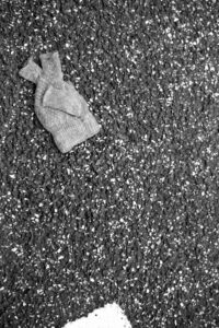
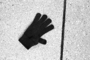
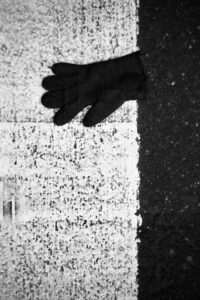
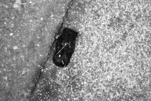
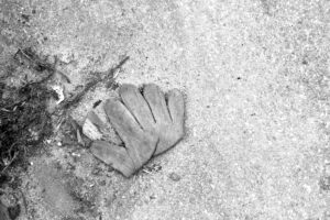
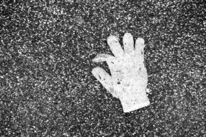
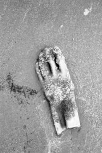
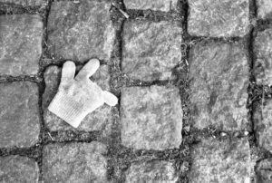
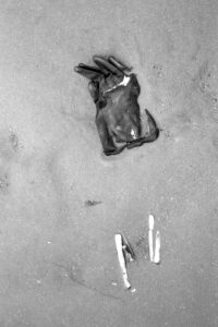
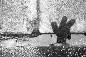
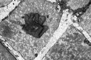
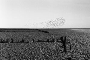
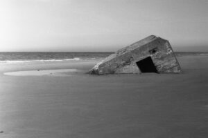
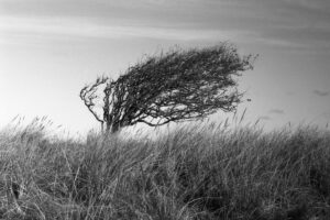
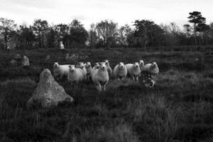
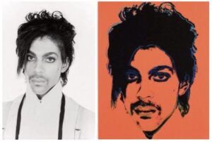


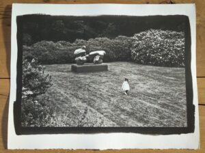
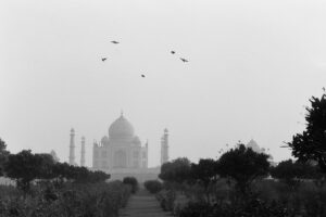
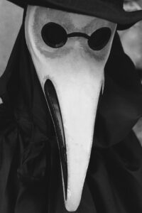
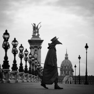
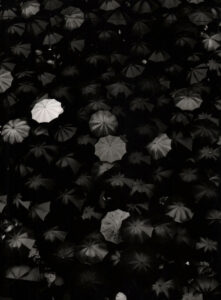
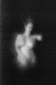
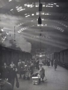
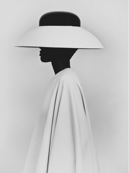
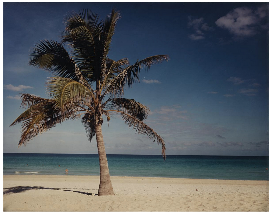
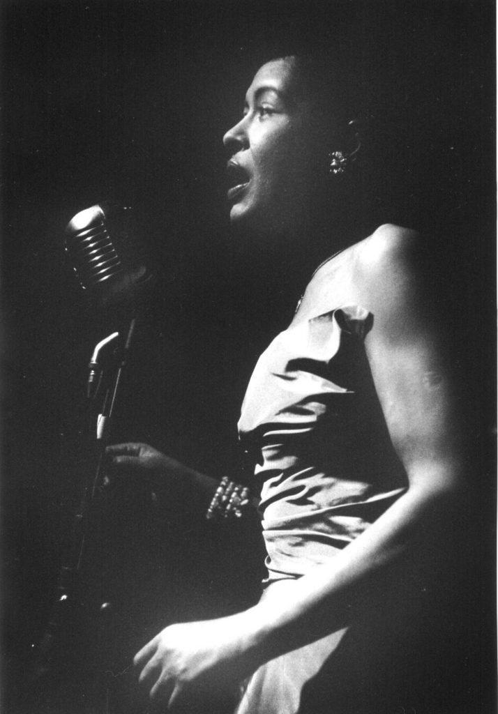
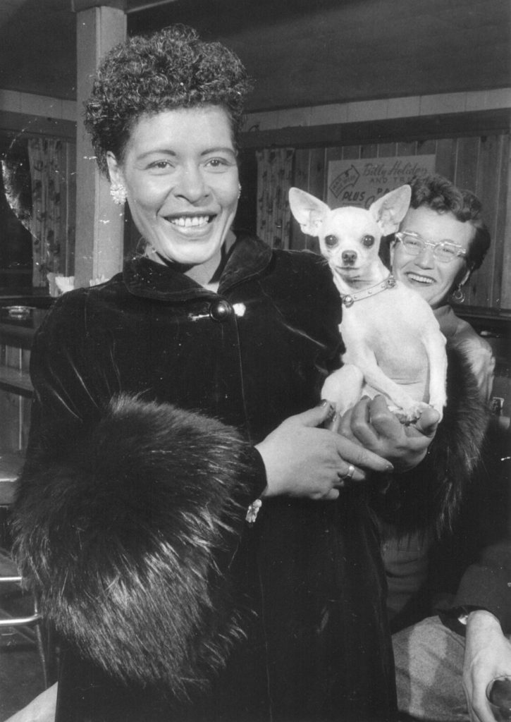
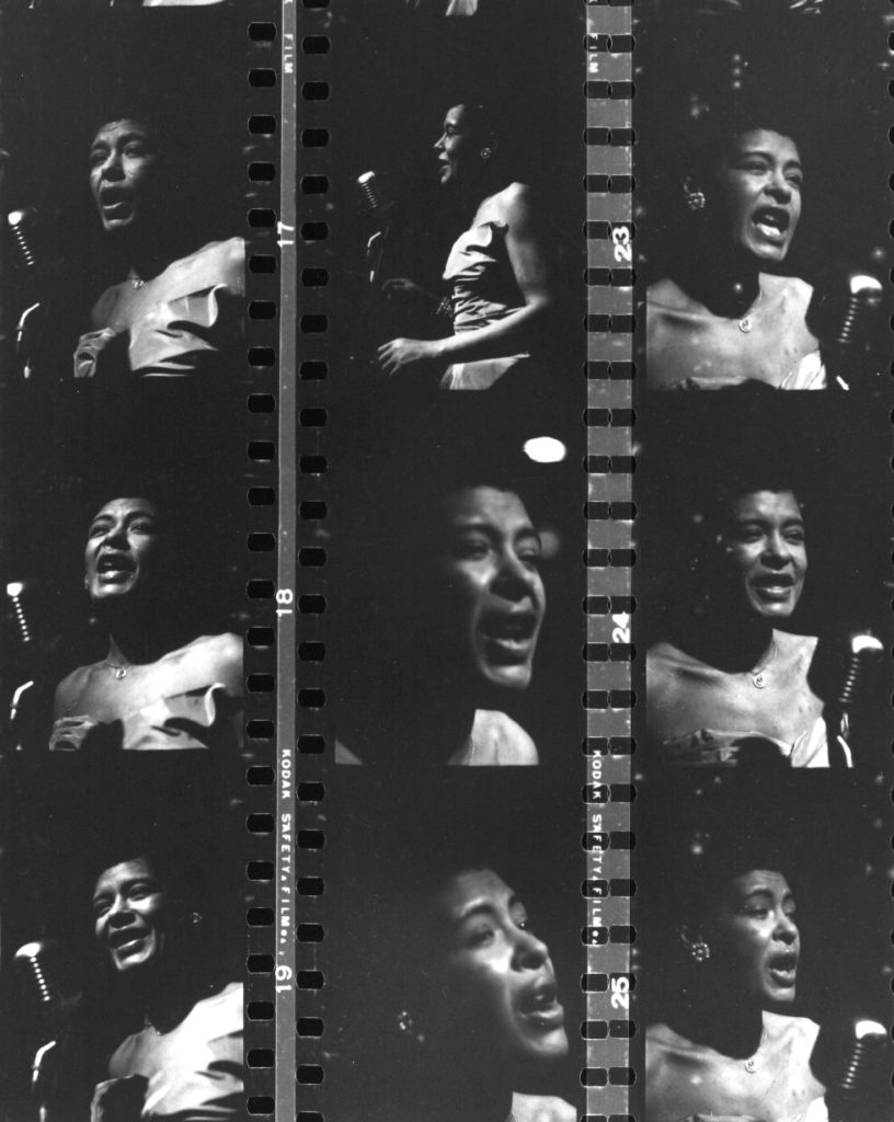
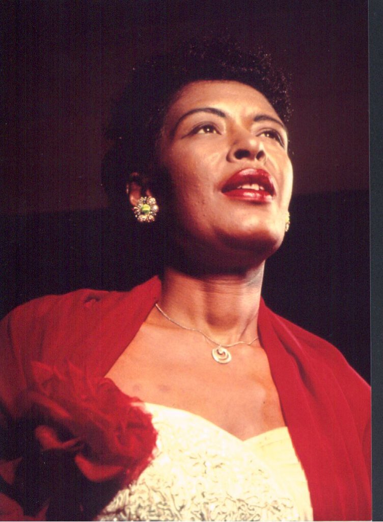
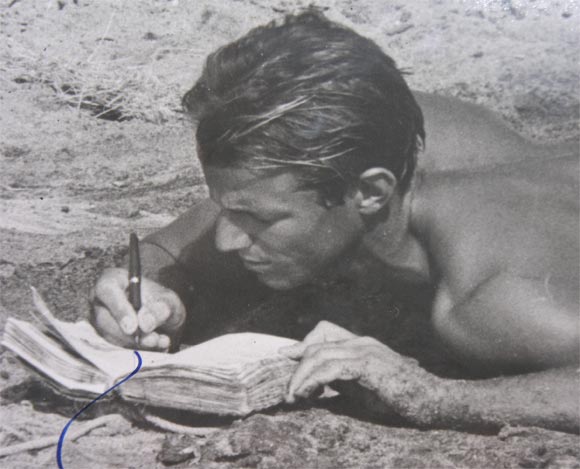
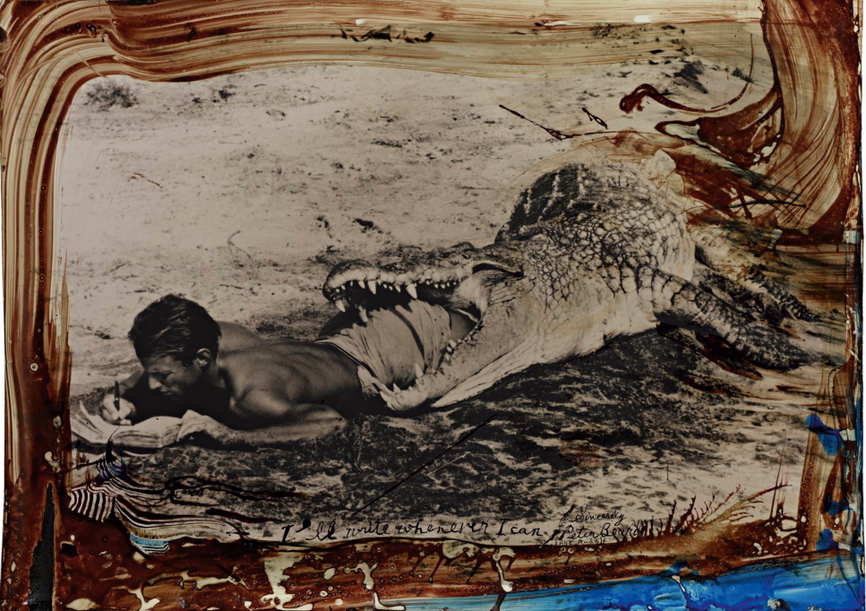
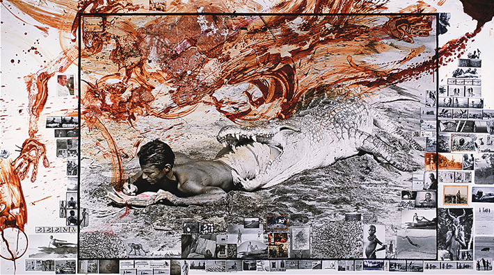
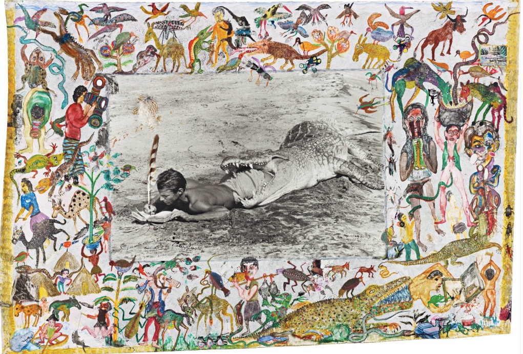
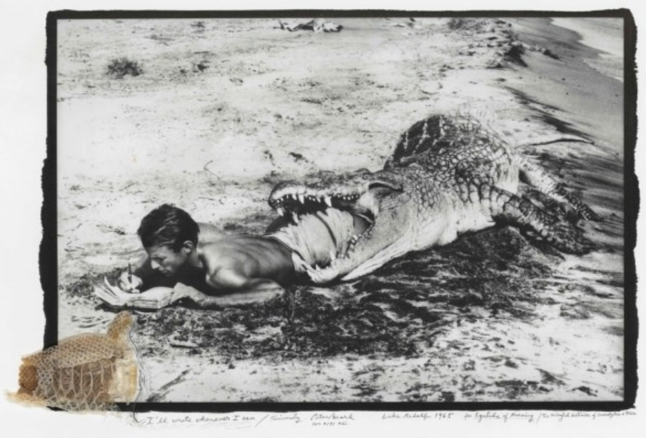
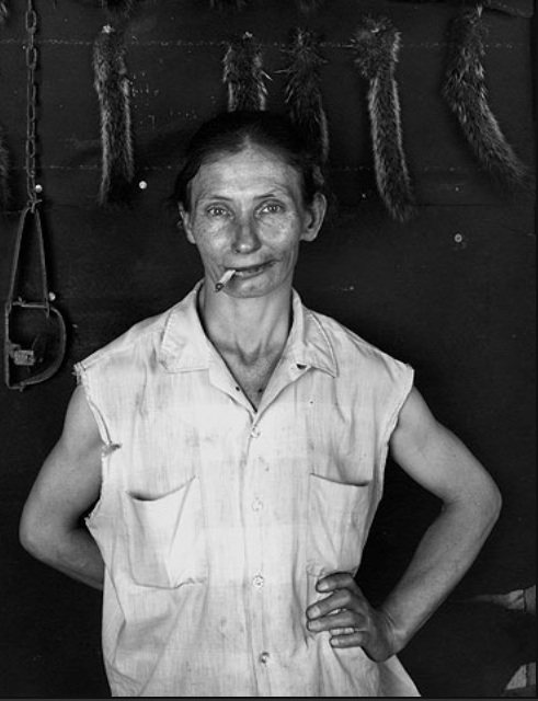
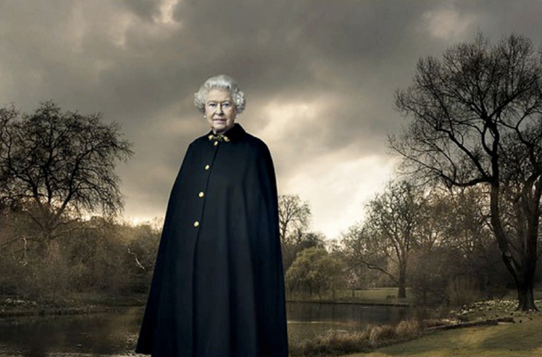
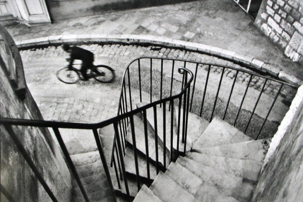


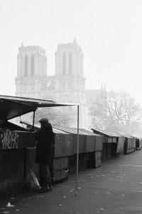

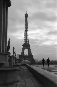

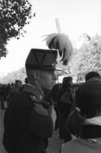
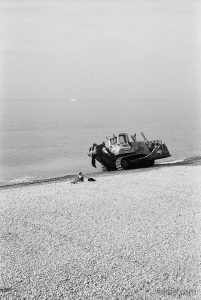
 Edward J. Steichen – Rodin
 Gertrude Kaesebier – le dejeuner sur l’herbe?