The Danger of the Artist’s Statement

I recently purchased a photograph by a young Greek photographer.  I really enjoyed the feel of the image and the mystery that he has achieved with what could either be simple analogue tools, or some heavy computer intervention.  I prefer to think it is the first!  Of course.

I did what I always do, ignoring the context entirely.  The photograph was in a selection by the photographer that showed up this morning in one of my photography newsletters.  I figure that given all the shows and exhibitions around the world that are suffering either from COVID-closure, or a very restricted audiences, that we owe it to the photography community to buy a piece here and there to keep everyone committed to their art in bread and water, if not steak and Chateau Lafite.

I may have made the purchase as a reaction to the news that for the first time in 20 years, I will not be attending Paris Photo, which was cancelled yesterday.   The Paris Photo organizers hung on much longer than they should.  My gallery friends said months ago that they would not take booths this year… that 50% of sales go to the United States, and given what is going on in the US, it would be unlikely that many, or any Americans would attend, or even be allowed to attend, etc.  Long story short; Paris Photo finally bowed to the increasing number of COVID cases in France and elsewhere, as well the recently imposed restrictions on the size of crowds.

Feeling my growing depression over not going Paris Photo, I was so pleased to see something I liked in one of my newsletters and jumped on the chance to acquire a super photograph.

But, I digress… the reason for today’s blog entry is for me to perhaps suggest that there is great danger in the written word.  Personally, I don’t like artist’s statements, nor do I like curator’s commentary most of the time.  I like to let a photograph speak to me on it’s own terms and having that impression help form my interpretation of what is happening in the image, and my response to it. 

The danger to me comes when the artist sets out on some kind of verbose rampage and completely messes with my feeling, or interpretation of a work.  There is a degree of risk here.  Because, if I see it, love it and want it, but then read that my reaction to the image is completely off side, relative to what the photographer says she, or he intended, one of two things happen:  Worst case; I turn around, shake my head and walk away, or best case; I buy it anyway and spend the rest of my life trying to dispel from my mind the statement made by the artist.

Karabelas, Nasos – Woman #101

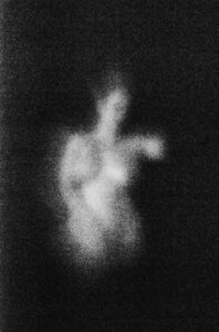
The image here I love.  Beautifully executed, the image allows my imagination to go wonder, while the other half of my brain goes on to an internal dialogue about the technical aspects of the execution – utterly hoping that it is not all about software.

Here is a portion of the artist’s statement:

“…..  Each photo is an entity, which includes a certain mental condition. So, we are dealing with a variety of emotional loads within a world that is equally ambiguous with ours. The forms obtain a dreamlike dimension. Sometimes you can not easily understand their contours. Τhe exploration of the forms inside the photographs gives us the opportunity to discover the various aspects of our psychosynthesis.

In this particular case, I went ahead and purchased the photograph, because I really think it is a great photograph, but it was close.  I almost walked away.

The lesson here is to not overthink the work, or at least let it speak for itself, because paraphrasing one of my favorite Japanese photographers: If I could write, I would not be a photographer.

Harbel

The Mystery of the Crying Frenchman


For many years, I have looked for a print of the famous war photograph that shows the profound sadness and despair among Frenchmen, not loyal to the Vichy puppet government.  I finally found a press print. 

Anonymous – The Weeping Frenchman

Like so many other mystery photographs, this one is attributed to an anonymous photographer. Some sources I found, say the Associated Press. But always one for a good mystery, I started looking a little harder.

There is newsreel footage from a solemn time in Marseille (not Paris, as has been assumed by many) where a parade of French Regimental Banners left French soil for safe-keeping in Algeria, so as not to fall into the hands of the advancing German Army. The banners left France onboard ship, returning only with the Invasion by Allied Forces towards the end of the war.  I assume this would have been in the fall of 1939.
I have always wondered why no photographer ever took credit.  Why no print was ever made that didn’t seem a little muddy.  As though the only way to print this image was from a not-so-great inter-negative.  Not an original negative.  Not a first-generation print.  I always thought the image was so good that the quality was perhaps secondary. Perhaps the image was so important that I should look for it even if it wasn’t in perfect condition.

But then, the great reveal………  I found this old newsreel on Youtube of all places.  The link is here, posted by someone called “All is History”:

Here is a screen capture at 29 seconds:


There is no way that a photographer would have been able to take a photograph at the exact same angle, from the exact same place, at the exact moment.  In other words, the credit for this incredibly important image goes not to a photographer, but to an unknown cameraman, covering the news.  Part of a newsreel for everyone to see in the theaters of what little remained of a free Europe, before the feature film that would follow.

It is a mystery that has probably been solved.  It is perhaps a little sad, as we now know that in fact there is no anonymous photographer, but rather a cameraman, who was in the right place at the right time.  Of course, now the cameraman is elusive, but that is a mystery for another day.

The ‘photograph’ of the crying Frenchman has become legend.  It has become the embodiment of so much pain and suffering by the occupied people of France.  It has been claimed as showing a heart-broken spectator to the German army marching down the Champs Elysee.  But the footage does not lie.  The voice-over tells the story: 

“Gone is the Republic of France.  Gone is free speech and a free representative government.  Gone is liberty, equality, fraternity.  With their ears they listen, but their minds and their hearts are down by the Mediterranean, where the colours of the regiments are being taken to Africa, out of the Nazi grasp.  The people weep, as their glory departs, but they don’t as yet know that France has hope, a rallying point.  Charles de Gaulle, a soldier in the great tradition of France is not surrendering. He will continue to fight, gathering about him loyal Frenchmen from all over the World, who become the free French army.  The fighting French.  Yes, the people weep as they watch their colours go, not knowing that two years later these same flags would be unfurled in North Africa.”

Clearly, the footage is a mix of film from different locations and different times.  The voice-over must have been added later. The mix of Charles de Gaulle footage and the footage of the banners leaving Marseille are not contemporary. However, the footage of the crowds and the banners leaving, I believe, are indeed from the same reel and as such, I can see nothing that would dispute either the origin of the photograph, or the ‘photographer’, the unknown cameraman.

Let me close by saying that I love the photograph.  I don’t care that it is a single frame from a few feet of film.  It is I believe a symbol.  A moment in time.  What a photograph can sometimes do when it is very successful.  It stands as a testament. 

It is France at a time of deep sorrow, captured forever in a photograph.  A single frame.

Harbel

Photography – The Emergence

Having spent a few days in the United Kingdom, I came away both troubled and encouraged. I got to photograph one of my bucket list locations; Castle Howard. Located just north of York, it is a castle, anchored in my mind from the time the lavish production of Evelyn Waugh’s Brideshead Revisited with Jeremy Irons and Anthony Andrews aired in 1981.   Strawberries and Champagne….., need I say more. I had the grounds of Castle Howard all to myself for a full hour before the buses arrived, it was truly a magical time, despite the drizzle.

Having carried on to the great colleges of Cambridge, it was with some sadness that I saw galleries lining King’s Parade and Trinity Street, opposite King’s-, Trinity- and St. John’s colleges. None of them, not a single one offered photography. There was jewelry by local artists, sculpture in various media and paintings, even a couple of hyper-realist painting that could have passed for colour photographs. I say this because there was a time, when I thought that photography had rightfully taken its place along with the other fine arts. But alas, it seems there is a long way to go before the vox populi start to share in the enjoyment of a great photograph.

I figured that with design magazines and the occasional great photography museum show, it would be a matter of only a short time before everyone would want a great photographic image on their wall.

What does it all mean? Well, the half-full view would be that it is a great time to buy a photograph, the half-empty view that photography will never catch up and take it’s rightful place among the fine arts. But economics will tell you that it has been one of the greatest areas of investment over the past 20+ years, and there is no end in sight. When you compare what you can get for your money in photography versus in painting or sculpture, the choice is simple.

At the end of the day, you read this because you area interested in photography, and as such, I am preaching to the converted. However, there is no doubt in my mind that even compared to the stock market, photography is a great place to be.   Much better to look at than a stock certificate, or a bond.

I don’t think I am wrong in saying that a lot of museums around the world are waking up to the fact that they forgot to collect photography and should be adding to their collections. Much great work is being purchased by museums and institutional collectors, driving up prices in the auction market. Museums rarely speculate, they want the sure thing, unless it is specific to their region, country or national identity, but they do want a collection that reflects the masters of the medium. You as the private collector have an opportunity to help set the market and identify great photographers.

It is a great time to be a collector and a great time to be a photographer!

Harbel

In Support of the Vintage Photograph

In continuation of my previous entry on the Vintage Photograph, here is Part II:

The case for giving special consideration to the vintage print is straightforward and logical. Consider that until only a few years ago, there were very, very few collectors and no photography market to speak of.  Until very recently there was no reason for a photographer to print multiple prints of the same image? He might print a couple to swap or give to close friends, fellow photographers, or on occasion send out in lieu of a Christmas card.

Following the argument that the vintage photograph is as close to the original vision of the photographer, the vintage photograph is the panacea of collecting.  Add to that the fact that there was no photography market until very recently, there are no more than a small handful of any given photograph.  More often than not, vintage photographs will be small in size.  They were easy to send, or give away, so the most likely size of a vintage photograph is 8″ x 10″ or smaller.  This is the real deal.

The source for vintage material is often the photographer directly. But just as often the source is wherever a photographer might have sold his work, a commission for a magazine, a company, or a person sitting for a portrait.

It is not that long ago that a career photographer would simply send over a print with the original negative to whomever gave the assignment, and that would be it, as far as the photographer was concerned. As a result, many now-defunct publications and newspapers had filing cabinets full of original prints and negatives sitting in a dark basement or storage room.  Some photographs are lost forever, known only from the magazine or newspaper where they appeared.  Some were picked from the dumpsters by what now must be seen as very wise and foresightful people. Some were sold in bulk to junk dealers, antiquarians, or antique stores. Wherever they went, they never seemed to make it back to the photographer.  These are the true vintage photographs.

Some large publications – which shall remain nameless – tried to sell photographs they had in their archives. With the market for photography going up dramatically over the past two or three decades, I am sure you can imagine the CFO getting wind of the goldmine sitting in the old filing cabinets in the basement. However, seller beware; a number of publications have been sued successfully by photographers for not returning material to them after use. So far, living artists have been more successful than estates in winning these types of cases, and I am sure many more battles will be fought before it finds an equilibrium.

Giving strength to the photographers’ claim to their rightful property is the famous Magnum Photos cooperative.  The cooperative was founded by some of the greatest photographers of the 20th century, and changed how photography is treated by the media. As a first, Magnum photographers retained the rights to a given image and licensed the media to a single use of a photograph by way of a contract, forever changing the value of the photograph and limiting its use. Magnum changed the balance of power between the publication and the photographer.

But back to the case for the Vintage Photograph….. The price of a vintage print by Edward Weston can go into the mid-six-figures, whereas the prints from the same negative printed by his son Cole will be in the four- or low-five-figure range. Edward Weston watched Cole print, he approved the prints, however to the purist, they are just not the same. There is no contest.

If you find a good image in a garage sale, flea market or antique store, give it a good look, see if it is stamped and maybe even has a scribble on the back, and you may have a small or even a large jewel for your collection. Always look for vintage first. It is the photograph in its purest form.

Harbel


The Vintage Print – What is it? – Why should I care?

The much abused and maligned term Vintage Print is perhaps the most hotly debated attribution of all. But what does it mean? And perhaps more importantly, why does it matter?

My definition, which I think is probably accepted by most dealers and galleries is a photograph printed by the artist within 12 months of the photograph having been taken and the film developed.

But why does it matter? The argument goes along the following lines: A photographer makes a photograph, develops the film and makes a print, all immediately following each other without any real lapse of time. The hard core collector will argue that this represents the most authentic version of the photograph, as it is perhaps the best representation of what the photographer had in mind when the shutter was pressed and the image made.

The debate about the significance of vintage the vintage photograph will go on forever, but it is very much part of the vocabulary among collectors and dealers. Two collectors chatting will refer to a photograph as a ‘vintage Brassai’, as opposed to a ‘nice Brassai’ or a ‘great Brassai.’ Collectors value the term ‘vintage’ as part of their code and use it frequently, sometimes loosely. Think of it as a type of insider lingo that confirms that you know of which you speak.

The generally accepted rule seems to be as I have stated above, but what if a photograph is printed within two years of being taken, or maybe three? History has a way of compressing itself.

In historical terms, the Hundred Years War between France and Germany was actually not a war that lasted 100 years, but a series of wars that in combination took about a hundred years. In the same way, when our descendants sit in the classroom in a couple of hundred years’ time, the First World War and the Second World War will have become simply the World War.

Using the same logic, the definition of what is a vintage photograph becomes more fluid in the eyes of some dealers and collectors. If a photograph was taken in March of 1930, developed in March of 1930 and printed in April of 1930, everyone agrees that it is a vintage photograph. If it was taken in 1930, developed in 1930 and printed in 1933, the definition no longer applies, but the further we get away from the 1930s, the more compressed time becomes and the more tempting it is to regard the 1933 photograph as being ‘close enough’ to vintage that it enters the gray area that is termed ‘vintage’ by some.

Of course, another factor in dating photographs is that barely any photograph is stamped with a date, or dated by hand. As such, a lot of decisions become somewhat subjective and the materials and the visual inspection by experts starts to determine ‘vintage’ versus ‘printed later.’

Experts use a number of variables to judge whether they will call a photograph vintage or not. Provenance is of course a major factor. Provenance, as you will recall from my previous blog, is when you can prove by documentation the history of the photograph. This includes letters, receipts and other documents that show where and when you acquired the photograph and where it was prior to that. In the case of a weak provenance, other factors will help determine the classification of a given photograph.

In 20th century photography, the determination of ‘vintage’ versus ‘printed later’ can hinge on things like the paper the photograph is printed on and the appearance of a photograph in comparison to other work from the time by the same photographer, already known to be vintage.

It is a generally accepted fact that up to 75 per cent of the world’s Rembrandts are by other artists, contemporary to Rembrandt. There is a society that spends all its time and energy authenticating paintings by the Dutch master. On a much smaller scale, there are connoisseurs of photography that specialize and are regarded as experts on specific periods in photography, or specific photographers. In the case of Rembrandt, the sciences determine the age of the canvas, the pigments used, the solvents, the varnishes used, etc. X-rays will determine underpainting, sketches and other invisible secrets. But science can only go so far. The Rembrandt expert will look at brushstrokes, the particular way in which an eye is painted or a shadow laid down and from experience will look for all the secret identifiers that determine whether a work is by Rembrandt or one of his associates, or even someone completely outside the circle of the master.

In photography determination of authenticity and age is similar. Certain photographic papers were only made for a short time and analysis of the fibres in a photograph can often determine the age of a print within a range of a few years. In the same way as the Rembrandt expert looks for tell-tale signature traits of the master, the expert on a given photographer looks for specific things in a photograph.

A photographer will during a lifetime likely change the way he or she prints, but during a relatively short period, the printing method and appearance of the finished print is likely to be fairly consistent. The expert will look at similar prints in various collections, private and public, and will through comparison and experience lend his name and reputation to whether a particular print is vintage or not. Of course this is not an exact science, but the collectors give certain experts a lot of respect, and their say-so is good enough for most to accept that a work is indeed vintage.

There are some interesting variations on vintage. What, for instance do you do with a photographer who does not print his or her own work? But that is for another blog.

Harbel


The Photograph – Art Versus Craft

The Photograph – Art Versus Craft

The case for a photograph being art, or craft has been argued at great length by critics, thinkers and collectors. Of course you will never get an argument from me or any other photographer, or collector. But you may still get an argument from the high-brow collector of painting and sculpture.

The crux of the argument usually centers around mechanical intervention (the camera) reducing the value of the photograph when compared to the other fine arts. I tend to take a view that is somewhat different.

The camera is an instrument that fixes an image to a piece of film or in a data file. The creation of this image is a subjective process. The photographer composes his or her photograph, decides what goes inside the frame and what stays out. This is no different than an artist sitting with a pencil sketching a scene and deciding what to include and what not to include. In fact it could be argued that the ability of the sketch artist to omit elements, such as street signs, power lines, or maybe a red Toyota, is more subjective than the photographer. The photographer presses the button on the camera and if it is in the frame area, it will show up in the picture, or at least it did until digital photography and Photoshop.

For me the camera is no more than the brush to the painter, or the hammer and chisel to the sculptor. I have deliberately stripped down my equipment to the minimum. I don’t use filters, tripods, or other tools. I don’t own a flash. I use the same film all the time, one speed, analog, one lens and one camera body. I print in silver gelatin, directly from the negative. No digital manipulation at all. I subscribe to Berengo Gardin’s statement of ‘Vera Fotografia’ (see my website and previous blogs on this). For me, my stripped down camera is my simple tool to compose and capture something that I see in front of me.

As an analog photographer I make my photograph, develop the negative and print my image. The painter, on the other hand, can add and take away at will. I ask you, which artist is more true to his or her original idea?

As Peter Adams said:  “A great camera can’t make a great photograph, anymore than a great typewriter can write a great novel”.  I couldn’t have said it better myself.

Harbel,
Madrid

See more on my website: harbel.com

Digital Photographs: Digital Media, Digigraph, Compugraph or Manipugraph?

Most of my friends and fellow analog photographers (those that use film and manually develop the film and print by hand in a darkroom) have been speculating, whether the reason a digitally modified image is sold as a photograph, as opposed to digital art (a digigraph? compugraph? manipugraph?) is simply fear.  The fear of facing a collector with the reality that the ‘photograph’ they have just sold is more computer than photograph. Fear….

I propose that what drives this fear is the vanity of the art market.  Let me explain…… Many looking to buy art – more and more often with one eye on investment value – have dived into photography.  Art advisors and many art-value indexes suggest that photography may be the place to invest, better than almost any other area of collecting.

The art market has in many ways been reduced to just another index ruled by nouveaux riches collectors shaping it with large amounts of money, which otherwise would sit idly in the bank making little or no interest.  Massive bonuses prop up an overheated art market, reaching levels that are difficult even to contemplate.

If these new collectors had to think in terms of what a photograph represents, versus a work of art created from one or more computer files, manipulated by software programs, and printed by a machine, would he or she still pay the prices that photography commands?

Can a contemporary computer manipulated image by an artist that has barely arrived on the scene reasonably command the same amount of money as a hand printed silver gelatin photograph by Manuel Alvarez Bravo, Andre Kertesz, Harry Callahan or Henri Cartier-Bresson?

Perhaps it is time to embrace the digigraph, or the compugraph?  Let the family tree of art sprout a new branch.  A new discipline that can stand on its own, command its own attention, on its own terms.

Let the traditional darkroom photograph be.  Stop the confusion.  Stop the insanity.

Harbel,
Donostia

See more on my website: harbel.com

Colour Photographs and the Collector – it is all about trust!

It used to be simple; photographs had a colour palette that went from black through the grays to white. Variations, such as the albumen photograph ranged from dark brown to light cream, and cyano-types went from an almost black marine blue to the palest of blue/white. However, throughout the history of the medium, most photographs were what we would call black and white.

Experimentation with colour started almost as early as photographs were stabilized on paper or metal. In the beginning, colour was simply applied with a brush to the black and white image. Early portraits got a healthy complexion with pink lips and rouged cheeks at the hands of the skilled touch-up artist. Later, a variety of methods were developed to show colour in photographs.

Unfortunately, most colour methods have not stood up well to the passing of time. Most have faded, colour-shifted, so that faces have turned from healthy to very sickly, and clothes, grass and trees turned to colours that are brown and muddy. Most older, colour photographs have simply lost their brightness and sharpness. Just have a look at your own family albums…. they look a little muddy and have that ‘old’ look to them, right?

I know of only two methods that are truly stable. One, the dye-transfer process, is no longer used because it became too expensive. Some great photographs were made using this method, but sadly no more. Ernest Hass was maybe the most consistent user of this technology. The second, is the Fresson process. Fresson printing a multi-step laying down of individual colour layers and is still done today at a single family owned lab in France. The closely guarded secret process has not changed in nearly a century. Sheila Metzner is a strong proponent of this printing method, as is the interesting French photographer Bernard Plossu.

Every so many months new inks are developed for new generations of digital printers, new and improved papers are developed. For many years, dating back to the 1940s, Kodak and Fuji went through many, many generations of ‘new and improved’, as have the print, ink and paper manufacturers that produce both the high-end commercial jobs, and the home-use printer you have sitting on the corner of your desk. But is it stable?

A 740 page whopper of a book, still regarded as something of a bible in colour photography, “The Permanence and Care of Colour Photographs” by Henry Wilhelm, is now more than 20 years old. But, it is still often referred to by those that are interested in colour photography. The book dives deep into 20 years of extensive research into the colour medium in photography and how it ages.

Published in 1993, this book describes in great detail all that has gone wrong over the years in colour photography, promises that were broken by suppliers of film and paper, only to be renewed with the next generation of printing technology. Perhaps a little surprising, Wilhelm, ever the optimist, too concludes that nirvana is imminent with new processes being proposed and new in-organic inks arriving on the scene that will change everything.

I am not sure what to believe. I have 5 colour photographs in my collection; One Fresson, two dye-transfer prints, two prints by the Saul Leiter of Canada, Fred Herzog. The latter two are modern digital prints. Don’t ask me what inks are used, or even what paper, but I have a document from the gallery that guarantees the images. The photographer, Fred Herzog is more than 90 years old and the gallery almost acts for him, so I am comfortable with my ability to replace my two images.

But, what if you are considering buying a terrific colour photograph? If it feels right, looks right and meets all the critical considerations that are important to you, as a collector, the obvious answer is to recommend that you buy the photograph. Love it. Enjoy it, but be aware…

Photography collectors have long suffered from chromophobia – the fear of colour. Many have seen fabulous work simply fade, colour shift, or virtually disappear in front of their eyes and are understandably cautious. But that may be the past. You, the modern day collector with no baggage, no prior catastrophes, may fell ready to take on the endless possibilities that colour represents.

Personally, I would make sure that when you buy colour work, the artist (even if you buy through a gallery) guarantees the work and will offer nothing less than a full refund or a replacement print, in the event of a small or epic failure. And do get this in writing signed by the artist, in the event the gallery where you bought the work should fall on hard times and disappear.

I only make black and white photographs, so thankfully have much less to worry about!

Harbel,
Bordeaux

See more on my website: harbel.com

The Photograph versus other Fine Art – Everyone is a Critic

A few years ago, I was sitting on a plane en route to Madrid. I was reading what was then the International Herald Tribune. I tore out a review of a photography exhibition taking place at the time. I have had this review burning a hole in my desk drawer and it is time to discuss! Obviously, the review was written by an art critic that was not an expert on photography, as you will see from the quote below:

“The issue of whether photography can be art is an old one that dates back to the origins of the activity itself. Ever since the pictorialist photographers of the 1870s attempted to compete with painters, borrowing from their compositions and subject matter, photographers have never ceased measuring their own work against that of plastic artists. They have come up with chemical and lighting tricks, they have used collage and montages, superpositions and hybrids….”, etc., etc.

It is quite clear that some critics until this day consider the plastic arts — that would be your painting, sculpture, and so forth — far superior. To them photography is beneath them and more of a craft or a technical skill. This may be in part because not all university art history degrees incorporate photography? Mine did, but you could easily have avoided photography all together, as all the photography courses were electives and the introductory Art History courses mentioned virtually no photography or photographers at all. As such, the critic above is not equipped to have an opinion, other than one based in personal taste, rather than foundational knowledge (it is common knowledge, and generally agreed, among photography art historians that Pictorialist photography did not start until 1885 or 1889, and was very dead by 1920).

But, all this aside, what is it that makes the critic frown upon the photographer and his work? Is it because it involves mechanical equipment? The chemicals in the processing? The ability to make multiple images? Each of these activities can be found in a number of the plastic arts, yet that does not seem to matter. A sculptor’s foundry, a painter’s lithographs, Andy Warhol’s silkscreens, all have some form of tool kit, along with a base material, be it stone, metal, canvas or paper. So why is photography treated differently?

Perhaps the best thing is to ignore the critics all together. Or listen to Jean-Michel Basquiat, who said: “I don’t listen to what art critics say. I don’t know anybody who needs a critic to find out what art is.”

Harbel,
San Sebastian

See more on my website: harbel.com

What Makes a Great Photograph?

What makes a great photograph?  It is very, very personal.  Books have been written, conferences held….  For me, I have learned that it can be a moving definition. It can change with time,  but it is worthwhile to have a look at the process of becoming great.

I am going to turn to the French philosopher Roland Barthes. He wrote a book called “Camera Lucida.” It is a small book with a long philosophical discussion of the photograph. Barthes coins two terms that are worth remembering: ‘studium’ and ‘punktum.’

Pictures or images with studium are images that you notice. Think of all the photographs you are exposed to every day, ads on your phone, computer, television, billboards, photographs in newspapers, magazines, and so forth. Now, of all these impressions, which some now count as more than 3,000-5,000 a day, there is maybe one that you really notice. That image has studium.

A photograph with studium has the ability to capture your attention. It draws you in. It may play on your heart-strings, it may remind you of something, it may fill you with guilt, play with your mind. You may not like it; you may think it is horrible. Image creators know what works and what doesn’t (most of the time). Think babies, puppies, humour, sex, and so on. Studium you notice.

Punktum is when one of your studium images stays with you over time. These are quite rare. It is an image that comes back to you under certain circumstances, given certain stimuli. 

You can probably think of images that you saw today that had studium, but probably not the ones from yesterday or last week. More importantly, you can likely think of images that have stayed with you and surfaced over and over again in your mind’s eye. They have punktum.

Let me give you some universal examples:

The dead migrant child on the beach in Greece; the Vietnam War photograph of the young girl running naked towards the camera following a napalm attack; the first man on the moon; the plumes of smoke on 9/11, etc. These are universal. I don’t have to show you any of these photographs; you have them stored in your mind, in full detail.

In addition to the universal images, there are punktum images that are particular to you. You know what they are. You may not be able to command them to appear before your inner eye, but given the right stimuli, they will show up, time and again.

Among my personal punktum images, none are news photographs.  This may be because I look for a particular skill in the photographer.  In the simplicity or minimalism of the photographs, which has a particular appeal to me.  No accounting for personal taste. 

Both my examples are of a single figure, a portrait of sorts.  The Horst P. Horst Mainbocher Corset was one of the first photographs I scraped together enough money to purchase.  Made in 1939, it represents to me a daring, superbly lit figure from a time in photography, which was starting to move from recording fact, through early experimentation and surrealism to the mainstream.  Made by the master of studio lighting, Horst, the photograph represents a very sensual rear-view of a corseted woman, with the ribbon loose and laying across a marble surface and in part hanging over the edge, where it catches the light beautifully.  Revolutionary for the time, the model is photographed from behind and skirting, if not crossing, the line of what was permissible in print media at the time.  An incredible image, which has remained with me since I first saw it in an art history class.  I look at it every day and continue to be in awe.

My second punktum image, is one that I call Boots.  I am not sure what the proper title is.  The photograph by Chris Killip, I first saw at the Rose Gallery in Los Angeles.  It hit me as being an incredibly composed and lit photograph, but emotionally charged with what I believe is anguish and maybe desperation.  To me, what hits home are the disproportionately big boots.  I remember as a kid getting a shirt and jacket that were ‘to grow into’.  These boots look like they are several sizes too big, maybe from a military surplus store.  It is a photograph of desperation.  I have seen many photographs of people that are down and out, but this boy, or young man is just too young to be this desperate.  Every time I look at this photograph, my toes tighten in my shoes, I get goose bumps.  I have had it hanging on my wall for several years now, and it still feels like a punch in the stomach every time I look at it.  Punktum.

To address the idea that your personal punktum may change over time, I can say that Diane Arbus’ Boy with a Toy Hand Granade was the photograph that made me change my focus at university to Photography from Renaissance Art.  The photograph had huge punktum for me, but has since lost its charge.  Why?  I saw the contact sheet from the shoot, and later read an interview with the boy in the photograph.  In the Arbus photograph the boy looks like he is a person with a mental disability, which is very consistent with the outsiders that appear again and again in Arbus’ work.  However, on the contact sheet, the boy looks like any other little boy playing in the park, and I do not like the fact that the photograph that Arbus selected from the roll, somehow misrepresents what was in front of her.  It no longer resonates.  It is like the Robert Doisneau photograph of the couple kissing at the Hotel de Ville in Paris, which I loved as the epitome of Parisian street photography, until I learned that it was staged with two actors…., but that is another story.

I must have seen millions of photographs in my time as a photographer and collector, and if you asked me to draw up a list of photographs that had punktum for me, I might get to 25 or 30. Some of these I have on my wall.  Some I would dearly love to hang on my wall. Some I will never have, because they are either sitting in a museum and not available on the open market, or I simply cannot afford them. Others, despite their punktum, I don’t want. They might be gruesome, or too difficult to look at and live with. I am fortunate to have a few punktum images in my collection that I love and would never part with. This is the power of punktum

Harbel,
Copenhagen

See more on my website: harbel.com

Images are borrowed from the web and are for illustration purposes only, no rights owned or implied.


In the Company of Greatness The Sir Elton John Collection at the Tate Modern

The collection of Sir Elton John counts more than 8000 photographs according to a recent interview. What I saw at the Tate Modern in London was nothing short of spectacular. A no fuss exhibition with nothing more than a short stencil intro to each room and a 4:30 minute video interview in a side-room with the man himself. The photographs mostly hung side-by-side on white walls at eye level. The light good and the ability to get in close, unencumbered.

I have traveled far and wide and have seen many, many exhibitions of wonderful photography, but rarely as many superb quality images in one place. When each year I attend exhibitions, I often think of the number of ‘fillers’ versus ‘keepers’. Elton John’s photographs selected for the exhibition at the Tate Modern, are all superb, all vintage and in near mint condition. 160 photographs, each one perfect. No fillers.

One thing that I found particularly gratifying with this collection, which spans from roughly 1920 to 1950, is the size of the photographs. There are no 100 cm x 150 cm (3 foot by 5 foot) images of the Rhine and its banks, or Italian beach scenes. Only small images, often contact printed, that you have to get in close to read, see, admire and truly enjoy.

When you consider the speed of film available in the day these photographs were taken, and the diversity of papers to print on, the success of every photograph in this exhibition is mesmerizing. You stand before a 24 mm x 36 mm contact print of the Underwater Swimmer by Kertesz, your nose mere inches away, and you feel how modernism must have gripped the photographers building on the constructivists’ myriad angles, shooting from above, from below, achieving some of the results that we today mimic and aspire to. The sun’s reflections in the water, the striped swim trunks, the distorted thigh, the elongated limbs of the swimmer cutting through the water…. this is 1917 we are talking about! It is among the greatest and most inspiring photographs of the 20th century.

Move along to the side-by-side pairing of Noire et Blanche by Man Ray printed positive and negative in frames that Sir Elton says normally hang above his bed and would surely kill him, if they should ever fall. Death by Man Ray. There are surely worse ways to go. Each print is perfect on beautiful textured paper, that one can only dream about. The tonal range in these photographs is among the best I have ever seen.

Each photograph in this exhibition is consistently of the highest quality I have seen. There are no fillers here. The photographs are not necessarily expensive or iconic, though most are, of course. The photographs are by many photographers, many well known, but some almost forgotten and deserving of revival. All are framed with flare and you are close enough to see your breath on the thin glass separating you from the masterpiece itself, be it a Man Ray, Andre Kertesz or Emmanuel Sougez. It is truly exceptional company for any aspiring or committed photographer.

And then there are the frames…. I confess that most of my photographs hang framed in plain, boring black or natural wood frames, but there is something here. Why can a great photograph not be framed in a great frame, gilt, hand-carved and heavy. Why not indeed! I had heard lots about the frames in the Sir Elton John collection, but seeing them with my own eyes, I must say, I like it. It works. I will have to go and revisit some photographs on my walls and perhaps buy a new frame or two.

The way forward: Small, intimate photographs of the highest quality. Hand printed and exquisitely framed, each one inviting you to engage at very close range.

Harbel,
London

See more on my website: harbel.com

Discovering New Talented Photographers

Bernard Plossu (born 1945) is not a well-known name in international photography, unless you happen to be French. Or at least, he was not to me. He is an avid traveler and his photography reflects everything from the journey itself, to what he sees when he gets there. I cannot say that I have known his name for long, only that I found him, a couple of years ago, when I was preparing for a great trip to Morocco with a Moroccan born Canadian friend, who took us on a fantastic trip from Essaouira to Fez, via Marrakesh and the southern interior, across the Atlas Mountains, not once, but twice!

Like I always do, when I travel, I take a look at photographers who have shot in the area that I am going to. I had a fair bit of notice, and therefore could look around Paris Photo, which I attend every year. One of the booths had a great photo of a few djellabahs laid over a stone-wall. A beautifully composed black and white photograph, in a size that I can hold and admire – the print was approximately 20 x 30 cm – and was hanging just below eye level. My eyes wondered to the label, which advised that the photographer was Bernard Plossu and that the photograph was taken in Morocco.

During our trip to Morocco, I made a lot of photographs, some with which I am almost entirely satisfied and a few I wish I could do over. It is difficult to make photographs in a place where the population is notoriously unhappy about you pointing a camera at them, so a lot of images, out of necessity, are ill prepared and very spontaneous.

When a people dresses in a characteristic way, it is often easy to go a little ethnographic, which is of course totally acceptable, but there are countless photographs in circulation of ‘types’. Postcards were sold by the millions in the first half of the 20th century, depicting your standard ‘type’ in a hood, face in the shadow, walking along the narrow streets of Fez with his donkey, or the more underground postcards of disrobed girls, often young, who for small change became eternalized in the cannon of poor taste and colonial dominance.

As you walk through the streets of almost every town and city in Morocco, you notice that not much has really changed in 100s of years. Delivery vehicles are often replaced with carts and donkeys, for the simple reason that the streets are very narrow and dark to keep the punishing sun at bay, and the temperatures just a few degrees cooler. In Morocco, it is possible to make photographs, which are entirely timeless. But at the same time you are at great risk of the cliché. So what do you do? Well you might think like Plossu, who seems to have been looking for the things that may be timeless, but would not have been photographed by the conventional travel photographer. Working in black and white, as do I, Plossu has taken great advantage of the bright light and deep shadows that are so intense in sun-baked Morocco. And of course, you then add the shapes that are so foreign to the west, of men and women wearing a cloak with a pointy hood and pointy slippers, which on their own make great shadows and in combination can take on a modernist feel when the composition allows.

One of the great things about Plossu is his eye. He has been very consistent throughout his career. He likes things a little quirky and things that are a little off. He has spent many years building his personal collection of photographs 1200 or 1300 of which have recently been given to the MEP, the French museum for photography, which is one of the great stops in Paris, should one be through here in the future.

The interesting thing about the collection that Plossu has donated is the absolute breadth of photographers and subject matter, from landscapes, to portraits, to close-ups and pure photojournalism. They are mostly small in size, forcing the viewer in tight to have a good look. But most importantly, the 1200+ photographs are by more than 600 different photographers, and all are the result of Plossu being given the work, or him having traded his own work for it. It is a remarkable achievement, to build a large collection of great photography, without spending a cent.

For me, the viewer of the 160, or so photographs from the Plossu gift, that are currently on display in the upper gallery of the MEP, the excitement is around discovering photographers that I have never heard of, and am seeing for the first time.

Each year, we go to galleries far and wide to discover new photographers. Some years, we go for many months without discovering someone new, who fits our particular esthetic. The Plossu show was the first time in a very long time that I saw dozens of names in the credits that I had never heard of. A cornucopia of talent and a joy to behold.

I made a lot of notes and enjoyed several evenings of pleasure scouring the internet looking up photographers to find more of their work.

Sadly, the Plossu gift has no catalogue, or even a list of photographs on display, at least not that I could find, but it does remain in the MEP collection after the exhibition comes down, in a few days. I went twice, and could go again, there was that much to discover. Thank you M. Plossu, you have opened my eyes yet again and I like what I see!

Harbel,
Paris

See more on my website: harbel.com

Humor in Photographs – the final frontier…. or not serious?

For many years, I have sought that elusive moment, when something comes together in a frame that is both funny and serious at the same time. We should not well in other people’s misfortune, nor should we create so much laughter that the entire photograph becomes a joke. It is all about balance. The balance between the serious and the funny, in a well made photograph.

Elliott Erwitt, who in his long career has made many such photographs, and who himself will admit it is difficult, extremely difficult, said: ““Making people laugh is one of the highest achievements you can have. And when you can make them laugh and cry, alternately, like Chaplin does, now that’s the highest of all possible achievements. I don’t know that I aim for it, but I recognize it as the supreme goal.”

There are few, very few that on a consistent basis can make photographs that on the one hand make us stop and think, and on the other draws that elusive smile with the little wrinkles around the eyes. Many photographers have one, or maybe two photograph in their entire body of work that manage to hit both serious and funny at the same time in a fantastic composition, that is well lit, balanced and, as my wife would say; delicious.

Often the well made humorous photograph represents a mere split second, and there is little time to ensure that all the compositional elements are optimal and just the way you want them, have the right lighting and balance between light and shadow. More often than not, it is one of those photographs, were you see it, lift your camera, as you spin round and press the shutter, all the while praying that you have the settings right. It is only in the darkroom, or on the light table that you see what else is in the frame!

Occasionally, you get a subject that stays put long enough that you can actually take your time to move around, get the context and composition right, before you make the photograph. But, alas, this is very, very rare!

Elliott Erwitt and Martin Parr both have a terrific ability to see the quirky side of life, sometimes even creating the opportunity to make a great photograph. I am not much for staging, but I think some people are simply wired to see the bright side of life, the humour in it all! Bless them, because I enjoy their work tremendously and am always on the lookout for the elusive moment, when it all comes together.

If Elliott Erwitt was known for his serious political commentary (of which he has done lots), his documentation of major global events (he has done a lot of those too), and gorgeously composed landscapes, cityscapes, portraits, etc. (of which he has made many), would he be even more famous? Could he command higher prices for his work? I would venture that unfortunately, while humour in a photograph is perhaps the ultimate challenge, it is mostly dismissed as not serious.

Like Erwitt, Martin Parr is a great, great photographer, he has a fantastic eye for colour, composition and has the nerve to get in real close in an anonymous, flaneur kind of way, which is both revealing of the subject, yet like he was never there. His work truly captures a particular moment, an irony, a fraction of a second that can stand for all eternity, as a validation of just how terrible hair was in the 80s, and how class structures are alive and well, with big hats and chipped nail polish.

Will Martin Parr and Elliott Erwitt continue to be seen as some kind of side-show to the more serious main event? I don’t know, but it is cruel, and unfair. The work of the photographer, who manages to consistently find the fun in our daily lives, in an unencumbered way, must surely be cherished.

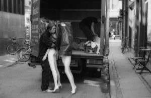
                                                 The dreamer. By Harbel

There will only ever be one Chaplin. 100 years on, we still view the old films with amazement, and a mixture of tears and laughter! Now, if only I could put that in a single frame….

Harbel,
San Sebastian

See more on my website: harbel.com

Gallery visit Milan – Herbert List and more

It is rare that you get to meet someone quite as enthusiastic as Alessia Paladini. She is the Director of the Contrasto Galleria in Milan, where I spent a couple of very engaging hours initially looking at the show currently hanging, which is a great mix of vintage and modern prints by Herbert List. The vintage prints have that something, which sadly no modern paper seems able to give us. There is a warmth and tonal range that we can only dream of today. Not sure if the slower film in the 1950s helped, but at any rate, the small 6×6 inch vintage prints were enough to make a grown man do a second take. We then got into the boxes, where I wanted to see some of the vintage material of one of my great heroes Gianni Berengo Gardin.

Berengo Gardin is a photographer who in addition to making great photographs has has an incredible record of more than 250 book projects, is well into his 80s and is still going strong, having just finished the 2017 calendar for the Italian Police Force. We looked at great photographs, some not much more than postcard size, all the way up to quite large modern prints. The vintage photographs, like the List photographs, had a wonderful feel to them and with only a couple of exceptions were of Italian scenes.

Gardin does not like being referred to as the HCB of Italy, he prefers being compared to his friend Willy Ronis. But if HCB is not the right comparison, then Ronis is not entirely bad company!

If you are ever in Milan, take a look at the shows at Contrasto Galleria, they are in a beautiful gallery space, off the beaten path a bit, but well worth the walk or metro ride. You will not regret it!

And NO, I derive no gain from mentioning or proposing you visit Contrasto. I am merely providing a service announcement for like-minded photographers and collectors!

Harbel,
Milan

See more on my website: harbel.com

Buying Photographs now!

A few years ago, the photographer Cindy Sherman, was written up in The Wall Street Journal as being the best investment in art over the past 25 years.

Cindy Sherman does not sell at photography galleries as a general rule. Her work is sold with contemporary art, i.e. graphic art, painting, sculpture and mixed media work. Andreas Gursky, the German photographer, I understand, refuses to sell his work through photography galleries and sells only through art galleries that carry a multitude of art forms. Why is that?

Meet Mr. Jones, a wealthy investment banker (fictional of course). When Mr. Jones goes to his dealer and gets ready to drop his annual art budget of a couple of million dollars, he does not even give photographs a second thought. That is because the galleries that he would typically frequent do not carry photographs. He will stand in front of a Basquiat graffiti-esque canvas and will study it, look at the $2.5 million price tag and think that this is quite the work and quite the steal. After all, the dealer assures him that Basquiat has sold for much more than that at recent auctions.

If Mr. Jones were to walk down the street to a photography gallery, he would walk in the door and see prices that are usually only a few thousand dollars. Typically, contemporary work is in the low four to five figures. He looks around, goes into doubt-mode and wonders if anything this cheap can possibly be good art. More importantly, at this low price point, it cannot possibly be appropriate for his next dinner party, when he will proudly show off his new Basquiat.

This is precisely why Sherman, Gursky and a handful of others sell in a mixed gallery where their work is displayed side-by-side with painting and sculpture. Going this route the artists have broken the price barrier that photography has imposed on itself.

When I speak with dealers, they acknowledge the problem. Often the photography collector will walk into the gallery with a certain price expectation. After all, he believes he knows what photographs are worth, or at least what he used to be able to buy them for. Beads of sweat emerge when he sees the sticker price of $45,000 for a 30×60-inch photograph by a contemporary ‘rising star’.

If we now go back to our first shopper, Mr. Jones, he goes to his regular dealer and is confronted by a Cindy Sherman hanging next to his Basquiat and the dealer goes on and on about how important the work is and how it will go up in value and how his friends will admire his sublime taste in contemporary art. The dealer will tell him that photography is all the rage.

He doesn’t even blink at the price. It is cheaper than the Basquiat, but it has more conversation value, shows his open mind toward contemporary art – Basquiat is so last year he thinks, while slowly drawing on the Cohiba and sipping his vintage port.

The issue here is one of expectations and of the nature of the photography collectors. No more than 35 years ago you could pick up major photographs by major artists for under $100. Therefore the leap to $50,000 or more is a difficult one. But if you have not grown up in the photography world, or taken it upon yourself to learn a bit of the history, then in comparison to other modern and contemporary art, photography is cheap — dirt cheap.

It will take some time and effort to move off some of the prices that have dominated photography over the years, but it will happen, and when it does, if you started collecting today, you might just be the one with the Cohiba saying, “I told you so!” It is not a matter of if, but when.

Harbel,
London

See more on my website: harbel.com

Visiting with Harry Callahan

I have always thought of Harry Callahan as a cool photographer. Cool in the sense that he is cool in the way we talk about a great garment or a spectacular bit of design. But more important, he is cool in terms of how his images are composed. Unemotional and somehow distant. I don’t remember ever seeing anyone in a Callahan photograph smiling, nor any photographs that display a sense of humour. Some of my friends say it is because he trained as an engineer!

I have looked at Callahan books. Many books. I have seen individual prints in galleries, museums and at exhibitions, and at auction. My first experience with a full show was at La Maison Européenne de la Photographie in Paris. Yesterday.

The show blew me away. By way of background, Callahan received a grant and took a sabbatical. At the encouragement of Steichen, he left his comfort-zone in the northern US and departed for Europe. He spent the majority of this time in Aix-en-Provence, in the south of France. He stayed there for 10 months with his wife and son. The show comprises a selection of the photographs he made during that stay.

All the prints are small in size, the majority of the prints are perhaps 15 cm or 18 cm square (6 or 7 inches) or 16 cm x 24 cm (6 x 9 inches) for the 35mm. This is a size that I truly enjoy. You have to get your nose almost to the glass, often attracting great concern and nasty looks from the custodians, but I digress.

Firstly, the printing is what my wife would call delicious. Callahan printed these images in the early 1990s. His vibrant blacks and great tonal range almost invoke the papers that are sadly long gone. Secondly, there is a patience in these photographs. Each is composed perfectly, with nothing out of place. Perfect balance. Perfect texture. Perfect light.

Callahan has used the narrow streets of the medieval city to great advantage, looking for the sun low on the horizon in winter, causing wonderful intense shadows and capturing, usually a single figure, in the bright rays. This is Ray Metzker, but somehow more real and less about effect and more about the moment.

His landscapes are from the area around the old city, and his architectural photographs are not the elegant villas, chateaux or even the wonderful cathedral, but rather the simple straight lines of houses in the side streets, with no ornamentation, save the odd drainpipe, fitted tightly into each frame.

Eleanor is of course also there, but mostly in double exposures with various landscapes. I am not a big fan of double or multiple exposures, but that does not take away from my overall experience.

You can do this show in a matter of minutes. It is basically a single room. But you can also linger, as I did, and get your nose real close. This is a true master at work.
For those in Paris: Go see the show. For those that are not: Get the book: Harry Callahan: French Archives.

Harbel, Paris

See more on my website: harbel.com

Vera Fotografia – Photography As It Should Be

On the back of each of Gianni Berengo Gardin’s photographs there is a green stamp. It reads: “Vera Fotografia”, his way of saying that what you see in his print is what was in front of him when he made the photograph. It has not been manipulated, changed or enhanced with Photoshop or other digital editing software.

But does a simple green rubber stamp really change anything or prove anything. In an email exchange with the editor of Black and White Magazine in the UK, it was yet again pointed out to me that we photographers have been manipulating our images in the darkroom since the very beginning. We crop, dodge, burn and tone our prints and so, it should be OK for the ‘contemporary’ photographer to use digital tools to achieve a desired outcome.…. Indeed.

I take the point, but perhaps there is a test that we could all employ, that being: Could the photograph in front of you, digital or analog have been made under optimal conditions with a camera and film; printed in a darkroom using an enlarger and standard chemistry? If so, it is worthy of the coveted green stamp: “Vera Fotografia”.

I am not here to criticize, merely to point out that I make photographs with an old leica M6, 100 ASA film, a 50 mm lens. No tripod, filters, flash or reflectors. Just me, my camera and what is in front of me. My negatives are printed full frame, with the black outline of the negative. To me that is: “Vera Fotografia”.

Harbel,
Paris

See more on my website: harbel.com