Should a Museum Be Able to Sell Its Works of Art

In a recent article in the NY Times, Julia Jacobs reports that the self-governed Association of Art Museum Directors voted 54% in favour of allowing the sale from their collections to pay for the preservation of other parts of their collection.   The devil’s advocate might wonder whether this means that the Chief-Curator and the entire curatorial staff can get paid from the proceeds of selling off a few unpopular works of art?  Is this the classic slippery slope?

I can appreciate that the COVID19 pandemic had a major impact on museums and galleries across the world.  With attendance and ticket revenue at zero for a number of months, a great many public museums relied on governments to step up and cover the shortfall.  Loans, grants and one-time funding were part of the short-term life-raft that many institutions needed to survive.

But this blog is not about the COVID19 pandemic, or museums struggling with attendance, but about whether the bond between the donor of work – often the artist – and the recipient of the donation – the museum – can be severed.  Does a museum ever have the right to sell work that has been given, or acquired?

Is it a reasonable expectation that an artist who donates work to a museum can expect future generations to be able to view their work in perpetuity?  While the museum may not be required to always have the work on display, is it a reasonable expectation that the work should at least be available from the stacks to be viewed by researchers, or other interested parties?

Many museum directors have voiced opinions about the new policy, but this is not a discussion for one museum, or the next, but rather whether it is a reasonable expectation on the part of the artist that forever actually means forever.  That a gift is permanent and cannot be sold to either buy other work, pay salaries, or keep the lights on.

In a recent auction sale at Hindman in Chicago, the Houston Museum of Fine Arts sold a group of Eugène Atget Photographs.  There was much celebration surrounding the successful sale.  One might argue that in the photography realm, doubles of the same photograph exist and perhaps having the right to sell doubles would be acceptable, but where does this stop.  The tip of the iceberg, perhaps?

I know several photographers who are working feverishly not to leave their heirs the challenge of finding a home for their work.  They are attempting to settles their estate during their lifetime and being happy in the knowledge that a gift to a great museum is going to give them and their descendents eternal peace of mind.  However, the new policy from the Association of Art Museum Directors and perhaps future decisions by this self-governed association, may well suggest that any gift or donation, or acquisition comes with an * giving consent to unilaterally sell it later.

Imagine if a photographer’s work falls out of fashion, and can be sold to the highest bidder because a Director, or Board of Directors, says it is appropriate to do so to pay for the salary of a new curator, or a new frame for a work by another artist.  What is a reasonable expectation?

Can one museum be deserving of our confidence, while others are ‘maybes’, and yet others are outright ‘high-risk’.  What is the Government’s role in preserving our past and not bowing to trends, pressure groups, or political correctness.  It is one thing not to show particular work, but selling it, or worse, is that a decision for the here and now, or is that a decision that we should happily kick down the road for future generations?  There are no backsies, once a sale has been made.  There is no coming back from a decision that in the future could be deemed poor, or even terrible.

Is it morally acceptable for a future Board of Directors of a given museum to sell off work with a simple vote by a temporary majority?

Harbel
Diane Arbus – A Wasted Opportunity

The Louisiana Museum, Denmark – March 24, 2022 to…. Forget it.

I managed to get to Louisiana, an art institution in Denmark, which has for many years been at the forefront of staging excellent exhibitions of mostly 20th century art. The museum has a strong enough collection to lend and borrow and thereby attract the best.

I admit my expectations were high. Diane Arbus was why I got into photography in the first place. The very unstable looking kid in Central Park holding a hand grenade was my trigger to change direction from Renaissance Art to Photography. Reading that the first ‘major’ exhibition of Arbus’ work in Scandinavia was only half an hour up the road from where I was staying, was an opportunity too good to miss.

This past Sunday, I made the short journey and couldn’t wait to see something about this great photographer that was new. Maybe even a few images I had not seen before. Maybe a visit with some of my favourite works. Alas, I was deeply disappointed. 

The selection of work was limited – exclusively drawn from the Art Gallery of Ontario collection in Toronto – and the whole thing felt like a travelling road-show. It felt canned and hung because it was easy and fast.  The AGO collection is far from exhaustive and has large gaps.  The Louisiana Museum had many months to plan and prepare this show, given COVID and with our new knowledge of how to use tools like Zoom, or Teams, I see no reason why they did not take the opportunity and bring together something much more exciting. 

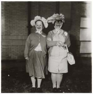
My main challenge, was placing the works in chronological order, which doesn’t really work with the Untitleds, which form such a major part of her body of work.  The subjects, which Arbus photographed in her many Untitled images, often have Down’s Syndrome, while others again are simply institutionalized ‘inmates’ with no voice of their own. These photographs are problematic in today’s context. Hanging them does not take into account critical issues around exploitation and the gaining of permission. Yes, the State may have allowed Arbus access, but that does not give her the right to shoot without permission, or does it? 

Diane Arbus: Untitled (1)

One of the early labels attached to an image I do not recall, quotes Arbus saying something like, and I am paraphrasing: “….. my style of photography and a short lens demand that I ask my subjects permission before photographing them.”  I do believe the Museum should have spoken to this when it comes to subjects that never had the choice, nor the voice. I presume by mixing in the Untitleds with the other works, the curator somehow thought he didn’t have to comment? 

The labels accompanying each photograph start out being plentiful in content, but virtually become title, medium, date towards the time when Arbus’ style was more fully developed (larger square format prints). There is no mention of the famous set of images of which she sold only a single set to none other than Richard Avedon (unless I missed it), nor was it clear which grants she did, or didn’t get.  There was a blown up low quality poster print of one of her applications glued to the wall – I think to the Guggenheim Foundation – which if successful should give hope to every aspiring photographer. It was rambling and poorly written, and certainly not terribly helpful for a jury to evaluate. The label did not say if she was successful in that particular instance.

Had the Louisiana curator and his team bothered to let it be known that this show was being assembled, there are experts abound who know Arbus and her work inside-out and backwards.  Where for instance were the reference works?  Where was Lisette Model’s Woman with a Veil, San Francisco, 1949, which so deeply inspired Arbus’ work.  Where are the contemporaries.  The Winogrands, etc. The Museum even had the recently published book from the seminal 1967 show in its bookshop, but it doesn’t show any examples. (New Documents – Arbus, Friedlander, Winogrand, MoMA 1967, curated by John Szarkowski).

Finally, Identical Twins hung on its own. A perpendicular short wall set up just for this image. Unfortunately, I am a little over this image. Over exposure perhaps, but it remains the cornerstone of any serious Arbus show, as it should. Identical Twins was – I think – printed by Arbus herself (I assume it was, as no Selkirk reference was given). It hung there in all its glory, but with a mat so tight to the image that you cannot see the border or framing at all. Anyone with any knowledge of Arbus and her work will know that she spent many, many darkroom hours working on how to use the edge of the negatives to create a frame around her work. The edge of the negative being part of how Arbus worked.

I have read many accounts of how Neil Selkirk – who printed for the the Arbus Estate under the direction of Arbus’ daughter – spent hours trying to copy the technique Arbus used to give the proper feel to each print. I do not understand why Identical Twins was framed the way it was. It makes no sense, as every other square format photograph in the larger size was hung in a frame with a mat that clearly showed the entire negative frame.

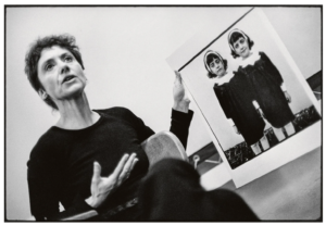
In the image below, which I grabbed off the internet, it is very clear what the border of an Arbus printed image of Identical Twins should look like.

Stephen A. Fran: Diane Arbus with her photograph Identical Twins, during a lecture at the Rhode Island School of Design in 1970.

The Danish population overall is not well educated in photography, the history of, or even the names of some of the key masters of the art.   This is a great shame, given the role of photography in art today.  You need only go look at the ‘photography’ section at the only important auction house in the country, Bruun-Rasmussen, to see that there is no market, nor it seems any interest in Denmark.  Nobody is laying the foundation of knowledge, which is so disappointing. Louisiana’s has had a key role in bringing 20th century art to life and to the Danes. It had an opportunity with Diane Arbus to start doing so for photography, but chose instead to bring in a canned show with little or no context.

I looked into the curator, whom I understand is well respected. From my little and limited research online, he has the art history credentials, but with no, or very limited photography background. He is incidentally also the head of acquisitions at the Louisiana Museum, which again does not bode well for photography.  Incidentally, I happen to know a couple of the photography curators that used to work at the Art Gallery of Ontario.  They eat, breathe, sleep and dream of photographs.  At Louisiana…. not so much.

The Diane Arbus show was such a wasted opportunity for the Louisiana Museum, and for their second act, well, the second act is just shameful. This summer, the Louisiana Museum will have a show of Richard Prince’s work. I wrote about this appropriating, unscrupulous, so-called ‘artist’ in a recent post. Needless to say, I will not be going.

Harbel

Lost and Soon Forgotten

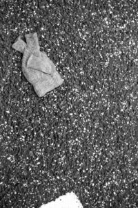
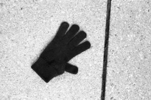
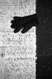
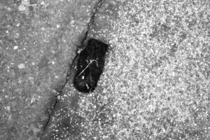
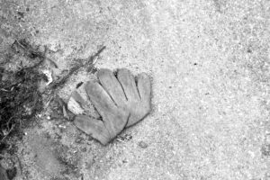
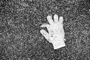
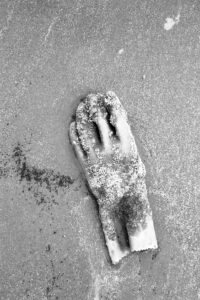
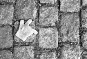
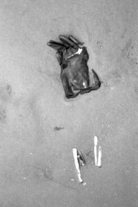
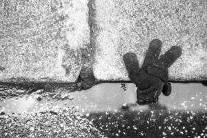
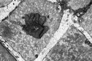
Dropped and lost gloves as found – The Dirty Dozen

I blame Irving Penn.  I saw his photographs of cigarette butts in a show in the 1990s.  The stunning platinum/palladium prints, the tonal range, the softness and texture, yet sheer scale of these small found and collected cigarette butts blown up many, many times in size, left me with a new awareness and perception of what you can photograph and what works as both great subject matter and great art.  In short Penn’s cigarette butts blew my mind. 

While my reaction to the Penn photographs was one of awe, they were also liberating.  Somehow they gave me permission to think about different things to photograph.  In photographic terms, what Irving Penn did for me with his cigarette butts was make me consider new subjects and more importantly, they reminded me to look down, scanning the ground, as I have since spent countless hours doing, while walking the streets with my camera thinking in 24 x 36 mm virtual rectangles. 

What I think about today, when I look at these same Penn’s photographs is how much of a lost opportunity the cigarette butts represent.  I think the context of these butts would have been interesting.  Where were they found?  Was there a puddle, were there other objects nearby?  Were there twigs, dirt, dried leaves?  There is a context that is missing.  I recognize that the perfectionist studio photographer does not venture into the natural world, but craves lights, tripods and so forth to be comfortable. In no way does this obsessive nature diminish the work, it just means that the story isn’t finished.  The game is underway, but all is not revealed.

As a result of my obsession with these Penn photographs, I have been looking down a lot when I walk.  Sometimes this has been very rewarding.  In particular, I have found that ‘the lost glove’ has found a special place in my photographic vocabulary.  For the past 15 years, I have been setting aside negs of lost gloves with the idea that maybe one day there would be enough good ones that I could do something with them.

I now have my dirty dozen, as I call them.  Some are weathered, dirty and often wet, while some look like they were dropped only minutes ago.  One is even covered in barnacles, spotted when I was walking along the beach after a storm.  I have thought often of what Penn would do with these gloves, but then I decided they probably wouldn’t work for him, as what makes them good is the shape, the context, the environment, the setting in which they were found.  None of my gloves have been moved, touched or enhanced by flash, lighting or other tools.  Nor have the photographs been manipulated digitally.  What you see is what I saw when I walked around with my head down and saw yet another single glove that had lost its owner and was now destined to end its life decaying or being scooped up by a road sweeper, or the flick of a broom.

Harbel: After the Thaw
Harbel – Lost Peace
Harbel – Black Wool
Harbel – Cross Walk
Harbel – Wool Mitten
Harbel – Folded Glove
Harbel – So Good Glove
Harbel – Barnacle Glove
Harbel – You Rock Child
Harbel – Lost with Razor Clams
Harbel – Lost with Puddle
Harlel – The Other Glove

There is a sadness that comes with every lost glove.  To me it is the perfect metaphor for loneliness. Once there were two, now only one remains. In recent times, the lost glove is a harsh reminder of what so many people have gone through during the past many months of COVID isolation.  It is the lost, the forgotten who suffer most. 

Harbel

Colour by Numbers

This morning I read an interview with the very au-courant and hugely popular photographer Bastiaan Woudt by Marie Audier D’Alessandris, a gallery owner in New York (The Eye of Photography website January 25th, 2022).  I read and re-read an answer to a question related to the colour Black several times:

The question“… Black is a very recurring color in your work, in the sense of a very deep, very strong, very rich dark in your images, what is it in this color that you’re going after?

The answer, in part:  “…. maybe it’s just part of the way that I process images and the way that I see, I really like to have a strong contrast in my images. But actually, it’s funny that you say that it’s like so black, because if you look in Photoshop it’s not totally black, it’s the same as the white parts in my images are never totally white…. these are all inspired of course by analog photography….”

At least Mr. Woudt is man enough to admit that it is all done in Photoshop. But, in a day and age where the Brazilian photographer Rafael Pavarotti is widely criticized for his ‘colour correction’ of 9 black models for British Vogue, where are we? Where should we stand on the use of digital manipulation.  A lot of the criticism of the Vogue shoot was about the lack of differentiation/representation of actual skin-tone and the resulting sameness.  I think we all agree that in reality everyone has a unique skin-tone, different one person to the next.  It is not appropriate to offer a digitally manipulated sameness in the name of consistency of colour and presentation of clothes.  When you view various photographs of the 9 Vogue models online, each one has their own skin-tone and each one looks entirely different, which is as it should be.

The question I have for Bastiaan Woudt – despite the fact that he shoots in digital and processes his work heavily in Photoshop – why are you choosing to present work where the skin-tones are so similar?  There is a fake sameness one photograph to the next.  Is it really possible to find models that are so alike, or is this more about sameness and presenting work that is so consistent to be unnatural and therefore in its imitation of living beings ends up being entirely about form and not at all about the model.  Is it more about the clinical than the real?  It is almost as though the model is an inconvenience.

It sadly feels like there is a certain Pantone number for near-black and another for near-white, and it is simply a matter of dropping in the digital file from the digital shoot and a second later extracting yet another like image, where composition – very good sometimes – is king and the sitter secondary, tertiary, or entirely irrelevant.

Skin-tones make photography interesting, it makes lighting – natural or cast by many lights – fun to play with and the results vary in intensity and strength, it is what makes capturing light so exciting.  It is never the same twice.  It seems this is missed entirely as the formula for Woudt-Photoshop-near-black and Woudt-Photoshop-near-white is generously applied.  The result being a very predictable, repetitious and highly consistent seen-one-seen-them-all photograph.  I look forward to seeing Mr. Woudt’s next body of work.  With the compositional skills that Mr. Woudt clearly has, I am crossing my fingers and hoping for the best.

Harbel

On Parr at the Villa Medici

After a long absence from my blog and from travel, I am extremely pleased to have been able to once again take in an exhibition.  I don’t know if the Martin Parr show at the Villa Medici was intended to be a show for COVID-times, or if it is merely a happy coincidence, however, the exhibition is a photography show in the open air.  I have rarely experienced these other than on the fence that runs along Les Jardins du Luxembourg in Paris, which is OK, but a rather terrible setting, and the odd temporary things you meet on the road that are neither curated, nor usually very interesting.

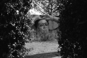
The Parr show on the contrary is well thought out and placed in a corner of the Villa Medici gardens, high above the rooftops of Rome.  Using various formats from maybe 1.5 m tall by 4 m wide, to smaller 30 cm by 40 cm, a couple even smaller, and finally a few lawn loungers with Parr images printed on the seating fabric. The show offers various views of Parr’s work in an unusual setting.

Harbel: Martin Parr – Villa Medici, Rome 2021

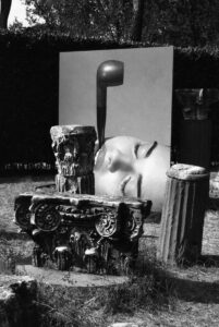
This section of the Villa Medici gardens are laid out with a grid gravel path and tall hedges that make up large rectangular spaces of grass with a few architectural fragments, the occasional sculpture, but still quite formal.  You walk the path, get to an opening and step in.  There are ‘6 rooms’ in the show, closed off with fences and images on two ends.  The show takes up only a portion of the whole garden, and the balance is blocked off for those that pay for another ticket to tour the gardens.  Not cool, but at COVID times, I guess any museum is excused for gouging a little.  It has been a heavy drought in the money department for most all of them, the private ones in particular.

Unfortunately for me, I guess I have seen too many Parr shows in the past few years and found that most of the images in this show are retreads of greatest hits.  The scale of the images do nothing for quality, and the fact that they are set the way they are, exposed to the elements, it is perhaps understandable that it is more about the image than the quality of printing.  As prolific as Parr is, there is a certain disappointment – at least on my part – when you see the same lady on the beach with her eye protection, and the man with the hat not quite covering the bald spot.  But, I must say, I was happy just to be there and see photography once again.

Harbel: Martin Parr at the Villa Medici, Rome, 2021

Was it great?  No.  Was it worth seeing?  Yes.  Would I pay for it if I knew what I was going to get?  Probably. I was just happy to be among photographs again.

Harbel

Conceptual Artists and the Photograph

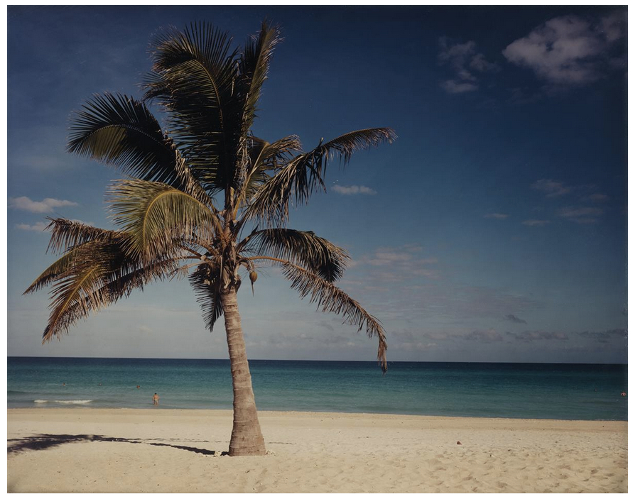
A perspective on a Christopher Williams palm tree.

I attended an auction this past week.  Sadly not in person.  I enjoyed the familiar, and not so familiar images passing my screen, the sound of the gavel and the recognition that life still goes on, despite everyone being in their respective homes and having to share online.  Yes, the atmosphere is not quite the same, but the excitement of the duel between the last two bidders standing and the teasing and cajoling by the auctioneer to squeeze every last penny from them is still real and exciting. 

I was curious about a lot, shown below, by Christopher Williams.  I will be the first to admit that I did not know the photographer, nor have I paid any attention to his work on past occasions, where I might have come across him at an auction or in some other context.  But, I am drawn to this image, not because it is particularly good, nor because it is particularly well composed, but because it was estimated to sell for between US$15,000 and US$25,000.  Pardon me?  I took photographs like this when I got my first camera and went on holiday.  This is a photograph from the beach, with a couple of little swimmer’s heads and a big palm tree shot in Veradero, Cuba.  I seem to recall that Veradero is one of the main charter destinations in Cuba and as such, no doubt, this photograph has been done over, and over again using everything from colour film to digital photographs using traditional cameras and today probably an iPhone.  This is not a great photograph!  This is a postcard……  What gives?

Williams, Christopher – Punta Hicacos Varadero, Cuba. Chromogenic print

I started to dig a little more, looked up Christopher Williams and started to understand that this wasn’t actually about the photograph at all, but rather a work by a contemporary artist who, as a student of John Baldessari, works in entire installations, using references, which require a lot of work by the viewer and is highly experiential.  I found a reference in The Guardian newspaper archives, which described an installation at one of the leading galleries in London, the Whitechapel Gallery.  The reviewer happened to be my favorite Sean O’Hagen, whom I have written about before.  The knowledge he brings to this show, along with what he learned from the accompanying catalogue creates a deep experience for those that attend the show and embrace the homework required to fully immerse in the exhibition and the message from Mr. Williams.

So, why am I writing about this?  Well, at the same auction Graziela Iturbide’s ‘Lady of the Iguanas’, perhaps her most famous photograph, sold for $ 5,000, including the buyer’s premium.  You could also have bought Eve Arnold’s fabulous image, incidentally also from Cuba, known as ‘Bar Girl, Havana’ for $4,250.  Or, you could have bought Robert Frank’s ‘Chicago Convention’ for the same price realized for the Williams palm tree.  As a collector, but also as a photographer, there is absolutely no contest in my mind.  A postcard versus key works by key photographers in the Pantheon of 20th Century photography. 

I do not profess to know a lot about the photography resale market, but it is a reality that unfortunately, people buy names.  Some buy photographs, but many buy names.  This may well be the case here. Williams’ work has been taken out of an original context – an installation – where I am sure it made sense given surrounding images, colours of paint on the walls, the height at which the photograph was hung, the frame it was in, etc.  I question whether a conceptual artist thinks this isolated palm tree photograph is an appropriate representation of their work?  

I understand that prints of concepts and installations by Christo and Jean-Claude were sold to raise money to make the temporary installations happen.  I completely understand that an Artist has to eat and make money.  But what does a photograph mean that was once part of an installation, which on it’s own has no independent reference, or context?  What is it worth?  And how should we view it?  And who should buy it?

Sean O’Hagen describes Christopher Williams’ installation in the following way:  “…. to fully appreciate the layers of meaning and allusion at play here, one must be au fait with the postmodern art theory from which they emerge.” And later concludes: “How much pleasure you take…. may depend on how much prior knowledge of his work – and of art theory and of conceptual strategies in general – you bring to it.”  While, I often struggle with photographs, where I have to do a lot of homework before viewing them, this is of course taking things to a level well beyond most audiences, including me. 

When I enter a photography gallery, or museum exhibition, I skip the catalogue, any text on the wall usually located at the entrance, and go straight to the images.  I don’t even read the captions.  I want the photograph to speak to me.  I want to enjoy the quality of the photograph, the paper it is printed on, and the feeling it gives me when referenced to the sensibilities and knowledge that I have accumulated over the years as a photographer and collector.  Only after will I sometimes – not always – look at what the curator intended and why the show is hung the way it is.  But, that’s just me.

I will conclude by saying that a colour photograph, a little larger than a piece of photocopy paper, 10 3/8 by 13 1/2 inches to be exact, printed in an edition of 10, showing a well lit palm tree on a beach, on a sunny day at a tourist hotspot that looks identical to a postcard that I might pick up at the tourist shop in the all-inclusive hotel that I would probably be staying in, makes no sense to me.  I simply don’t get it.  Outside a conceptual installation, how can I possibly look at this photograph and coolly drop $10,000? 

Martin Parr made a book called Boring Postcards, which was exactly that; reprinted boring postcards.  Need I say more?

Harbel