Diane Arbus – A Wasted Opportunity

The Louisiana Museum, Denmark – March 24, 2022 to…. Forget it.

I managed to get to Louisiana, an art institution in Denmark, which has for many years been at the forefront of staging excellent exhibitions of mostly 20th century art. The museum has a strong enough collection to lend and borrow and thereby attract the best.

I admit my expectations were high. Diane Arbus was why I got into photography in the first place. The very unstable looking kid in Central Park holding a hand grenade was my trigger to change direction from Renaissance Art to Photography. Reading that the first ‘major’ exhibition of Arbus’ work in Scandinavia was only half an hour up the road from where I was staying, was an opportunity too good to miss.

This past Sunday, I made the short journey and couldn’t wait to see something about this great photographer that was new. Maybe even a few images I had not seen before. Maybe a visit with some of my favourite works. Alas, I was deeply disappointed. 

The selection of work was limited – exclusively drawn from the Art Gallery of Ontario collection in Toronto – and the whole thing felt like a travelling road-show. It felt canned and hung because it was easy and fast.  The AGO collection is far from exhaustive and has large gaps.  The Louisiana Museum had many months to plan and prepare this show, given COVID and with our new knowledge of how to use tools like Zoom, or Teams, I see no reason why they did not take the opportunity and bring together something much more exciting. 

My main challenge, was placing the works in chronological order, which doesn’t really work with the Untitleds, which form such a major part of her body of work.  The subjects, which Arbus photographed in her many Untitled images, often have Down’s Syndrome, while others again are simply institutionalized ‘inmates’ with no voice of their own. These photographs are problematic in today’s context. Hanging them does not take into account critical issues around exploitation and the gaining of permission. Yes, the State may have allowed Arbus access, but that does not give her the right to shoot without permission, or does it? 

Diane Arbus: Untitled (1)

One of the early labels attached to an image I do not recall, quotes Arbus saying something like, and I am paraphrasing: “….. my style of photography and a short lens demand that I ask my subjects permission before photographing them.”  I do believe the Museum should have spoken to this when it comes to subjects that never had the choice, nor the voice. I presume by mixing in the Untitleds with the other works, the curator somehow thought he didn’t have to comment? 

The labels accompanying each photograph start out being plentiful in content, but virtually become title, medium, date towards the time when Arbus’ style was more fully developed (larger square format prints). There is no mention of the famous set of images of which she sold only a single set to none other than Richard Avedon (unless I missed it), nor was it clear which grants she did, or didn’t get.  There was a blown up low quality poster print of one of her applications glued to the wall – I think to the Guggenheim Foundation – which if successful should give hope to every aspiring photographer. It was rambling and poorly written, and certainly not terribly helpful for a jury to evaluate. The label did not say if she was successful in that particular instance.

Had the Louisiana curator and his team bothered to let it be known that this show was being assembled, there are experts abound who know Arbus and her work inside-out and backwards.  Where for instance were the reference works?  Where was Lisette Model’s Woman with a Veil, San Francisco, 1949, which so deeply inspired Arbus’ work.  Where are the contemporaries.  The Winogrands, etc. The Museum even had the recently published book from the seminal 1967 show in its bookshop, but it doesn’t show any examples. (New Documents – Arbus, Friedlander, Winogrand, MoMA 1967, curated by John Szarkowski).

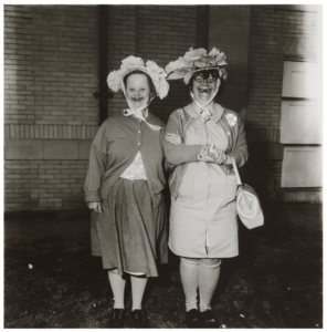
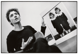
Finally, Identical Twins hung on its own. A perpendicular short wall set up just for this image. Unfortunately, I am a little over this image. Over exposure perhaps, but it remains the cornerstone of any serious Arbus show, as it should. Identical Twins was – I think – printed by Arbus herself (I assume it was, as no Selkirk reference was given). It hung there in all its glory, but with a mat so tight to the image that you cannot see the border or framing at all. Anyone with any knowledge of Arbus and her work will know that she spent many, many darkroom hours working on how to use the edge of the negatives to create a frame around her work. The edge of the negative being part of how Arbus worked.

I have read many accounts of how Neil Selkirk – who printed for the the Arbus Estate under the direction of Arbus’ daughter – spent hours trying to copy the technique Arbus used to give the proper feel to each print. I do not understand why Identical Twins was framed the way it was. It makes no sense, as every other square format photograph in the larger size was hung in a frame with a mat that clearly showed the entire negative frame.

In the image below, which I grabbed off the internet, it is very clear what the border of an Arbus printed image of Identical Twins should look like.

Stephen A. Fran: Diane Arbus with her photograph Identical Twins, during a lecture at the Rhode Island School of Design in 1970.

The Danish population overall is not well educated in photography, the history of, or even the names of some of the key masters of the art.   This is a great shame, given the role of photography in art today.  You need only go look at the ‘photography’ section at the only important auction house in the country, Bruun-Rasmussen, to see that there is no market, nor it seems any interest in Denmark.  Nobody is laying the foundation of knowledge, which is so disappointing. Louisiana’s has had a key role in bringing 20th century art to life and to the Danes. It had an opportunity with Diane Arbus to start doing so for photography, but chose instead to bring in a canned show with little or no context.

I looked into the curator, whom I understand is well respected. From my little and limited research online, he has the art history credentials, but with no, or very limited photography background. He is incidentally also the head of acquisitions at the Louisiana Museum, which again does not bode well for photography.  Incidentally, I happen to know a couple of the photography curators that used to work at the Art Gallery of Ontario.  They eat, breathe, sleep and dream of photographs.  At Louisiana…. not so much.

The Diane Arbus show was such a wasted opportunity for the Louisiana Museum, and for their second act, well, the second act is just shameful. This summer, the Louisiana Museum will have a show of Richard Prince’s work. I wrote about this appropriating, unscrupulous, so-called ‘artist’ in a recent post. Needless to say, I will not be going.

Harbel

Lost and Soon Forgotten

Dropped and lost gloves as found – The Dirty Dozen

I blame Irving Penn.  I saw his photographs of cigarette butts in a show in the 1990s.  The stunning platinum/palladium prints, the tonal range, the softness and texture, yet sheer scale of these small found and collected cigarette butts blown up many, many times in size, left me with a new awareness and perception of what you can photograph and what works as both great subject matter and great art.  In short Penn’s cigarette butts blew my mind. 

While my reaction to the Penn photographs was one of awe, they were also liberating.  Somehow they gave me permission to think about different things to photograph.  In photographic terms, what Irving Penn did for me with his cigarette butts was make me consider new subjects and more importantly, they reminded me to look down, scanning the ground, as I have since spent countless hours doing, while walking the streets with my camera thinking in 24 x 36 mm virtual rectangles. 

What I think about today, when I look at these same Penn’s photographs is how much of a lost opportunity the cigarette butts represent.  I think the context of these butts would have been interesting.  Where were they found?  Was there a puddle, were there other objects nearby?  Were there twigs, dirt, dried leaves?  There is a context that is missing.  I recognize that the perfectionist studio photographer does not venture into the natural world, but craves lights, tripods and so forth to be comfortable. In no way does this obsessive nature diminish the work, it just means that the story isn’t finished.  The game is underway, but all is not revealed.

As a result of my obsession with these Penn photographs, I have been looking down a lot when I walk.  Sometimes this has been very rewarding.  In particular, I have found that ‘the lost glove’ has found a special place in my photographic vocabulary.  For the past 15 years, I have been setting aside negs of lost gloves with the idea that maybe one day there would be enough good ones that I could do something with them.

I now have my dirty dozen, as I call them.  Some are weathered, dirty and often wet, while some look like they were dropped only minutes ago.  One is even covered in barnacles, spotted when I was walking along the beach after a storm.  I have thought often of what Penn would do with these gloves, but then I decided they probably wouldn’t work for him, as what makes them good is the shape, the context, the environment, the setting in which they were found.  None of my gloves have been moved, touched or enhanced by flash, lighting or other tools.  Nor have the photographs been manipulated digitally.  What you see is what I saw when I walked around with my head down and saw yet another single glove that had lost its owner and was now destined to end its life decaying or being scooped up by a road sweeper, or the flick of a broom.

Harbel: After the Thaw
Harbel – Lost Peace
Harbel – Black Wool
Harbel – Cross Walk
Harbel – Wool Mitten
Harbel – Folded Glove
Harbel – So Good Glove
Harbel – Barnacle Glove
Harbel – You Rock Child
Harbel – Lost with Razor Clams
Harbel – Lost with Puddle
Harlel – The Other Glove

There is a sadness that comes with every lost glove.  To me it is the perfect metaphor for loneliness. Once there were two, now only one remains. In recent times, the lost glove is a harsh reminder of what so many people have gone through during the past many months of COVID isolation.  It is the lost, the forgotten who suffer most. 

Harbel

A Postcard Interrupted

Since I was a very young boy, I have been travelling to major sightseeing destinations around the world, mostly in Europe, but also in North America and Asia.  Instead of making my own photographs, I bought postcards, because I knew that those that make postcards wait for the perfect weather, the perfect clouds, the perfect light and the perfect scene that represents the city, palace, church or temple.  Usually these postcards are in colour.  They are a standard size, and either in a vertical or horizontal format. 

Postcards rarely show any people.  I guess, people tend to place the photograph in time, and place due to the clothing that people wear, the haircut, or the handbag.  This would impact the longevity of the card and reduce sales!  Photographers also avoid cars for the same reason, as a particular model will tell the person looking at the photograph when the photograph would have been taken.  As such, most photographs have no people in them, no cars and try to be as timeless as possible.  In short, you sell more postcards if the image is perfect and there are no references to time.  These photographic postcards survive year after year on custom metal stands that are rolled out every morning, and returned inside every night.  But are they not dead?

I have always looked at these photographs as impossible.  How do you get the light to be perfect, the clouds just so, with no people around and no indication of the year, month or day the photograph was taken?  Of course this has gotten easier with time, as software now can remove undesired elements, but when I was a kid, I am sure the photographers waited for months for just the right circumstances.

Harbel: Piazza Navona

To me, these photographs are interesting, but not real… or at least they seem impossible.  I have over the years been fortunate to spend extended periods of time in several major cities and have wondered what might be possible.  I still stand confused and in disbelief.  If the clouds are right, the angle of the sun is not.  If the angle of the sun and the clouds are right, then an irritating delivery van is parked in the wrong place, or a flock of tourists wonder across my frame.  A poster advocates for a political candidate, or a poster for a movie.  All are time stamps that just don’t seem to be there in the perfect postcards in front of the tobacco shop.

Harbel: The Papal Apartments

So, what can I do to take iconic images and rethink them?  I thought that perhaps by going to black and white I could maybe do something.  But that has been done before we had colour postcards, more than 120 years ago.  But then it came to me that I could create movement around these well-known places by using a simple instrument.  A bird or two to suggests that there is life in these places, that they are not dead, even though they may be devoid of people.  Is this a new way of seeing?  Surely not, but it is my way of rethinking the standard postcard, and I have been doing it for years.  The confluence of good light, an iconic setting and a bird, or two does not happen often, but sometimes, you can get lucky…..

Harbel: The Taj

Harbel