Addiction to the Digital Darkroom

At the risk of yet again sounding like a broken record to those that read my blog from time to time, I cannot help it. This morning I was looking at the various newsletters that I subscribe to and came across the work of Lisa Kristine.  A photographer, whom one can only admire with her commitment to end slavery and her desire to document the world, often of those less fortunately than ourselves.  In the lead-in to her short answer questionnaire on The Eye of Photography, her first experiences in the darkroom with her uncle….. perfect…. I really want to love her work!

Kristine, Lisa – Slavery – Freedom – Ghana

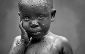
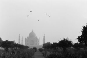
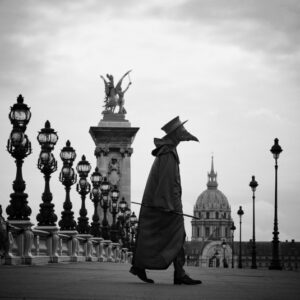
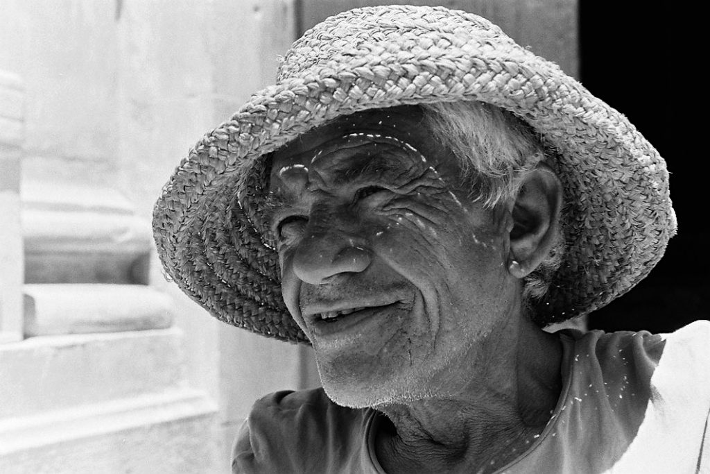
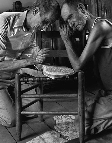
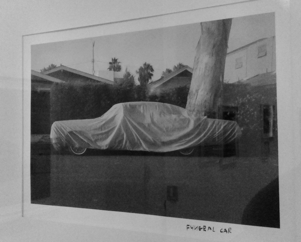
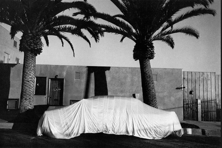
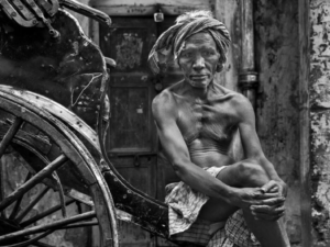
Normally not a super fan of colour work, Lisa Kristine’s colour images are both arresting and very strong. Her compositions are terrific and the impact is both hard hitting and beautiful, all at the same time.  However, in the two black and white images that I found – shown here – there are some inherent challenges, which I think are symptomatic of the time in which we live.

Kristine, Lisa – Rickshaw Wallah – Kolkota

Turning the real into the unnatural

Painters face an eternal question. When is the painting finished? The canvas sits there on the easel. The painting is fabulous. The painter holds the brush and is trying to make it better. The tiniest of brush strokes that will surely take the painting even further. The temptation is always there to do that little bit extra, correct that little something that you are sure everyone will notice, but only you can see. That little bit of magic that will forever change the work to your best. Some need others to say when enough is enough, when finished is truly finished and the work cannot get any better.

In the digital darkroom, the situation is much the same, but the temptation often overwhelming. I have written about Steve McCurry’s photographs and the choices of National Geographic Magazine, as well as several others who have taken it too far, under various guises. Knowing when to stop is equally as important to the photographer, as the painter.

I know my eye is sensitized to black and white photography, which I freely admit that I prefer. I won’t comment on colour saturation, or try to insert myself into what should or should not be done in colour work, but what I have trouble with is the excessive light and shadow in black and white work. The two examples here are in my view past the point of what one might achieve in optimal conditions with an analogue camera and film, or for that matter what one might see with the naked eye. I think this is at the expense of the message and the reality that the work tries to represent.

Am I really the only one that finds it hard to look at these super bright, hyper-unrealistic photographs that can only be born from software. They do not exist in the natural world and are purely the result of a need to make excellent impossibly better!

Harbel

(may not be reproduced in full, or in part without the written permission from the author)

Exquisite Platinum Prints

One of the advantages of being locked up due to the COVID pandemic, has been the time to read and look at the excellent prints that I have in my boxes by some of the great photographers, whom I admire.  It also gave me time to go through thousands and thousands of my own negatives to see if there are any worthy of platinum/palladium printing.

My friend Gerry Pisarzowski in Toronto, Canada, is a world-class platinum/palladium printer and I have long wanted to make a few.  Gerry shares my world-view on what constitutes a great print, and he is a master at making them. 

After much time spent looking at small rectangles through a loop and at my silver prints, I picked 20 negatives and made the decision to have them printed in platinum/palladium.  There is a magic to platinum/palladium prints that is hard to describe, so this is probably not the greatest forum to try to present what should really be seen and touched, yet, it is worth trying.

Harbel: Yorkshire 2017

The classic platinum/palladium print has a beautiful flat surface, the paper is mat and often has a little texture, like water-colour paper for instance.  A print usually bears the very dark brown, or pure black strokes made with the brush when the platinum/palladium coating was applied, before being exposed to the light source.  As such, platinum/palladium prints have the white of the paper, the black of the brush stroke frame, and finally the image itself.  Some people mask the brush strokes either with a mat when framing, or by using a frame when applying the coating.  Personally, I love the effect of the hand painted frame around the photograph, and I think it a great shame to hide it. 

Much has been said about the platinum/palladium print as the king, or indeed the queen of photographs.  I know this in part technical, as the process makes an incredibly stable and safe photograph, however, I think it is also because of the rarity of the platinum photograph.  It is not a cheap process. The materials are expensive, and prints tend to be small, because it is a contact process, meaning that the negative is the same size as the final print.  Given that small prints don’t seem to be in vogue at this time, where often prints seem to be judged by their square footage, as opposed to their quality, platinum prints are unique and special. Very special.

In a time when bigger is better, the luxury of being able to hold in your hands a small print made with care, using deep knowledge of the process and a bit of black magic is not only wonderful, but so different than what you would expect from a digital, or silver gelatin photograph.

I can warmly recommend that if you can find a great platinum/palladium printer, it is worth the effort and cost to make a few and experience what your photographs can also look like when presented on fine papers using noble metals. You could start by visiting my friend Gerry Pisarzowski’s website for more details of the process and perhaps you too can enjoy holding in your hands a magic platinum/palladium photograph. (http://geraldpisarzowski.ca/)

Harbel

A Postcard Interrupted

Since I was a very young boy, I have been travelling to major sightseeing destinations around the world, mostly in Europe, but also in North America and Asia.  Instead of making my own photographs, I bought postcards, because I knew that those that make postcards wait for the perfect weather, the perfect clouds, the perfect light and the perfect scene that represents the city, palace, church or temple.  Usually these postcards are in colour.  They are a standard size, and either in a vertical or horizontal format. 

Postcards rarely show any people.  I guess, people tend to place the photograph in time, and place due to the clothing that people wear, the haircut, or the handbag.  This would impact the longevity of the card and reduce sales!  Photographers also avoid cars for the same reason, as a particular model will tell the person looking at the photograph when the photograph would have been taken.  As such, most photographs have no people in them, no cars and try to be as timeless as possible.  In short, you sell more postcards if the image is perfect and there are no references to time.  These photographic postcards survive year after year on custom metal stands that are rolled out every morning, and returned inside every night.  But are they not dead?

I have always looked at these photographs as impossible.  How do you get the light to be perfect, the clouds just so, with no people around and no indication of the year, month or day the photograph was taken?  Of course this has gotten easier with time, as software now can remove undesired elements, but when I was a kid, I am sure the photographers waited for months for just the right circumstances.

Harbel: Piazza Navona

To me, these photographs are interesting, but not real… or at least they seem impossible.  I have over the years been fortunate to spend extended periods of time in several major cities and have wondered what might be possible.  I still stand confused and in disbelief.  If the clouds are right, the angle of the sun is not.  If the angle of the sun and the clouds are right, then an irritating delivery van is parked in the wrong place, or a flock of tourists wonder across my frame.  A poster advocates for a political candidate, or a poster for a movie.  All are time stamps that just don’t seem to be there in the perfect postcards in front of the tobacco shop.

Harbel: The Papal Apartments

So, what can I do to take iconic images and rethink them?  I thought that perhaps by going to black and white I could maybe do something.  But that has been done before we had colour postcards, more than 120 years ago.  But then it came to me that I could create movement around these well-known places by using a simple instrument.  A bird or two to suggests that there is life in these places, that they are not dead, even though they may be devoid of people.  Is this a new way of seeing?  Surely not, but it is my way of rethinking the standard postcard, and I have been doing it for years.  The confluence of good light, an iconic setting and a bird, or two does not happen often, but sometimes, you can get lucky…..

Harbel: The Taj

Harbel

Wearing the Mask

A 1648 engraving found at the Museum of Medicine in Madrid shows the ‘Plague Doctor’ in full costume.  The costume design is credited to the French Royal Physician, Charles de Lorme in the early part of the 17th century. The protective costume was designed to keep the doctor safe, while treating patients who suffered from the Plague. It was also known as the Black Death. The plague was wide spread in densely populated cities across Europe in the middle ages, resulting in millions of deaths.

Harbel – The Mask

The key feature of this protective outfit is the characteristic mask with the large beak shaped nose. The beak was filled with various aromatic and medicinal herbs to protect the airwaves of the wearer from infection.  The Plague Doctor wore full PPE, in those days made of impregnated leather boots, gloves and a cloak, as well as a hat and is often seen with a short stick that he would use during his examination of the patient.

Stephan Gladieu – The Plague Doctor in his mask

The photograph above is a modern take on the Plague Doctor traversing Paris at a time of high stress during the 2020 COVID19 pandemic. The photograph is by Stephan Gladieu, a great French photographer, perhaps best known for his colour portrait work.

The profile is unmistakable. The warning very real!

The sight of the Plague Doctor silhouette walking the empty streets to the home of a poor suffering citizen, or to the hospital to treat patients suffering from the bubonic plague, would be incredibly alarming. Very scary. I cannot help but think that this is perhaps a great message even today. 

Be careful and stay safe, AND wear your mask whenever you are around other people.  It is the right thing to do. The safe thing to do. It is the least you can do to protect and respect those around you.

Harbel

The Albino – A Nino Migliori Masterpiece

I came across a photograph by the Italian Master Photographer Nino Migliori.  Like most other photographers, I have known Migliori only for a single image.  In fact, I will admit that I knew the photograph, but not the maker for many years.  I am of course thinking of his spectacular Il Tuffatore (The Diver) from 1951, which I always think of in the company of Kertesz’s Underwater Swimmer from 1917.  Both of which have achieved almost iconic status. 

Migilior, Nino – The Diver 1951

“The Diver” – shown above – is the result of a great eye, a great composition and a little good fortune, given the speed of film in 1951.  But, to my happy surprise, I ran into an auction catalogue, where I saw another Migliori image, which I had not seen before, and which I find wonderful.

Born in 1926, Migliori is closing in on his first century.  He has worked in what I would describe as an independent and slightly irreverent manner his whole life.  His work reflects a great love of his native Italy, while at the same time making images that are not necessarily geographically specific, but rather show the genius of a great observer.  I have previously quoted Eduoard Boubat, who noted that the difference between a great photographer and everyone else, is that “the wandering photographer sees the same show that everyone else sees. He however stops to watch it.”

When you stand in the window and look at the rain come down and your daily walk with your camera is messed up, because of bad light and rain, it takes a certain genius to see this photograph develop in front of you.  Add to that the great fortune that someone down there didn’t get the memo about the exclusive use of black umbrellas…..  The photography gods were clearly on the side of Nino Migliori.

Migliori, Nino – The Albino 1956

The photograph plays with scale. It takes a while to figure out what you are looking at, and to me at least, it has an almost botanical feel.   A close-up photograph of a pillow of perfectly formed dark flowers with a single bloom that is without pigment?  Or, with a smile on my face, I thought it could be the pope amongst his flock, but of course on closer inspection, the tightness of the crowd and their umbrellas throw you back to a time when people carried black umbrellas, wore hats, and suits and actually went to the office.  Now people sit at home thinking of a time when crowded streets and subway platforms were the norm, hoping one day to return.

It is time to look at more work by Migliori.  I look forward to it!

Harbel  

The Danger of the Artist’s Statement

I recently purchased a photograph by a young Greek photographer.  I really enjoyed the feel of the image and the mystery that he has achieved with what could either be simple analogue tools, or some heavy computer intervention.  I prefer to think it is the first!  Of course.

I did what I always do, ignoring the context entirely.  The photograph was in a selection by the photographer that showed up this morning in one of my photography newsletters.  I figure that given all the shows and exhibitions around the world that are suffering either from COVID-closure, or a very restricted audiences, that we owe it to the photography community to buy a piece here and there to keep everyone committed to their art in bread and water, if not steak and Chateau Lafite.

I may have made the purchase as a reaction to the news that for the first time in 20 years, I will not be attending Paris Photo, which was cancelled yesterday.   The Paris Photo organizers hung on much longer than they should.  My gallery friends said months ago that they would not take booths this year… that 50% of sales go to the United States, and given what is going on in the US, it would be unlikely that many, or any Americans would attend, or even be allowed to attend, etc.  Long story short; Paris Photo finally bowed to the increasing number of COVID cases in France and elsewhere, as well the recently imposed restrictions on the size of crowds.

Feeling my growing depression over not going Paris Photo, I was so pleased to see something I liked in one of my newsletters and jumped on the chance to acquire a super photograph.

But, I digress… the reason for today’s blog entry is for me to perhaps suggest that there is great danger in the written word.  Personally, I don’t like artist’s statements, nor do I like curator’s commentary most of the time.  I like to let a photograph speak to me on it’s own terms and having that impression help form my interpretation of what is happening in the image, and my response to it. 

The danger to me comes when the artist sets out on some kind of verbose rampage and completely messes with my feeling, or interpretation of a work.  There is a degree of risk here.  Because, if I see it, love it and want it, but then read that my reaction to the image is completely off side, relative to what the photographer says she, or he intended, one of two things happen:  Worst case; I turn around, shake my head and walk away, or best case; I buy it anyway and spend the rest of my life trying to dispel from my mind the statement made by the artist.

Karabelas, Nasos – Woman #101

The image here I love.  Beautifully executed, the image allows my imagination to go wonder, while the other half of my brain goes on to an internal dialogue about the technical aspects of the execution – utterly hoping that it is not all about software.

Here is a portion of the artist’s statement:

“…..  Each photo is an entity, which includes a certain mental condition. So, we are dealing with a variety of emotional loads within a world that is equally ambiguous with ours. The forms obtain a dreamlike dimension. Sometimes you can not easily understand their contours. Τhe exploration of the forms inside the photographs gives us the opportunity to discover the various aspects of our psychosynthesis.

In this particular case, I went ahead and purchased the photograph, because I really think it is a great photograph, but it was close.  I almost walked away.

The lesson here is to not overthink the work, or at least let it speak for itself, because paraphrasing one of my favorite Japanese photographers: If I could write, I would not be a photographer.

Harbel

When Photographs Talk of Change

When in the early 1990s, I finally went back to university to study art history with a focus on photography, there was no doubt that the female photographers dominated.  This was in part because the school that I attended was a very pink school (I say pink, because when I was growing up, it was customary for the serious feminists to wear a pink-dyed headscarf, and for them to be referred to as being ‘pink’).  In addition to being a university run by a strong group of feminists, it was politically quite far to the left of centre, and so one could argue that the pink became red and sometimes it was hard to determine the exact shade. 

One thing is very clear:  Female photographers were central to my first serious ventures into the world of photography. Add to this the egalitarian nature of photographing – after all, as Chef Custeau would have said, had he been a photographer and not a chef: “Anyone can photograph.” There is a level playing field for the photographer – any photographer – to create a good, or even a great image.  Sure, there were, and still are, barriers to entry, from a commercial point of view, glass ceilings, and so forth, but the image itself is available to anyone.  Back in the day, if you could lay your hands on a camera and some film, you could create.  Today the average phone can do the trick. I hope that my time spent in a left-leaning school, in the company of women photographers has stood me well in my own work, trying to be humble and appreciate great work, whatever the source. 

I have thought often about those days and all the images that moved from the projector to the screen, while the talking heads pointed out particular qualities and characteristics that were important to pass the upcoming exam.  The list of female photographers; famous, well-known and less-well-known, was long. 

Personally, I am drawn to work that has an ephemeral quality, where the photographer, the printing, the paper and the image come together in splendid whole, capturing an elusive fraction of a second in time.  When this is successful, there is nothing like it.  You can have long discussions about the technical aspects of all the steps that go into making a great photograph, but at the end of all this, only one thing remains, the gift that the photographer presents to you, or me, the viewer.

Photographs that really work have this extra quality that you cannot put your finger on. For me it is a whole movie with a great soundtrack condensed and concentrated into a single frame on a small piece of paper, brought to life by the vision of the photographer.  There can be no lengthy description, no deeply articulated justification for the work.  There is the work.  The single image.  The story that I get to write in my mind is mine, and mine alone, as I look at this humble piece of paper with blacks and whites and all manner of greys in-between.  

I am drawn, in particular to a quote by Jürgen Schadeberg, who very smartly points out that: “there are certain moments we do not see unless we photograph them.”  This goes hand-in-hand with what Edouard Boubat has said many times: “”The photographer sees the same show that everyone else sees. He however stops to watch it.”

I cannot pretend that these seemingly simple observations apply to all photography.  Sometimes elaborate sets are constructed, lights are erected, timers engaged and subjects distracted by little birds on the end of toy fishing pole to encourage that particular smile, or a whole phalanx of assistants mill about eagerly anticipating the second when the maestro will press the shutter, before moving on to the next frame.  But, this is not my kind of photography. It doesn’t speak to me.

When I really pay attention.  When I really see.  There are gifts everywhere.  One of my all time favourite photographs, and yes, by one of those hardcore feminist photographers, is by Abigail Heyman.  There is something very familiar to those of us who were around in the 1970s, who might have seen this exact scene play out any number of times, without really noticing it.  But, as Boubat and Schadeberg both suggest, there is genius in stopping, watching and recording. 

Heyman, Abigail – Supermarket 1972

There is a time, a context, and a reality captured in this photograph, which on one hand is simply a 1972 snapshot at the supermarket, but there is genius in the composition, the generational play, the bleak future of the young woman in the foreground, who appears to be working on nothing more than becoming her mother, represented by the older ladies just behind her.  A vicious cycle to be repeated over, and over again.  But in this photograph I see a message of hope that the cycle can be broken. The photographer uses the mundane to put forward a new idea, a new vision, and a different future.  There is a streak of defiance in the young lady’s eye, and a brighter flower on her dress.  By pointing to the mundane and sad mediocrity of the suburbs in 1972, a simple message is delivered.  We don’t all have to become our parents.  God forbid.  We can break the cycle.  Make our own reality.  We can change the world!


Harbel

The Wabi-Sabi of Photographing with Film

I once toured the ‘S’-class Mercedes manufacturing line, where hundreds of highly paid auto-workers hand-build the top-of-the-line Mercedes cars.  There is a certain respect owed to those people that build and assemble with their hands.  The aura in the great hall was palpable and the pride was everywhere.  I crossed the road and went to the ‘C’-class Mercedes plant, which is virtually 100% automatic and has robots swinging large and small pieces back and forth across space and time, before a car emerges at the far end of the line. 

In discussing the two plants, which could not possibly have been any more different, the member of the design team that was walking me around said that actually, the ‘C’-class is a much more accurate and precisely assembled car, and if it wasn’t for the customers who insisted on having a hand-built car and were willing to pay for it, rightfully the ‘S’-class Mercedes should be built by a similar line to that of the ‘C’-class.  Clearly, there is value in a little inaccuracy, knowing that it was made by a human, and not a machine.

The Japanese have a lovely term called wabi-sabi.  Wabi-sabi has many definitions.  To me, it means that there is perfection in imperfection.  That a small error, or imperfection in say a drinking vessel, a flower arrangement, or even a new building, is what adds the human touch.  The little something that is a signature of human quest. 

Harbel: The Sicilian – (I only saw the mask once I got in the darkroom)

Analog photography is much the same.  There is film, a camera, developing, printing, a final print, and at each step, there is a little bit of the photographer.  A little bit of wabi-sabi.  Bruce Weber talks of clients being impatient and wanting to see a photograph, even before it is taken.  How digital has created the need for urgency, immediacy, perfection, and if not, the ability to make perfection. 

“A lot of people have gotten so used to this digital age. They all expect to see the picture before it is taken. Or they want to change the picture. I like it when pictures aren’t so perfect.” – Bruce Weber on Shooting with Film

I read recently about the thousands of individual micro-lenses that combine to create the perfect depth of field in a digital camera.  The perfect sharpness from the front of the image, all the way to the back.  This is like the new hyper clear and sharp televisions that give me a headache.  Life is not like that. 

When we look at our surroundings, our eyes focus on something.  We focus on something close up and everything else around that object falls slightly out of focus.  If we look at a wider area in the distance, things that are near us drop a little out of focus.  To some degree, analog photography mimics this.  As photographers, when we focus a camera on a particular area in front of us, we are making a decision.  We are choosing to focus on something, and not something else.  Or we may elect to throw it wide open and get as much of the scene in front of the lens into view, but that usually comes at a price, which drops whatever is immediately in front of us out of focus.  Of course, modern technology can mimic these types of decisions.  A digital camera can be set to take photographs like an analog camera.   But, most photographers who shoot using digital don’t bother.  They deal with that on the computer later, using Photoshop, or whatever software platform they choose. 

The joy to me of analog is that you see the image in your mind’s eye.  You set your variables, select what goes where in the frame and focus on whatever draws your attention, or not, depending on what you are trying to achieve.  You press the shutter and you wait. 

First there is the joy of seeing the negative and placing it on the light table, getting out the glass and having a look at what you have managed to capture.  Then there is the print itself, when you place the negative in the enlarger and make the first test print.  Perhaps a small 8×10 or 5×7 print.  And only after you have studied and played with the process for a while do you end up with the final print.  Doubtless, there are imperfections.  Things you could have done better.  Perhaps a bit of shadow where you had not seen it, when composing the image.  Perhaps the horizon line is not entirely level.  Perhaps there are a couple of people in the distance that you had not noticed, because you were so focused on getting a particular subject just right.  To me, this is the fun of photography.  The serendipity that sometimes works in your favour, sometimes not.  This is analog photography.  Photography as it should be.

I have the luxury of making the same photograph five times;  I compose it in my minds eye;  I make the photograph;  I see the negative;  I see the test print;  I make the final print.  And no matter what, there is always something that you wish you could have done perhaps a little differently.  This is wabi-sabi.  The small imperfections that make us human.

Harbel

Probably the Most Important Living Photographer in America – Shelby Lee Adams and his Appalachian People

One can only stand back and admire Shelby Lee Adams and his commitment to a full and honest presentation of the people of Eastern Kentucky’s Appalachian Mountains.  For nearly 40 years, he has been doing this with a large format 4”x5” camera, a heavy tripod and repeated visits that have made his sitters close friends, who look forward to his visits, and the photographs that he brings, as a gesture of thank you for letting him make their photographs. 

I think of Shelby Lee Adams as a contextual portraitist.  A photographer who includes enough circumstance and environmental content to not only portray the image of the person, but who also includes references to where the sitter comes from and what they are about.  I could perhaps refer to this as the antithesis of the Irving Penn Worlds in a Small Room photographs.  Where Penn photographed in his mobile studio against a neutral background, Adams works hard to include the references around the sitter to help the viewer better understand the subject of his photographs.

Shelby Lee Adams: Brothers Praying

I understand that Adams walked and drove with his uncle, a retired physician, who after a year of retirement in Florida came back to Kentucky and in a WWII Willy’s Jeep did many years of house calls in the foothills of the Appalachian Mountains in Eastern Kentucky.  Often riding with his uncle, Adams earned the trust of the many families he met, and one could say, earned the right to return with his heavy and cumbersome tripod and lights.

The photographs that Mr. Adams makes are of course anchored in a long tradition of great photographers.  The list is long and you can no doubt come up with everyone from Disfarmer, to Evans, Dorothea Lange and so forth, but when you take the time to study Adams’ work, you realize that he is different.  The Farm Security Administration set out to document migration and the lot of those that suffered during The Dust Bowl of the 1930s and started the slow move West.  The mostly anonymous people in the FSA archive, who may from time to time be identified with a short description following a quick exchange with the photographer, before they moved on to the next shot, remain largely unknown. FSA photographs are documents, or proof of a certain suffering.  Adams’ work is different. 

Adams’ sitters have a glow in their eyes, an affection that comes across only when the sitter is a close friend, beyond just being a subject.  Adams has spent many, many hours with the families, has shared meals, drunk good home made sour mash and enjoyed the company of these largely forgotten people that somehow the American Dream left at the doorstep.  Proud, free and honest, often grounded in a strong Christian faith, the people of Shelby Lee Adams’ photographs come to life in a way that can only happen when you can feel an intimacy between the person with the button and the person in front of the lens. Adams says: “I can’t emphasize enough how vital a non-judgmental eye and sincere recognition is…. Kindness and empathy contribute on this journey. “

Shelby Lee Adams: Mary, 1989

Shelby Lee Adams of course is also a master printer.  His work comes across in beautifully toned prints on paper that is the best available.  I am sure, he would have dreamed of having some of the papers that were available 50, or more years ago.  There is a classic elegance to the work that would have been perfect on a warm 1930s paper.  However, we live in the 21st century and we work with what is available and Mr. Adams does a wonderful job presenting his subjects in a manner that can only be described as timeless, reverential, but honest and true to the circumstances under which the people live in the Hollers of Eastern Kentucky.

When still available, Shelby Lee Adams worked with a Polaroid back for his 4”x5” camera and used to give the Polaroid to the subject of his photograph, before organizing himself for the actual exposure.  Taking home the film and developing and printing the images in his studio at the very north tip of the Appalachian Mountains, Shelby Lee Adams returns a couple of times a year to visit and share the resulting images with his friends, who greet him with a smile and a hug.

You can feel Shelby Lee Adams’ photographs.  This is rare and wonderful and justifies my nomination for the title the Most Important Living Photographer in America.

Harbel

The World of Photography Knew it was Inevitable. Yet We Mourn.

Robert and Fred died within a day of one another.  Both hugely significant in their own right, and while one will always overshadow the other, it would be a great shame for one to be lost and not given the proper attention that he deserves…..

On Tuesday the September 10th, it happened.  What everyone had been expecting and nobody wanted.  Robert Frank, perhaps the most important photographer of the 20th century passed. I have a great passion for the type of photographs that Robert Frank made.  Frank’s timing was not always perfect, his focus sometimes a little off, even his lighting was sometimes a little too hard, or too soft, but he captured images that forever changed photography and gave him almost mythical status.  Among those of us who like to think we make photographs in a certain tradition that for all intents and purposes link directly back to him, he is a god.

Robert Frank had an uncanny ability to see things that captured the essence of our existence.  I doesn’t matter if you look at his later work, which was more cerebral, or if you look at his break-through portfolio ‘The Americans’, it was always about capturing an honest, unembellished truth.  The essence of an American town, a rodeo, a road leading to eternity, or a tuba.  His images were not all individually outstanding, though many were, but they have an honesty and a virtual time-stamp that bring out the best in time, place and circumstance.

Robert Frank was Swiss, he captured America with an open mind and an open heart, as only one from ‘away’ can, which leads me to the second thing that happened that week……

The day before, on the 9th of September, in Vancouver, a city known in photography circles mostly for contemporary work – some in large light boxes – the passing of Fred Herzog went largely unnoticed, except by those who either knew him, or admired his visionary approach to colour photography. 

Vancouver in the 1950s was a backwater, a pacific port with lots of warehouses, ships coming and going and a departure point for those engaged in the mining- and logging industries.  Not particularly refined, nor particularly pretty.  With a setting between ocean and mountains it had a great canvas. But as only we humans can, it was a lot of front row industry, a busy, dirty and noisy port, lots of really bad neon, bars, wooden houses that looked ever so temporary, surrounding a couple of monumental stone buildings, that would eventually come to anchor what most will now agree is a world city. 

Transience was the nature of the old wood houses that were usually no more than a couple of stories high, set in a tight geographical setting that over time would require much densification and endless high-rises.  As such, much of what was around in the 1950s and 1960s has been erased.  Virtually no evidence of the frontier town by the water remains.  Thank goodness for Fred!  At a time when colour film was slow as frozen molasses, and people still moved as quickly as they do today, Fred captured Vancouver in a way that is both local and global.  He found qualities in simple new cars in an alley, a sea of neon lights, the interior of a barbershop, a window at the hardware store, and in people who look like they are from everywhere. 

For most people these scenes are difficult to place geographically, other than it being somewhere in North America, but that is what makes them great.  Herzog doesn’t dwell on the incredibly beautiful Vancouver setting with mountains, sea and sky, but on the urban.  Often the slightly gritty urban.  His head-on elegant use of colour and composition with people peppered in for good measure, always in just the right number and somehow perfectly placed, gives rise to his great eye and masterly skill, using tools that today seem almost impossible to handle well.

The Equinox Gallery in Vancouver still has a great selection of Fred Herzog’s work.  It is still attainable and exquisitely printed from the original Kodachrome slides that in miraculous fashion have survived less than optimal circumstances.

Fred’s work found its way to Paris Photo a few years ago, the annual mecca for those, like myself who are consumed by great photography.  A bold show of only Fred’s work took up an entire, large booth at the seminal event of the year.  It was a popular stop for collectors, who found something new, exciting and rooted in photographic excellence.

Fred worked for the University of British Columbia for almost as long as I have been alive.  He started the year I was born.  He photographed in the name of science and in his spare time out of personal obsession the city he came to love from a very early age.  Anecdotally, he came to Vancouver based on a single photograph in a geography textbook at school back in Germany, where he was born, during a time of great upheaval. 

Fred came to Canada in 1952.  He leaves a legacy, having captured a vanished time, but while geographically specific and significant, also of great universal appeal.

Ulrich Fred Herzog was born in Stuttgart, Germany, September 21st, 1930 and passed away in Vancouver on September 9th, 2019. He was 88.

Both Herzog and Frank were not from where their most famous work is made.  Is this significant?  Does the outsider see differently…?  Save that for another day.

Harbel, Donostia

A Conspiracy of Ravens

You travel the world, and while it is different everywhere you go, certain things seem to remain the same.  Take for instance the presence of certain birds.  It seems that wherever you go there are pigeons, crows, seagulls – at least where there is water nearby – and of-course the humble house sparrow. 

In photography, there are a number of people that have focused on birds, as do I when I see the opportunity.  At the moment there seems to be a bit of a wave happening.  For instance, there is a French publisher, that has gone to a number of well-, or lesser known photographers and asked them to put together a book of photographs with birds. 

The books are small collections of maybe up to 50 photographs, put together and sequenced by the photographer.  Different photographers feature birds, others simply have birds as an accessory.  All are photographs, where birds take on great importance, either by design, or accidentally, adding a certain instantaneous urgency to the photograph. 

The sudden flight of a bird, or something as transient as a bird temporarily sitting on a branch, or on the head of a statue, or flying through the air just so, might make the difference between something wonderful, or something very ordinary.

Cases in point are two photographs, which I judge to be the best of their kind.  The first by Pentti Sammallathi, is a purely serendipitous composition, which in a photographer that does great work, time after time after time, is perhaps not a coincidence, but rather extremely observant.  Or perhaps just plain lucky.  

A tree devoid of leaves and looking like either the dead of winter, or death itself, comes back to life for an instant, when the plumage of leaves may be seen for no more than a fraction of a second, created by a passing flock of birds.  The scale of each leaf, or in this case each bird, relative to the tree, lets the viewer contemplate for a brief second the splendor of a tree fully in its glory, at a time when in fact, it is either dead, or dormant.  It is perhaps a metaphor for life itself.

Sammallathi, Pentti – Delhi

The second, and equally as incredible photograph, is a much, much darker master-piece by Masahisa Fukase.  A Japanese photographer, I will confess that I did not know well, until I saw a show of his in Amsterdam.  He had a strange, photography obsessed life, where at the height of his career, where so many wonderful things could have happened, he fell down the stairs and spent the last 20 plus years of his life in a coma, on life-support, never regaining consciousness.  The photograph may or may not say something about a photographic career, or it may say everything.  Fukase worked on a project in the unforgiving winter of the north of Japan, where he made photographs, which resulted in a book that has achieved cult status, and fortunately was recently re-issued, called Raven.

Fukase, Masahisa – Ravens

This particular photograph is of a tree, where a large number of crows, or ravens have taken shelter for the night.  The scene is dark, yet because the photographer used a flash to make the photograph, the eyes of the birds reflect the light and this is captured on the film, as white dots.  It is as though the birds are all watching the photographer.  There is something incredibly ominous about this photograph.  Something very Hitchcock.  I am usually not a great fan of flash photography, and never use one myself, but in this case, it works.  The result is both scary and magnificent, all at the same time.  The Murder of Crows, or the Conspiracy of Ravens.

Birds animate a photograph in ways very little else does.  Maybe that is why many photographers like them in their photographs.  A simple fly-by can change the mundane to the inspired.

Harbel

Fun with the Moon Landing

I remember when in 1969 – at the age of 7 – I was watching a small black and white screen at friends’ cottage.  A small grainy picture.  I had been playing most of the day and we all gathered for the eventful moment when man – in the person of Neil Armstrong – stepped off the bottom rung and planted his boot on the surface of the moon.  I didn’t speak English at the time, so a quote would not be appropriate here, but I was very much aware of the weird huge white space suits, the oversize motorcycle helmets and the super awkward gloves that looked like they were completely useless at picking up anything.

Over the years, I have had a lot of NASA photographs pass through my hands.  I have kept a few, but mostly, I exchanged them for other things, because, I am not a great believer in the longevity of old colour photographs.  But I digress…. I did keep two.  One that I think proves beyond a reasonable doubt that actually, the moon landing never happened. It was all on a set in the Arizona desert. And to prove my point, when you go to the NASA library and look up this particular image number, it doesn’t exist!

NASA: 5-72-33899

I am only kidding, of course, but the man in the background does prove good fodder for what the conspiracy theorists all say. The wide 70s tie blowing in the wind and his high-waist brown pants and loafers. The hair.  You have to love the hair.  It reminds me a little of my dad’s hair at the time, along with the sexy mustache and the shades.  He wasn’t really supposed to be in the frame.

Of course man landed on the moon, but this particular photograph is all about the simulation, in the heat of the Arizona desert.  Can you imagine just how horrible it must have been?  Unbelievably uncomfortable.  I would imagine great relief among the chosen few, when finally they got on with it and landed on the moon, putting the strange suits to good use.

The second image I kept is usually referred to as the ‘Jumping Salute’.  I will leave it to the official description from NASA:

“Astronaut John W. Young, commander of the Apollo 16 lunar landing mission, leaps from the lunar surface as he salutes the United States flag at the Descartes landing site during the first Apollo 16 extravehicular activity. Astronaut Charles M. Duke Jr., lunar module pilot, took this picture……”

NASA: Jumping Salute

Between these two photographs, I think I have found the two most humorous from all the NASA Apollo missions.  Both are great fun, and both should be part of the celebration of what we can achieve as humans, while maintaining a smile on our faces.  Don’t forget, it was all accomplished with the computing power of the average pocket calculator (for those that remember what they looked like).

It has been 50 years since the last time.  Perhaps, it is time to renew the vision of man on the moon. Perhaps, looking back at the only planet we have, we can make sure we start to take climate change seriously!?

Harbel

Just Because We Can Doesn’t Mean We Should – Photography as Conceptual Art

I read this morning that a body of work by Annie Leibovitz is being presented at Art Basel as a 200 cm x 100 cm composite of her Driving series from the 1970s and early 80s.  While this on its own is not great shakes, it goes to the continuing issue of bigger is better.  Instead of 63 images in a book, these have been assembled in a digital grid – 9 across and 7 down – unlike the original images, which were of course analog.  So, how do we read this.  Is it a means to an end, as in achieving a huge price point, for a work by Annie Leibovitz?  I don’t get it. 

Leibovitz’s gallery, Hauser and Wirth – a Gagosian Gallery in training – when announcing their exclusive representation of the photographer, said among other things:  “…through a poetic body of far-reaching work Leibovitz has become an avatar of the changing cultural role of photography as an artistic medium”.  I don’t even know what that means….. 

Hauser and Wirth is a global super gallery that represents few photographers, a lot of conceptual artists, and I guess, now Annie Leibovitz.

I have a lot of time for Leibovitz’s work in her days at Rolling Stone Magazine, but sadly, I think she lost it a bit over time going to large crews, huge production and lighting get-ups and sadly more and more digital manipulation.  The final straw for me was when I read that she shot Queen Elizabeth II for an official portrait and then decided it was better if she moved her outside, expect she only did that on the computer, so we have a photograph taken inside Buckingham Palace with perfect, controlled lighting and a completely fabricated background.  Maybe she was thinking of Renaissance portraits that often had highly imaginative landscapes in the background, like the Mona Lisa? 

Leibovitz, Annie – Queen Elizabeth II

All this to say that I am a great admirer of Leibovitz’s handheld, spontaneous and opportunistic photographs of artists and people driving cars, but she seems to have lost the plot and is now represented by a gallery that is playing with the price point of her work to create a new and different Annie Leibovitz, no longer a photographer, but some kind of conceptual artist.

Incidentally, Hauser and Wirth also represent August Sander, about whom they say “Sander is now viewed as a forefather of conceptual art…..”  Serieux?  The same August Sander that the gallery quotes on its homepage, just a few lines above, saying:  “I hate nothing more than sugary photographs with tricks, poses and effects. So allow me to be honest and tell the truth about our age and its people”. I guess you will say anything to get your artists to fit within certain gallery parameters.

One has to wonder about the big global galleries (read super expensive) that are said to manage the careers of their stable of artists, and, I am told, unceremoniously dump them, if they cannot reach a particular price point within a certain period of time. These galleries usually will show a variety of artists; great masters of modern painting and sculpture, contemporary artists and the occasional photographer.  They will include the photographer, because the gallery’s clientele is the super wealthy that will pay top dollar for art recommended by these galleries, and at the moment, photography is cool.

But how do you solve the price point? Bigger is better, seems to be the answer. Gursky’s huge digitally manipulated plexiglass mounted images, or Jeff Wall’s equally huge digital tableau prints and light boxes, help justify the price. Now, you can add Leibovitz’s 9 x 7 grid of drivers in cars.

One has to wonder, if clients are actually buying art, or are buying a gallery provenance.  Do they say:  ‘I bought this at Hauser and Wirth’, or ‘I bought a photograph by Annie Leibovitz’.  A guess? …….Anyone?

Annie, the Avatar, as defined by Webster:  “An electronic image that represents and may be manipulated by a computer user”.  Appropriate?  I am sorry Ms. Leibovitz has chosen this path.  Her work deserves better.

Harbel

Plagiarism – Letter to Simon Baker, Director MEP

Dear Mr. Baker,

I have for the past few hours looked for a contact email address for the La maison Européenne de la Photographie in Paris.  I have given up.  I was in your museum this past Friday and I walked the Coco Capitán show.  Might be a little early for a young photographer to have her first museum show, but I am sure she is very grateful.  There are some original ideas, particularly in the texts, however, I lost interest when I saw the this:

Coco Capitán: Funeral Car

Please forgive my horrible photograph, it is obviously from my phone and in trying to eliminate glare and reflections, it is taken from the side, as you can see.

What troubles me is that you, Mr. Simon Baker, the recently appointed Director of MEP by way of the Tate would choose, or allow the photograph to hang with no credit to Robert Frank, one of the greatest living photographers. Not any reference that I could see. 

For the readers here, I have found a reasonable representation of Robert Frank’s image online, which I have pasted here.  Mr. Baker, I am sure you need no introduction to this image.

Robert Frank: Covered Car, Long Beach 1956

I have over the years enjoyed the shows/exhibitions at MEP.  And while some is not to my taste, other work has been exceptional, and that is what a good museum should do.  Inform, challenge and enlighten.

However, it saddens me that in a time of easy plagiarism checks, with software solutions abound, you would let Coco Capitán’s ‘Funeral Car’ hang on your walls.  I find this extremely troubling.  There is no credit given to Robert Frank, as there should have been at an absolute minimum. For a person of your pedigree, there is no excuse. 

The notion that art may be ‘repurposed’ is often used as an excuse, however, the way in which a similar size black and white photograph with an identical composition, even tonal range is presented crosses the line. Diptych or not, the framing lets the photograph stand alone. This is plagiarism, pure and simple.

While I may find the work of Cortis and Sonderegger fun, as they recreate iconic photographs in their Swiss studio, at least they show enough of their handy-work to make sure there is no way a viewer would see an image as the original work.  Further, in their descriptions, they give full credit and actually explain the context of the original work.

Other photographers will copy the style, or content of a photograph, however, I would like to think that they do so while honouring the original photographer by way of declaring their photograph an homage.

As for Coco Capitán, there are no redeeming factors that I can see. Sure, she might not have known, she may not have studied the history of the medium, but for you, the Director of the Museum, there is no excuse. You failed to do the right thing.

Kind regards,

Harbel

The Mystery of the Crying Frenchman


For many years, I have looked for a print of the famous war photograph that shows the profound sadness and despair among Frenchmen, not loyal to the Vichy puppet government.  I finally found a press print. 

Anonymous – The Weeping Frenchman

Like so many other mystery photographs, this one is attributed to an anonymous photographer. Some sources I found, say the Associated Press. But always one for a good mystery, I started looking a little harder.

There is newsreel footage from a solemn time in Marseille (not Paris, as has been assumed by many) where a parade of French Regimental Banners left French soil for safe-keeping in Algeria, so as not to fall into the hands of the advancing German Army. The banners left France onboard ship, returning only with the Invasion by Allied Forces towards the end of the war.  I assume this would have been in the fall of 1939.
I have always wondered why no photographer ever took credit.  Why no print was ever made that didn’t seem a little muddy.  As though the only way to print this image was from a not-so-great inter-negative.  Not an original negative.  Not a first-generation print.  I always thought the image was so good that the quality was perhaps secondary. Perhaps the image was so important that I should look for it even if it wasn’t in perfect condition.

But then, the great reveal………  I found this old newsreel on Youtube of all places.  The link is here, posted by someone called “All is History”:

Here is a screen capture at 29 seconds:


There is no way that a photographer would have been able to take a photograph at the exact same angle, from the exact same place, at the exact moment.  In other words, the credit for this incredibly important image goes not to a photographer, but to an unknown cameraman, covering the news.  Part of a newsreel for everyone to see in the theaters of what little remained of a free Europe, before the feature film that would follow.

It is a mystery that has probably been solved.  It is perhaps a little sad, as we now know that in fact there is no anonymous photographer, but rather a cameraman, who was in the right place at the right time.  Of course, now the cameraman is elusive, but that is a mystery for another day.

The ‘photograph’ of the crying Frenchman has become legend.  It has become the embodiment of so much pain and suffering by the occupied people of France.  It has been claimed as showing a heart-broken spectator to the German army marching down the Champs Elysee.  But the footage does not lie.  The voice-over tells the story: 

“Gone is the Republic of France.  Gone is free speech and a free representative government.  Gone is liberty, equality, fraternity.  With their ears they listen, but their minds and their hearts are down by the Mediterranean, where the colours of the regiments are being taken to Africa, out of the Nazi grasp.  The people weep, as their glory departs, but they don’t as yet know that France has hope, a rallying point.  Charles de Gaulle, a soldier in the great tradition of France is not surrendering. He will continue to fight, gathering about him loyal Frenchmen from all over the World, who become the free French army.  The fighting French.  Yes, the people weep as they watch their colours go, not knowing that two years later these same flags would be unfurled in North Africa.”

Clearly, the footage is a mix of film from different locations and different times.  The voice-over must have been added later. The mix of Charles de Gaulle footage and the footage of the banners leaving Marseille are not contemporary. However, the footage of the crowds and the banners leaving, I believe, are indeed from the same reel and as such, I can see nothing that would dispute either the origin of the photograph, or the ‘photographer’, the unknown cameraman.

Let me close by saying that I love the photograph.  I don’t care that it is a single frame from a few feet of film.  It is I believe a symbol.  A moment in time.  What a photograph can sometimes do when it is very successful.  It stands as a testament. 

It is France at a time of deep sorrow, captured forever in a photograph.  A single frame.

Harbel